The Conversation (0)
Pixabay
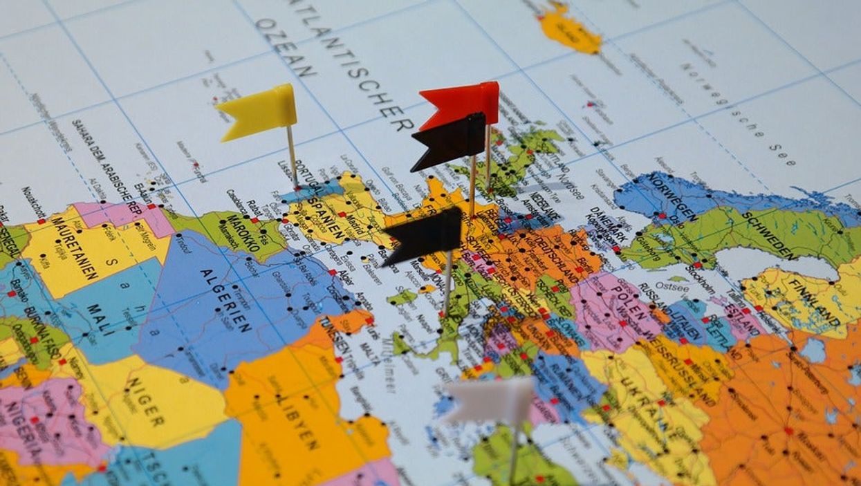
Everyone knows what a map of the world looks like, right? It’s probably been burnt into your retinas since your school days.
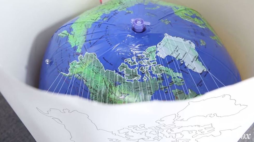
The thing is, the image you think of what the world looks like is actually pretty wrong. How come? Well, as we’re sure you know, the Earth is spherical. Which means that it is impossible to produce an accurate flat image, showing the layout of countries as they really are. It’s a hard concept to get your head around with an actual globe in front of you, but this video from Vox does a good job of explaining it – by cutting open an inflatable globe and trying to lay it out flat.
So how are maps created then? Using a process called ‘Cylindrical Projection’, which the video describes as “putting a theoretical cylinder over the globe and projecting each point of the sphere onto the cylinder’s surface”.
 )
)
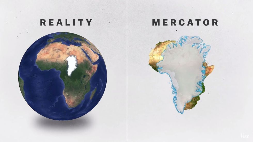
That creates a type of map called the Mercator projection. That’s the sort of map you see in schools, and it is also what Google uses. It is good because countries retain their proper shape. But it makes some countries look much bigger than they are. For instance, Greenland looks like it is about the same size as the whole of Africa. But in reality, the continent is 14 larger smaller than Greenland.
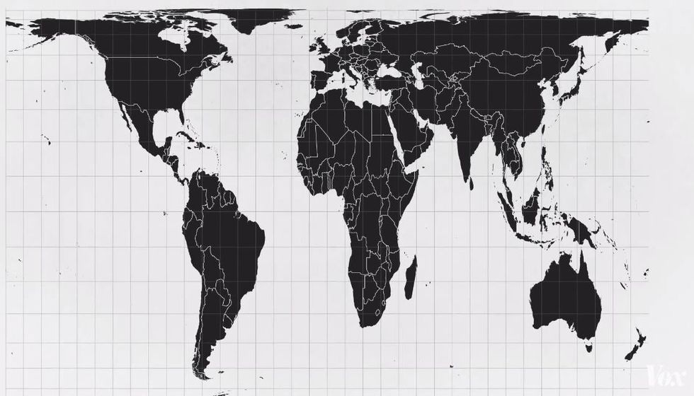
There are also lots of other types of maps, that more accurately display land mass but distort the shapes of countries.
And to think we used to beleive the Earth was flat.
Top 100


x