


The Conversation (0)
Science & Tech
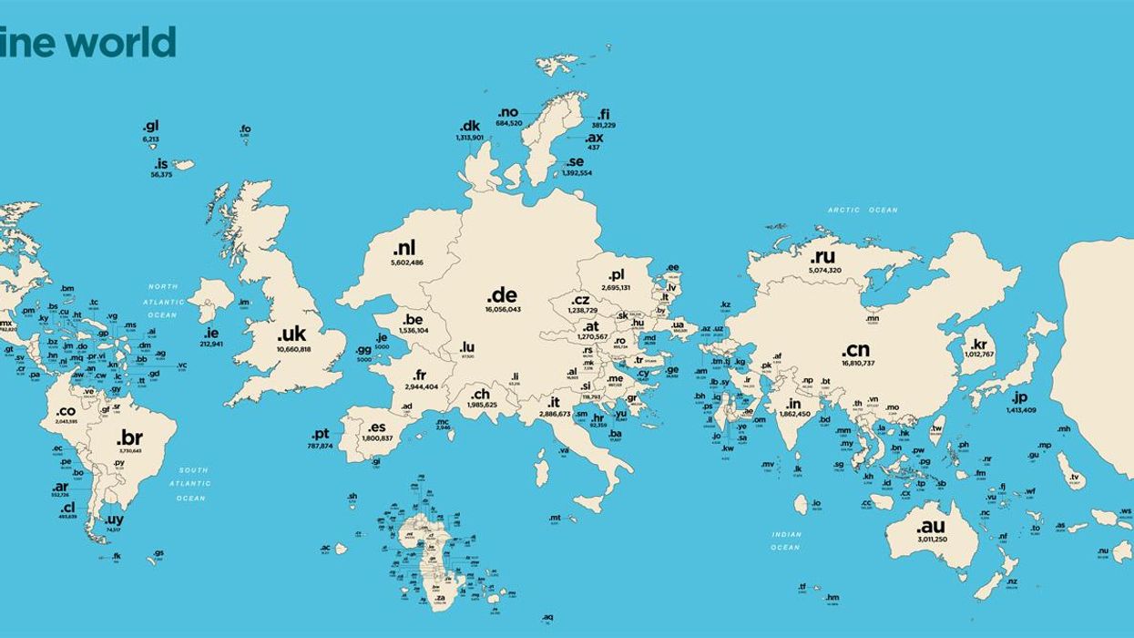
The above map is what the world would look like to scale, based on the number of websites that use each country's domain code, like the UK's '.uk'.
The map, created by Nominet, raises a few questions, the first of which is "What is that huge '.tk' island?".
It's Tokelau, an island with a population of just 1,400.
The reason there are so many .tk websites is because it's free - a Dutch company called Freenom has been providing the domain names since 2000 and gives the advertising money back to the people of Tokelau.
There are 31 million registrations under Tokelau, and a sixth of the country's GDP comes from .tk domains, according to some reports.
The second question, then, probably is "Why is the US so small?".
The reason is '.com', the favoured domain of websites in the US, which at around 123 million registrations is the world’s most common domain.
'.us' is the country-specific domain in the US, but due to its late public start (it launched in 1985, but was only used by governments and schools until 2002), it became less desirable than .com.
Relatively popular is the '.uk' domain, which is the world’s fourth largest country-code domain. A new '.uk' site is registered every 20 seconds, and there are currently 10.6 million of them.
For a full resolution version of the map, click here.
HT Mashable
More:11 maps and charts to challenge how you see the internet