The Conversation (0)
News
You're probably quite familiar with this map showing each US electoral county by who they voted for in November 2016.
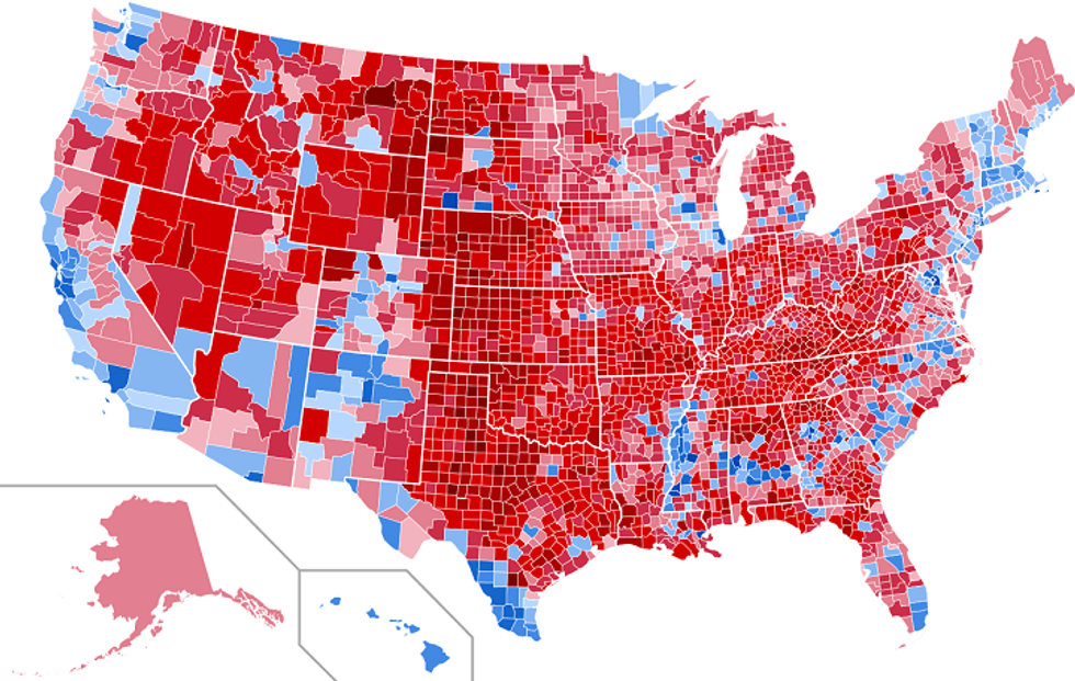 Picture: Wikimedia commons
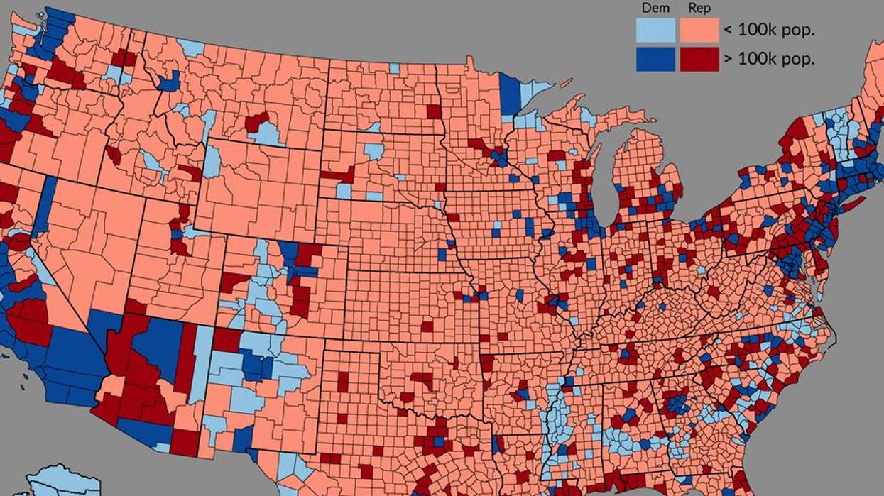
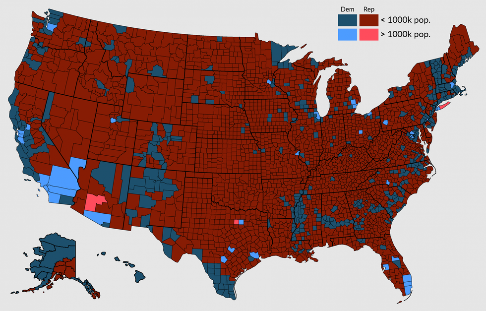
However, this map posted on Reddit, gives a very interesting insight into just who voted for Trump and Clinton in high density population areas.
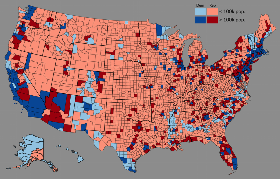 Picture: Reddit/ Mainstay17
In light red are the counties with a population of less than 100,000 that voted Republican, in dark red countries that voted Republican with a population of over 100,000.
The light blue shows the counties with a population of less than 100,000 that voted Democrat, and in dark blue counties that voted Democrat with a population of over 100,000,
What do we see?
Lots of dark blue and light red, showing bigger counties overwhelmingly vote Democrat and smaller ones vote Republican.
 Picture: Reddit/ Mainstay17
It restates the extent to which the electoral college is skewed in favour of rural voting areas, and therefore Republicans.
More: The US election map if 'not voting' was a candidate
More: No, the viral image of 2016 election results and 2013 crime rates is not real