News
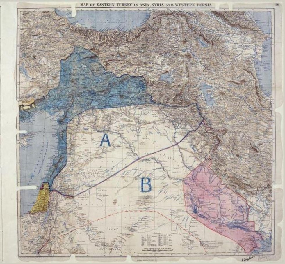
This month marks the 100th anniversary of the Sykes-Picot Agreement, a deal struck between the French and British during WWI which has had profound effects on the Middle East ever since.
The secret agreement was drawn up to divvy up the conquered Ottoman Empire into spheres of British and French influence at the end of the war.
It roughly delineated the borders of Syria and Iraq, and has been blamed as a major contributing factor for many conflicts raging in the region, including the current situation.
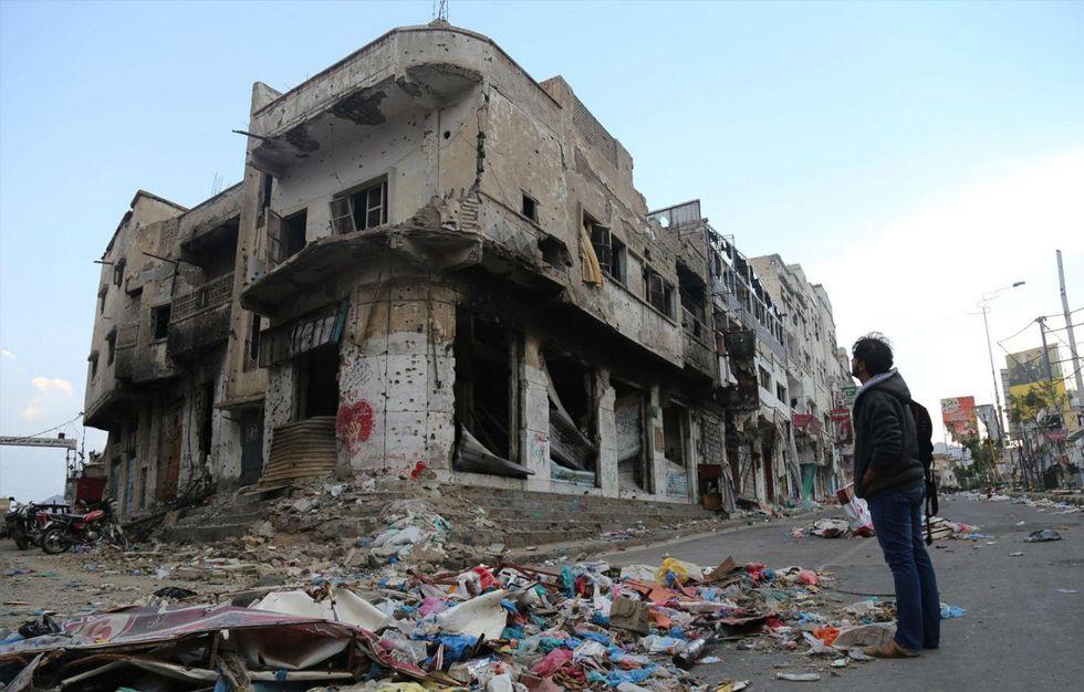
In Syria, the Assad regime, aided by Russian airstrikes, hopes it is close to crushing the last of the country's rebel strongholds, and Isis continues to reign bloody terror in their self-declared caliphate stretching across northern Syria and Iraq.
Saudi Arabia is bombing Houthi rebels in Yemen, Libya's government is struggling to regain control of the country, and Egypt's military government has cracked down on the Muslim Brotherhood. Saudi and Iranian money is tied up in all these conflicts.
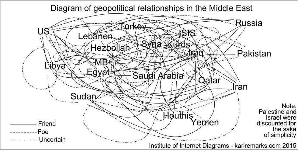
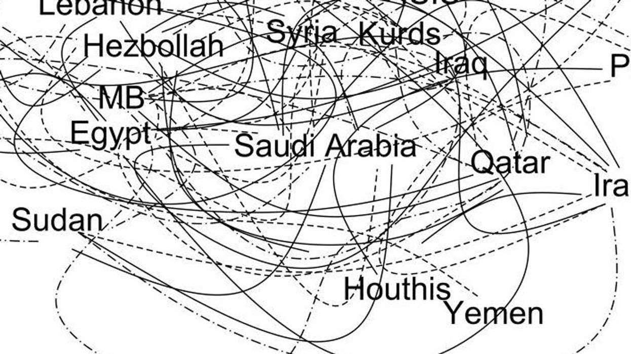
If all this is hard to follow, that's because it is. But blogger and commentator on the Middle East Karl Sharro's diagram of the alliances in the Middle East should help... possibly.
He told indy100 that the graphic was intended as a parody of the idea that the Middle East is an obscure, chaotic place beyond the realms of understanding, and based on the assumption that its problems are timeless.
Despite the incomprehensible nature of the drawing, many people on Twitter took it seriously.
Sharro told indy100 in an email a few months ago:
I think it works on two levels, people who get it and appreciate it as satire, but it's also interesting to see the people who take it at face value because in a way it confirms the position I'm satirising.
However, I was still surprised at the number of people who made factual comments or corrections, which the diagram clearly doesn't represent accurately.
He added that he did empathise with people trying to understand the complicated local dynamics of the Middle East.
Accepting that is far better in my opinion than the simplified narrative about good guys and bad guys that often leads to catastrophic interventions. I think for example both right and left in the UK are guilty of that, they just disagree on who the 'villains' are. The diagram in a sense is satirising those attempts at oversimplifying the situation.
More: Letter to Daily Mail gives excellent explanation of war with Isis
Top 100
The Conversation (0)

