


The Conversation (0)
Narjas Zatat
Aug 20, 2017
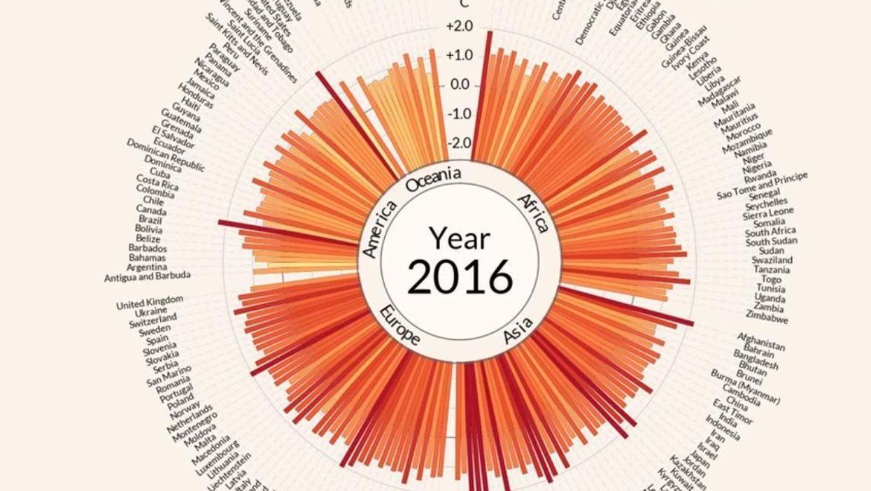
Global temperature anomalies over 100 years
Antti Lipponen/YouTube screengrab
The Earth could be 1.5 degrees Celsius warmer than the late 1800s in just nine years.
The year 2016 was the hottest on record for the third time in a row.
Antti Lipponen, a climate researcher at the Finish Meteorological Institute collected data on the Earth’s temperature using information gathered by NASA’s Goddard Institute for Space Studies’ Surface Temperature Analysis (GISTEMP).
Then, he created a graphic which showed year-on-year temperature abnormalities in different countries.
At first, the graphic is blue and the spikes short, however as the years go by, more and more countries experience hotter-than-normal temperatures.
This is indicated by the longer, red spikes.
The following graphic outlines, in stark clarity, how much temperatures across the world have risen:
Lipponen added July 2017's temperatures afterwards and, in line with the trend he outlined in the graphic, July was the warmest month on record so far.
More: 11 images from Nasa that show climate change is real
More: This is the trillion tonne iceberg four times the size of London that cracked off from Antarctica