Science & Tech
Louis Dor
Jan 09, 2016

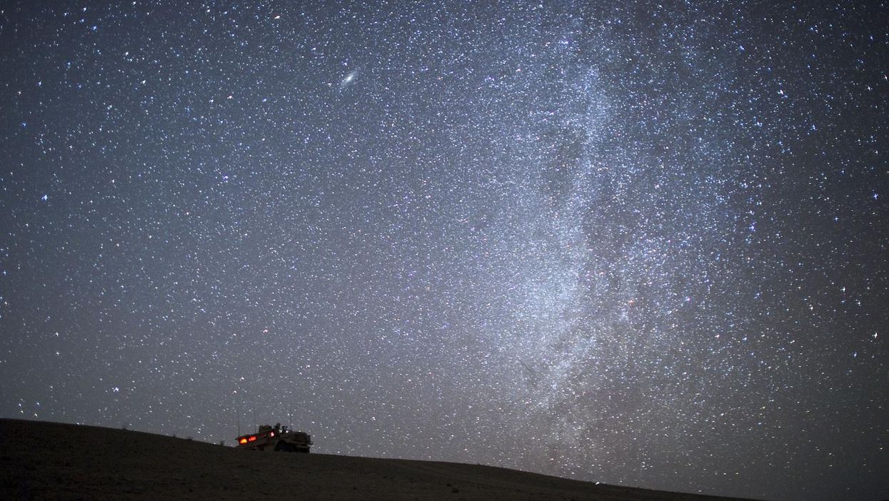
An armoured vehicle of US Marines from 1st Battalion 8th, Bravo is seen in Helmand province on 23 January 2011
The below map was created by astronomers at the Sloan Digital Sky Survey (SDSS), who took on the task of measuring the growth of the Milky Way.
The image shows the latest measurements for the ages of more than 70,000 stars and extends halfway across the galaxy.
Picture: G. Stinson (MPIA)Coloured dots are superimposed on an artist’s impression of the Milky Way, the hues of which show how many billion years have passed since those stars formed.
Red dots show stars that formed when the Milky Way was young and small and are typically closer to the centre, while blue shows stars that formed more recently.
The researchers mapped the Galaxy by observing red giants, as explained by Marie Martig, co-author of the study:
If we know the mass of a red giant star, we know its age by using the fusion clock inside every star.
Finding masses of red giant stars has historically been very difficult, but surveys of the Galaxy have made new, revolutionary techniques possible.
So what does this show? In the words of lead author Melissa Ness:
Our Galaxy grew up by growing out.
To see this, we needed an age map spanning large distances, and that’s what this new discovery gives us.
HT Mashable
Top 100
The Conversation (0)


