The Conversation (0)
Viral
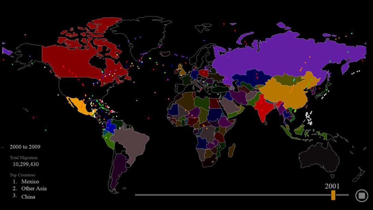
The United States, since 1820, has received roughly 80 million people who have gained lawful permanent resident status in the country.
Using data from the Department of Homeland Security's Office of Immigration, Max Galka of Metrocosm plotted this in an interactive visualisation.
Every dot represents roughly 10,000 people.
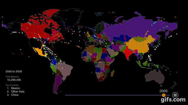
It's fascinating to watch how the sources of immigration change from primarily Western Europe to a range of countries around the world as the decades go on.
It's worth noting that the visualisation does not include forced immigration in the form of the slave trade.
Watch the full video below:
More: This great map lets you explore the history of migration for every single country