The Conversation (0)
A CV is often the first impression you make with an employer, a handshake via a piece of paper if you will.
Because everyone knows this, we tend to get quite myopic about it.
The formatting - do you do an intro paragraph? Include a picture? Chronological work experience or by importance?
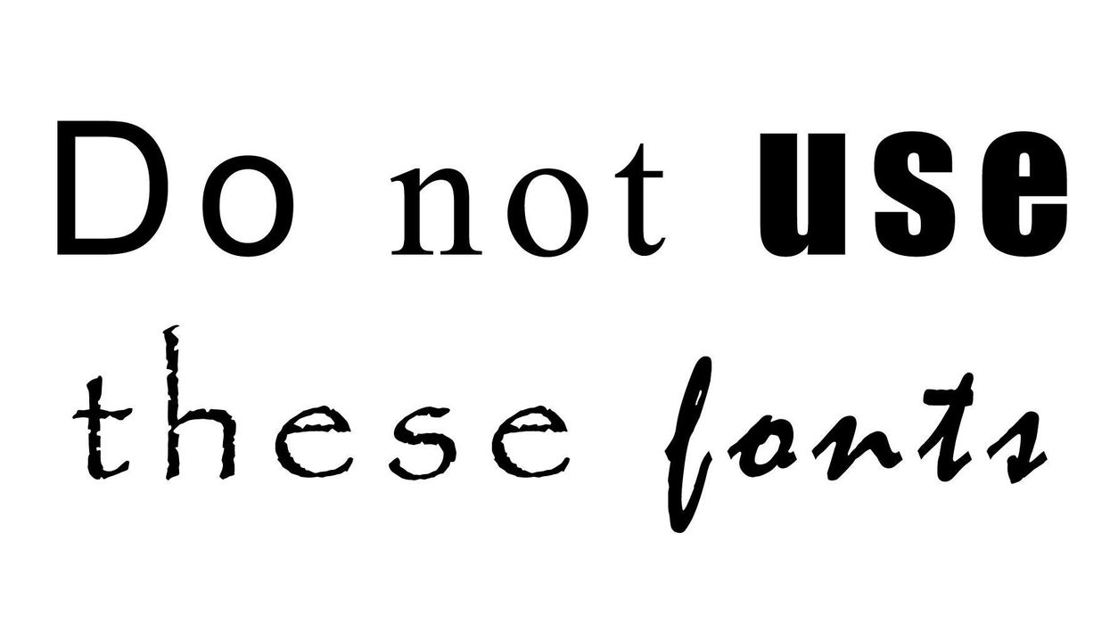
Even the fonts can be dizzying.
Sadly it seems there are wrong answers when it comes to typography.
Here are a few fonts you should avoid in your CV:
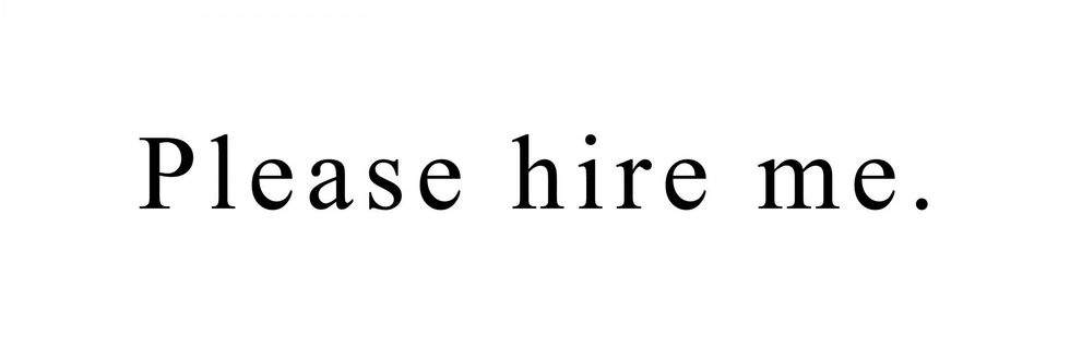
1. Times New Roman:
indy100 asked CV expert Mildred Talabi for fonts you shouldn't use.
Times New Roman was a big negative.
When it comes to bad fonts for your CV, I don't have a list, just one MAJOR culprit - Times New Roman!
Avoid this like the plague!
Nothing says 'I haven't updated my CV in ten years' more than the Times New Roman font and that's definitely not the message you want to be sending out to employers.
2. Arial:

Mildred added:
Stay away from Arial - it's not quite at the Times New Roman extinct CV level yet, but it's getting there quickly.
3. Impact:

Garett Southerton, a brand designer and consultant told CNBC:
Impact is an odd choice frequently used on resumes and designs
He called it "boxy" and "unprofessional, adding it is:
a sure-fire way to get your resume trashed immediately.
4. Papyrus
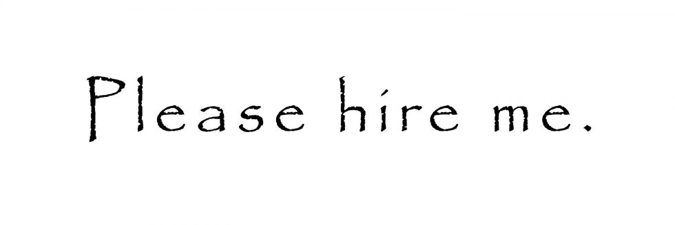
Juan Villanueva, type designer at Monotype, told CNBC:
In general, I'd stay away from typefaces that have too much personality.
These typefaces are hard to tame.
Ultimately, you want your choice of words and fonts to work together to enhance your message, not distract from it.
5. Mistral
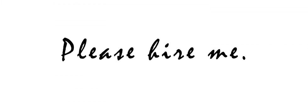
Standage says:
Don't use script faces for resumes.
It is almost as inappropriate as using Comic Sans.
HT CNBC, DesignTaxi
More: The one font you should never, ever use on your CV (and the fonts you should)
Top 100