The Conversation (0)
Viral
Autocomplete maps have been all the rage for years.
People have, since the early days of the Google function, been fascinated by what stereotypes the search engine throws up, informed by people's assumptions and queries.
A state by state map of autocomplete results has recently been reposted on a popular map enthusiast subreddit.
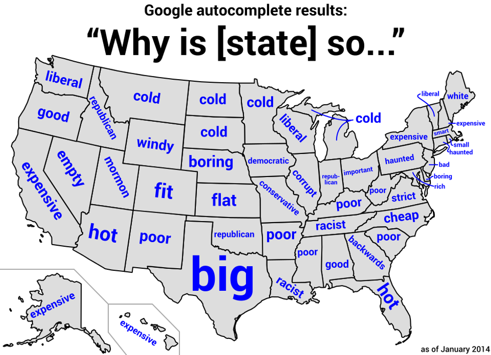
So we thought it was high time that Britain got in on the action.
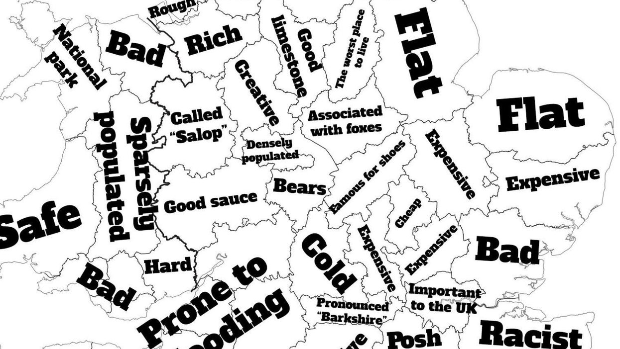
Using a similar methodology, typing in "Why is [county or largest city/town] so...", we've produced this 100 per cent scientific map below:
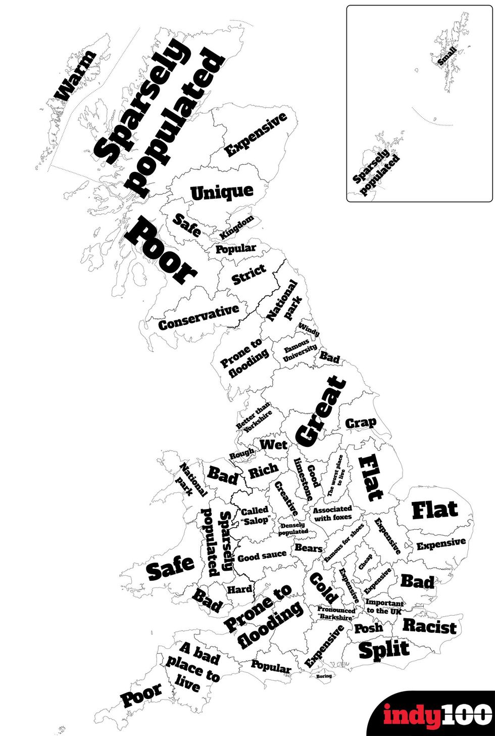
The fixation that British Google apparently has with population density and flooding is pretty in keeping with the national identity and local authority concerns.
Meanwhile, it's also quite fortuitous that Bedfordshire sits as "Cheap" amid a sea of expensive home counties.
Oh and poor Kent. Shame on autocomplete for labelling a whole county racist - it can't be blamed for being home to Britain First.
A note on methodology: Factual queries (e.g. about local geography, government, things with the same name etc) were discounted for the most part, and the "so" part of the query was sometimes removed if it produced no answers. Depending on the county, the largest town or city was sometimes used in order to generate a result.