The Conversation (0)
News

Only two more days. Only two more days of debates and rebates and political teammates.
Only two more days of false £350m figures and scaremongering and your racist uncle Barry telling you what's what.
The end is so close the country can taste it, and we all are screaming maniacally for its arrival, like tortured souls in a political purgatory.
But it is not here yet, so here's a load of charts and maps.
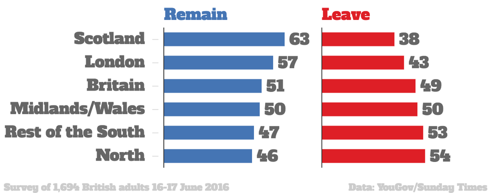
If it were down to England and Wales (minus London) we'd be out very fast.
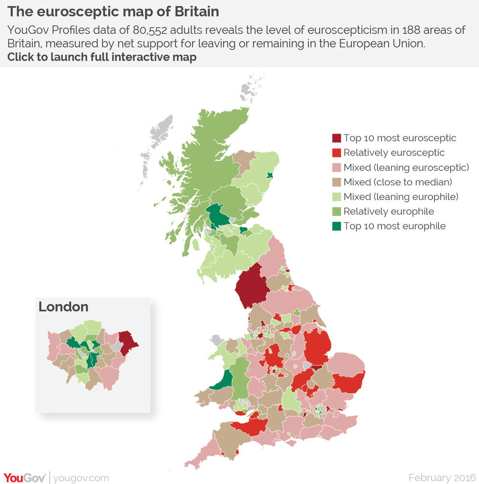
A recent map of Euroscepticism by YouGov showed that five of the top ten most Europhile areas in Britain were in London, the rest being in Scotland and Wales.
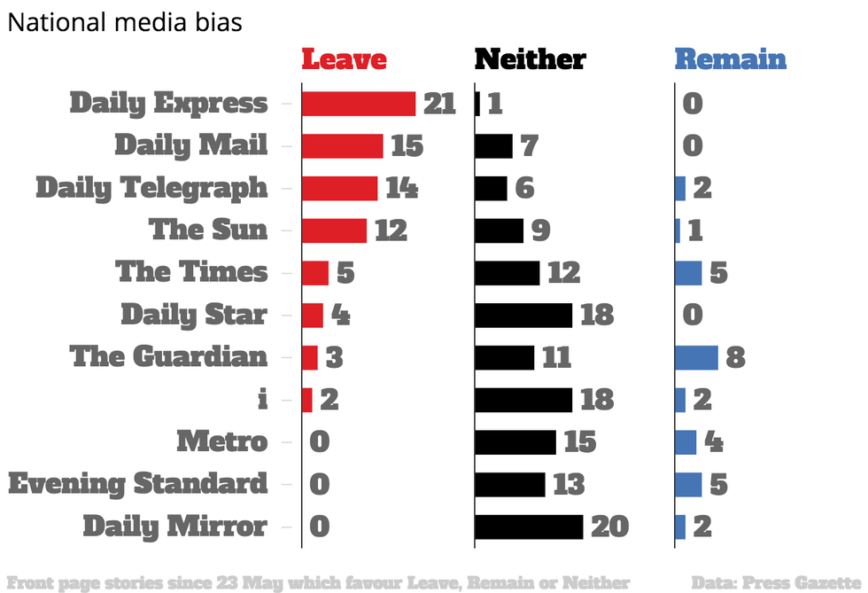
Analysis of front page stories since 23 May by Press Gazette found that on the whole, the media is dominated by Brexit-positive stories.
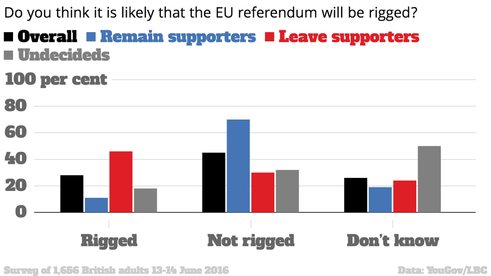
The poll, by Yougov for LBC, found 28 per cent of all voters believe Thursday’s referendum is rigged, compared to 64 per cent of Ukip supporters and 46 per cent of Leave voters.
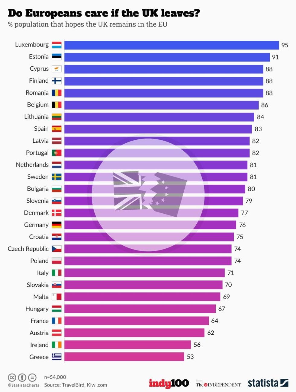
Countries like Luxembourg, Estonia, Cyprus and Finland are standing outside our window with a boombox, whereas Greece and Ireland are only sending the occasional needy text.
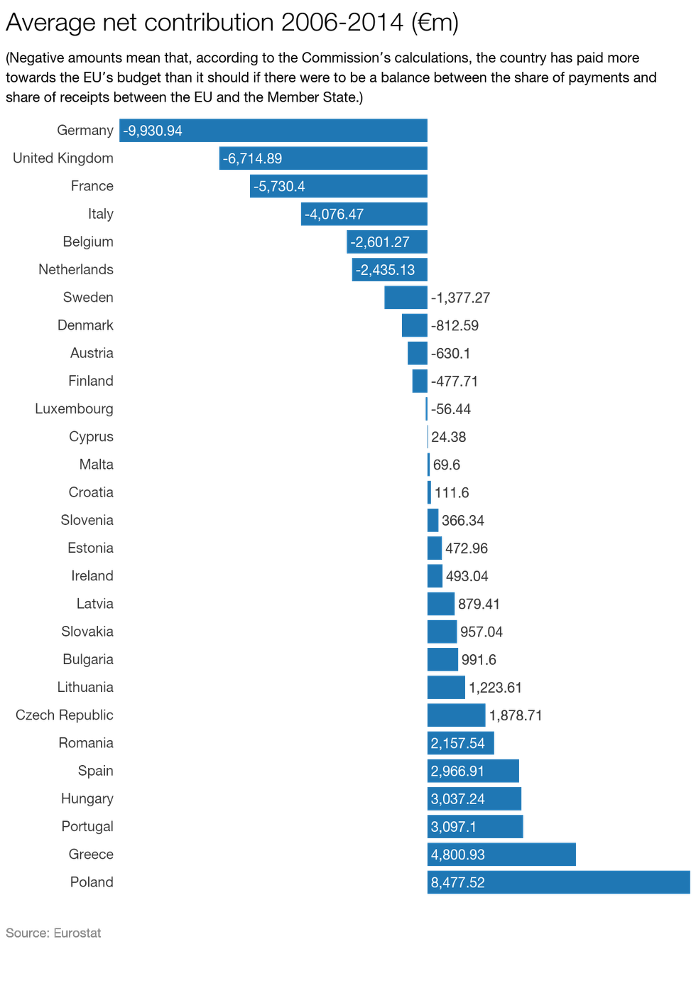
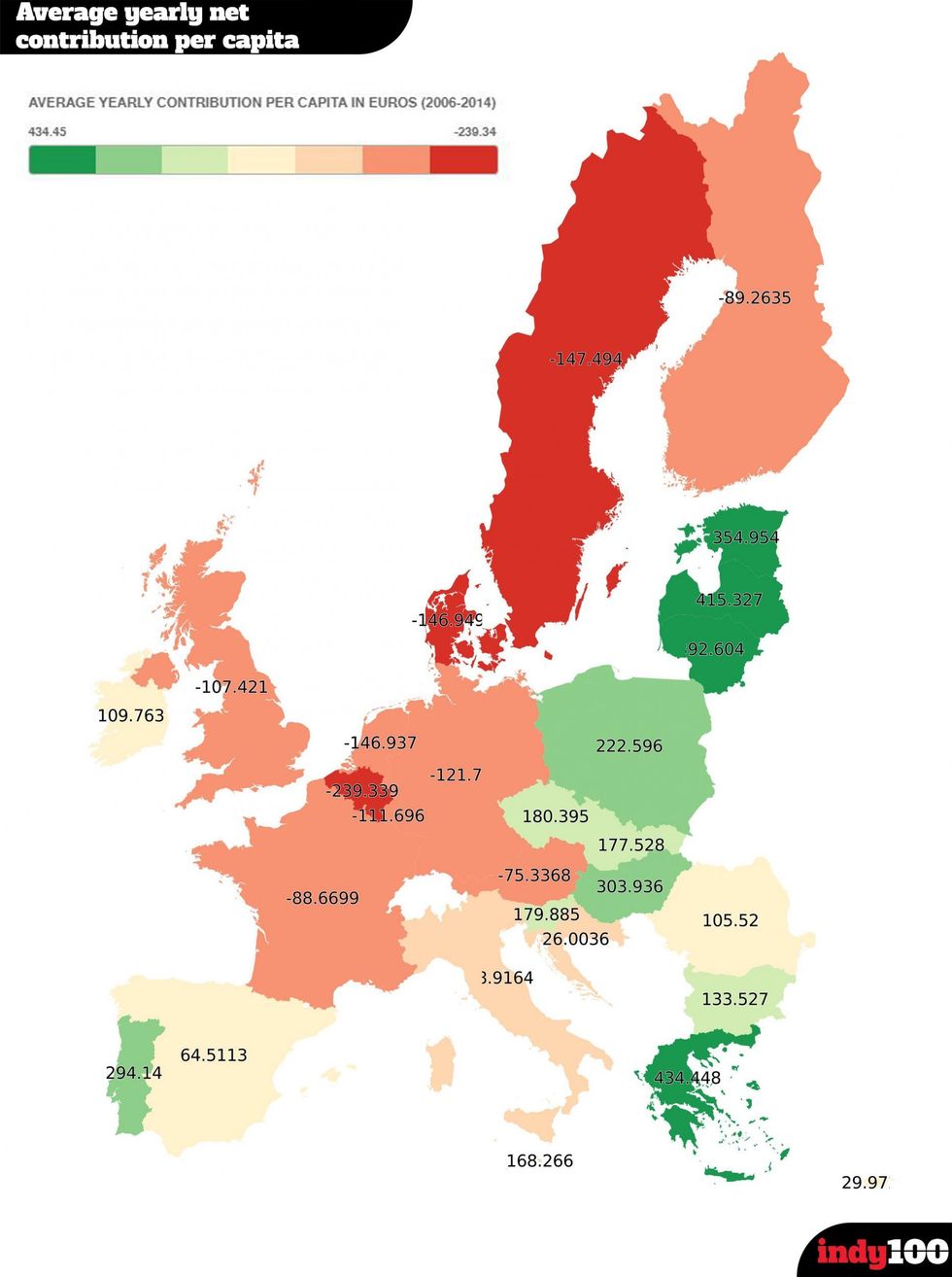
Using Eurostat population averages for the same time period, it appears these countries pay more per person, although in Belgium and Luxembourg's cases this can be linked to EU infrastructure.
Interestingly the country most commonly listed as superior in the data collected by the World Economic Forum is Switzerland, which isn't even in the European Union.
Although whether this is to do with the fact it has long established financial institutions, is a tax haven, is one of the worlds most developed and wealthy countries and is full of idyllic alpine scenery, chocolate and cheese, is not for us to say.
More: David Beckham just backed Remain and the referendum is now essentially over
More: Tories agreed with Jeremy Corbyn during the Sky EU debate and everyone is thoroughly confused