


The Conversation (0)
Louis Dor
Feb 14, 2018
Picture:
Ajgloe/imgur
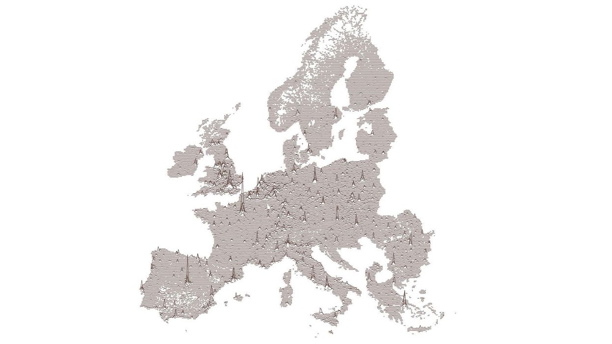
A population map of Europe has been submitted to a mapping subreddit, showing the population density in selected countries around the continent.
Methods of representing this form of data are usually confined to chloropleths or heatmaps.
So seeing a visualisation along lines is kind of refreshing, courtesy of AJgloe on reddit.
It's a similar sort of of representation to the Album Cover for Joy Division's debut album, Unknown Pleasures.
The map also had its critics for only featuring certain countries.
The work also appears similar in format and execution to James Cheshire's population lines print on spatial.ly.
The code for the parallel processing in r is available here.
More: A map of Europe according to the number of people living abroad