The Conversation (0)
News
A Boston school district has decided to drop the Mercator projection, which is the favoured map used in schools, and instead decided to use Peters - whose proportions are more in line with reality.
Here's a little look at the differences.
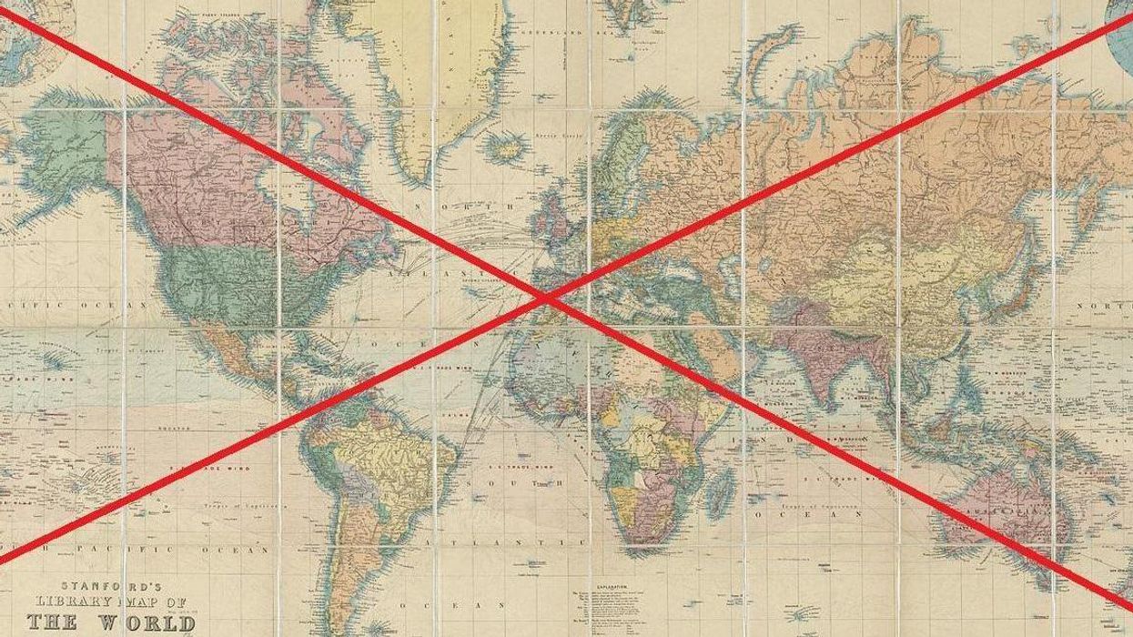
 Picture: Wikipedia Creative Commons
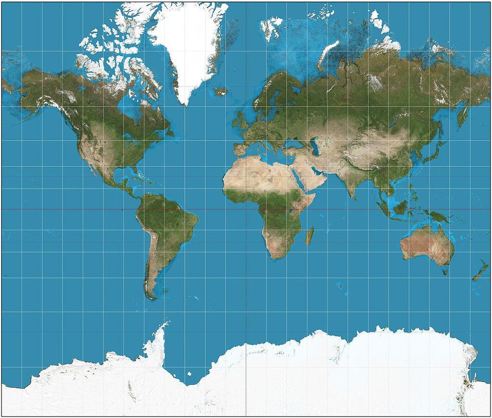
Designed by Flemish cartographer Gerardus Mercator in 1569, the map puts Europe in the centre, and diminishes the sizes of Africa and South America.
Some argue that, when rendering a 3D shape, like the world, into a 2D format there are problems. The cartographer did not wish to compromise the valour of Europe, and so they shrunk the surrounding continents. Others however, claim that the decision to make Europe bigger was made within a colonial context, in order to demonstrate the might of the imperialist power.
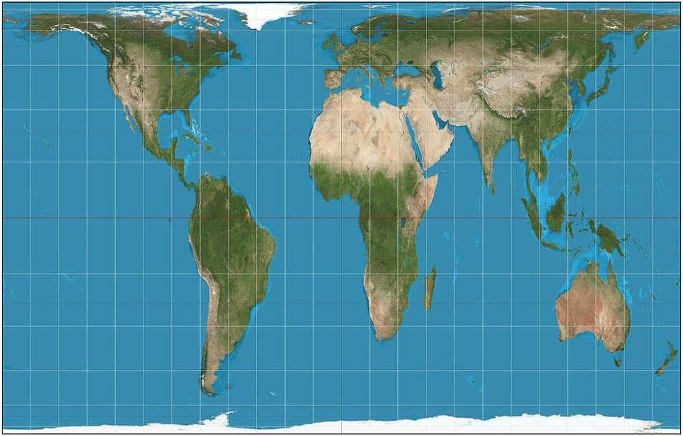 Picture: Wikipedia Creative Commons
The Peters map portrays the African continent as being much larger than North America and Europe. South America too, is a much larger region than Mercator had drawn.
The teachers in the Boston region decided not to take the Mercator projection down. Instead, they chose to put the Peters projection besides the original map, so that students could see and study them.
Natacha Scott, director of history and social studies at Boston public schools told the Guardian:
Some of their [the students’] reactions were quite funny… But it was also amazingly interesting to see them questioning what they thought they knew.
More: Someone made a map of the world according to Donald Trump
More: This map of Earth is the most accurate ever produced, and it looks completely different