


The Conversation (0)
News
The routinely hilarious Facebook page Terrible Maps specialises in exactly that, terrible maps.
If you've never been on the page it is a collection of the worst and most unhelpful maps you've ever seen.
Here are a few examples:
That is all well and good but every now and again these funny little maps can make a very poignant and brutally honest point.
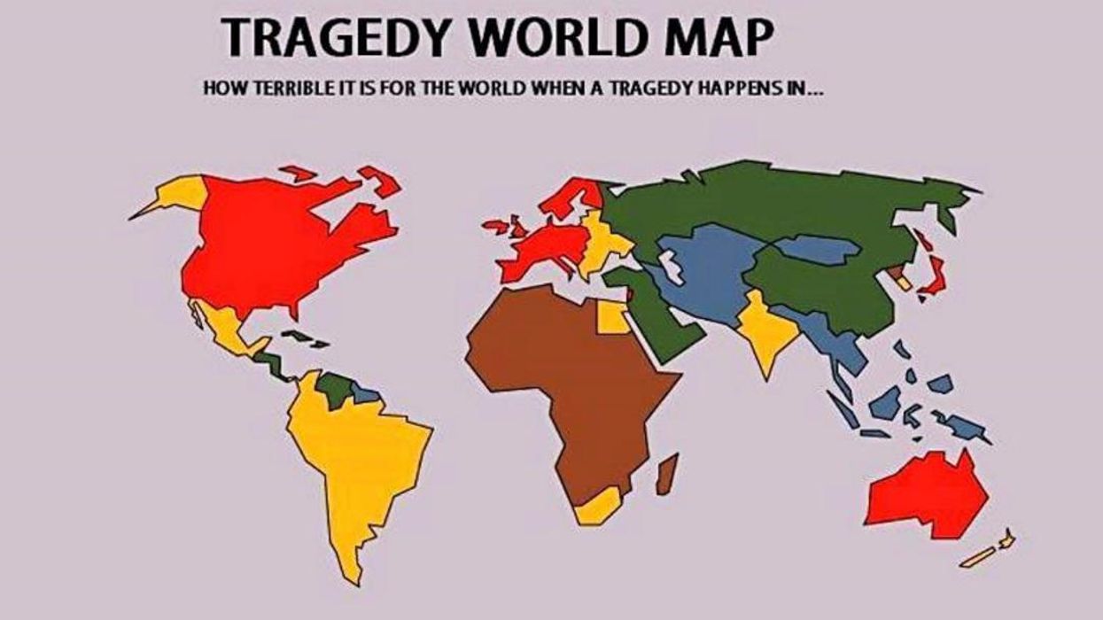
The tragedy world map is probably the best example of this.
Not only does it criticise how the media reacts to tragedies or crises in the Western world it highlights how little we hear about news from Africa or large parts of Asia.
For instance did you know that over 1000 people in Niger, Nigeria and Sierra Leone recently died in floods?
Probably not because it happened at the same time Hurricane Irma and Hurricane Harvey hit the United States.
It also shows how patronising the west can be to issues in the Middle East, China or Russia.
Comments replying to the original post agreed with what they saw.
HT Facebook