


The Conversation (0)
Science & Tech
Earlier this month US president Barack Obama announced the White House’s most aggressive plan to date for tackling climate change.
President Obama said at the announcement:
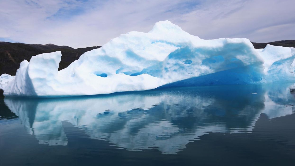
Shrinking ice caps forced National Geographic to make the biggest change in its atlas since the Soviet Union broke apart.
It’s true.
The publisher has altered the Arctic caps in the 10th edition of the National Geographic Atlas of the World , declaring it: "one of the most striking changes in the publication's history":
(Image: National Geographic/YouTube)
The white mass depicted on the maps is ice that has lasted over years, whereas the sea ice - ice that melts and refreezes with seasons - is depicted as lines.
Ice that is one year old or less is not shown as part of the solid shape, which is an editorial decision due to the seasonally fluctuating areas of ice.
Rosemary Wardley, National Geographic's senior GIS cartographer said:
We do not show the minimum extent simply because there is only so much information we can put on the map before it becomes confusing to the user.
According to Nasa, Arctic sea ice has retreated by 12 per cent per decade since the 1970s, and perennial ice cover is diminishing.
Josefino Comiso, a senior research scientist at Nasa, said:
The perennial ice cover in the 1980s and early 1990s was averaging between seven and eight million square kilometres.
(Image: National Geographic/YouTube)
In 2007, when there was this drastic decline, it went down to as low as 3.5 million square kilometre and in 2012 it went down to almost 3 million square kilometres.
To watch the full video, see below:
More: Republican senator denies humans caused climate change, cites Bible
More: 40 per cent of the world's population has never heard of climate change