The Conversation (0)
Viral
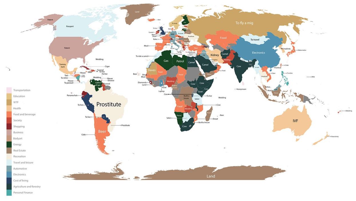
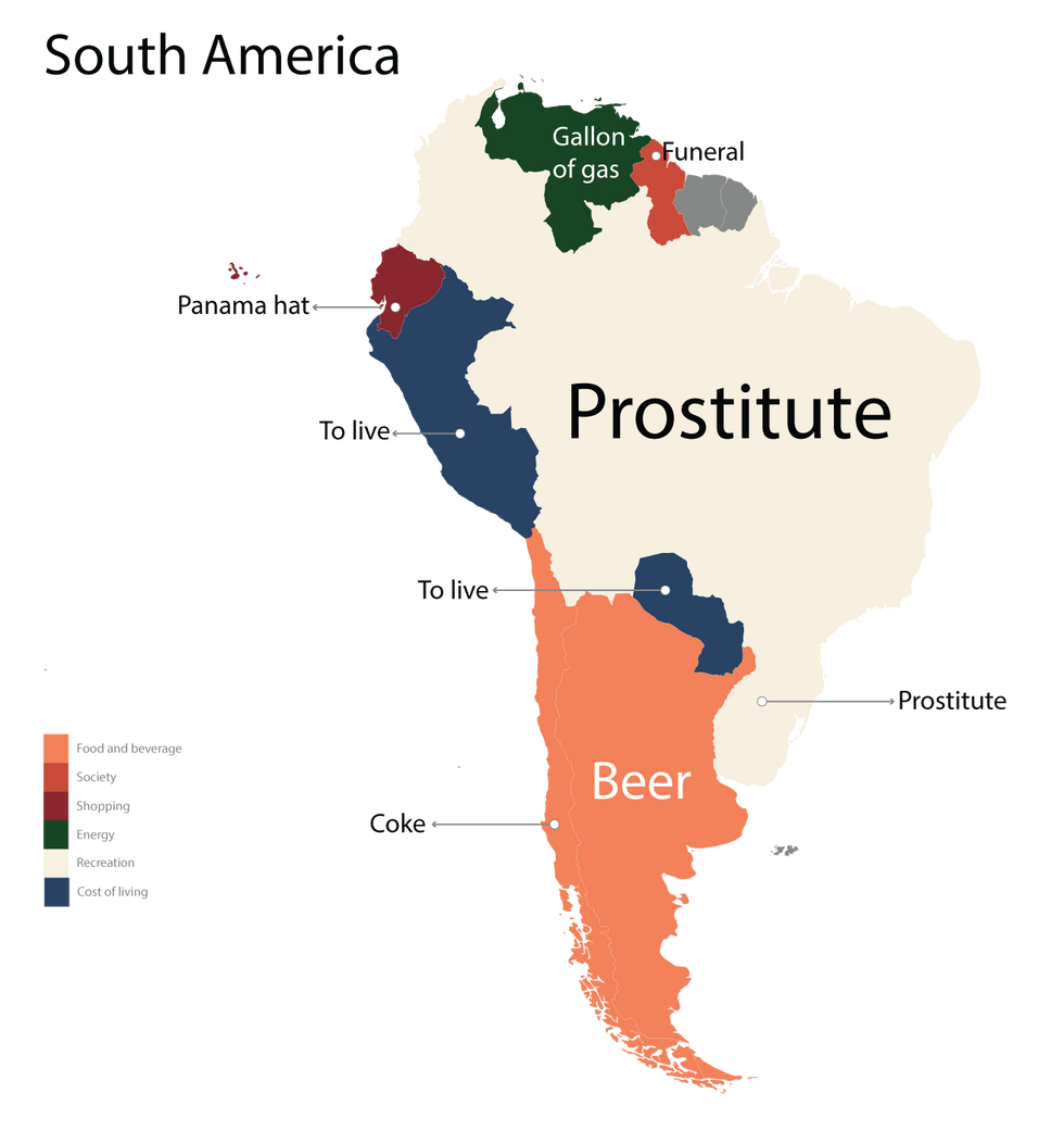
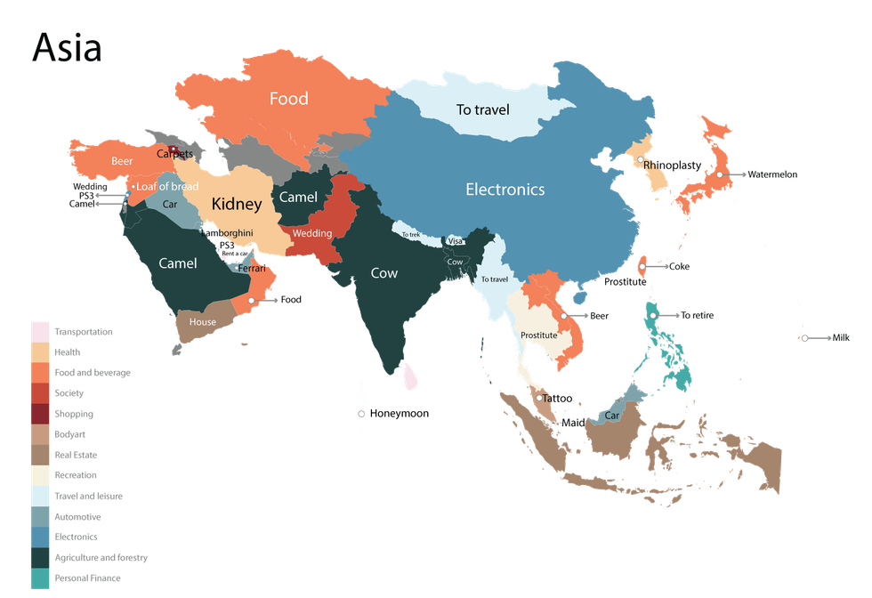
This is a map of the world's countries according to the most common cost of item queries searched for on Google.
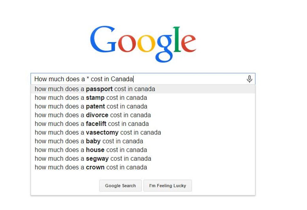
The graphic was compiled by US company Fixr by asking this simple question and waiting for the search engine to autocomplete the item.
While interesting, the map also reveals some disturbing assumptions and desires. People want to know how much it costs to live in Britain, how much a croissant costs in France and how much a meal costs in Portugal - but they also want to know how much a prostitute costs in Brazil, Ukraine, Hong Kong, and Latvia, how much a kidney costs in Iran and how much slaves cost in Mauritania.
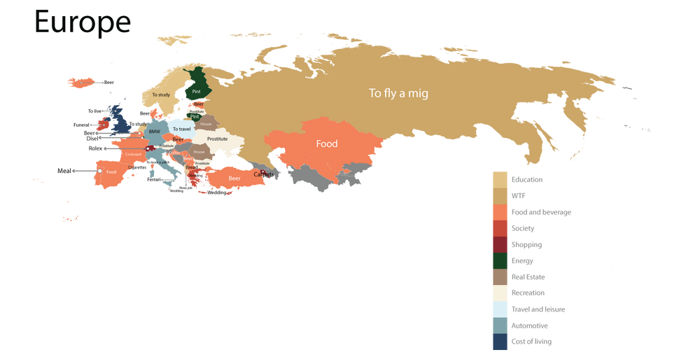
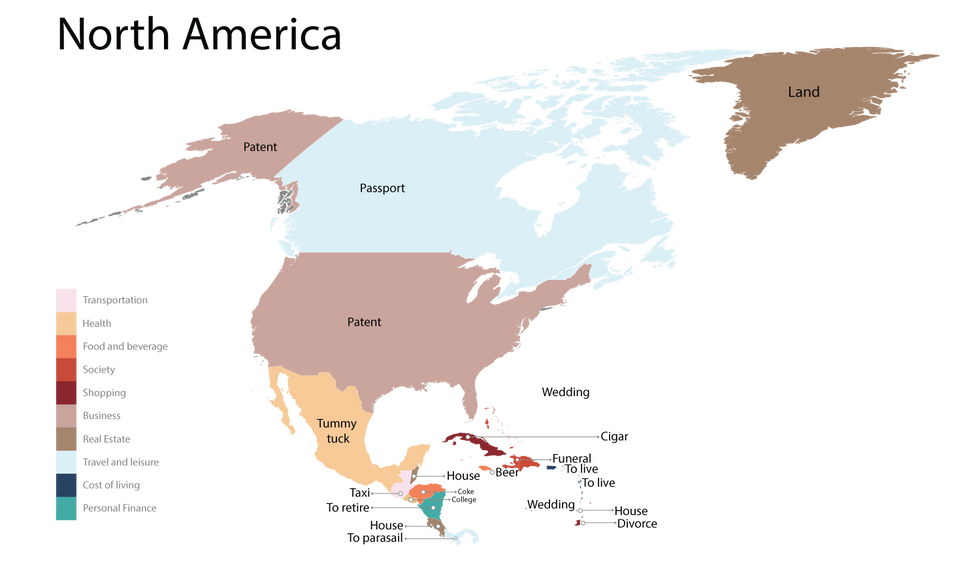
Here's a closer look at Europe, Asia, Africa, North America and South America.
Finally, a quick note on methodology: the map was made from autocomplete searches on Google.com which will differ slightly to searches from the UK.
More: How selected consonants sound around Europe, in 9 maps