


The Conversation (0)
Wil Jones
Apr 06, 2017
Picture:
Jakub Marian
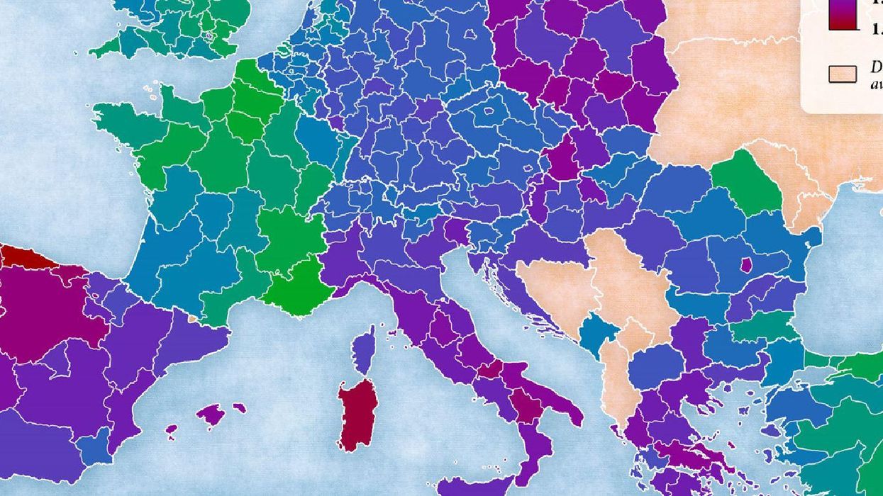
In layman’s terms, the total fertility rate of a country is the amount of children the average woman will have in her lifetime, providing everyone keeps trying for a baby at the same rate they do now.
This data has been mapped across the whole of Europe by Jakub Marian, in the infographic below.
However, before we look at it, there’s another metric you should be aware of. The replacement rate is how many babies people need to be having to keep the population stable (taking mortality into account).
In developed countries, that rate is around 2.1 – eg. Nine out of ten women should be having two children, and one in ten having three.
Now let’s look at the map:
Things do not look good. The UK, France, Turkey and Scandinavia are all around or just under that rate.
But Central Europe is noticeably below 2.1, and countries like Spain, Portugal, Greece and Italy lie in the 1.0 to 1.2 range.
This of course potentially affects so many things, such as pensions, healthcare and immigration.
If there’s no one replacing us, who is going to look after this generation when we are elderly?
More: The map of the world in 2090 suggests we have a huge problem