The Conversation (0)
Viral
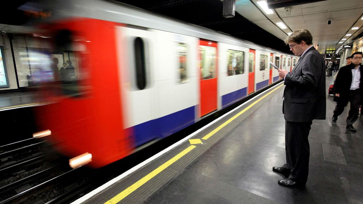
Whatever your feelings about the commute, the London Underground is a fairly remarkable system.
When it was built it was the first underground railway in the world, and its iconic design features have endured.
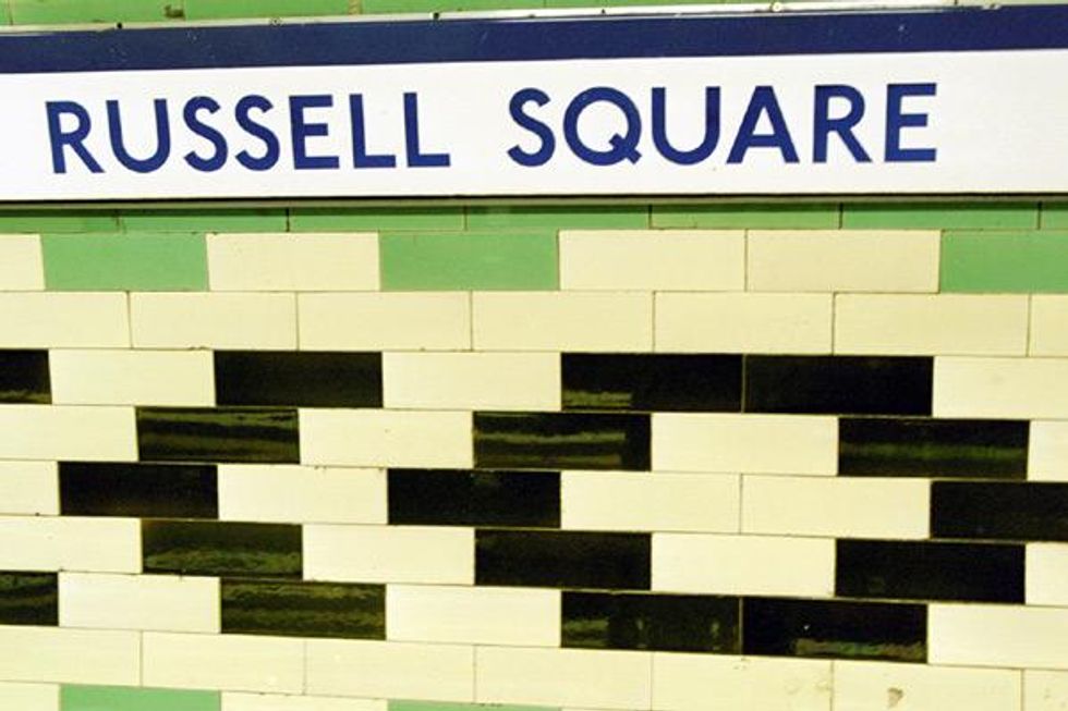
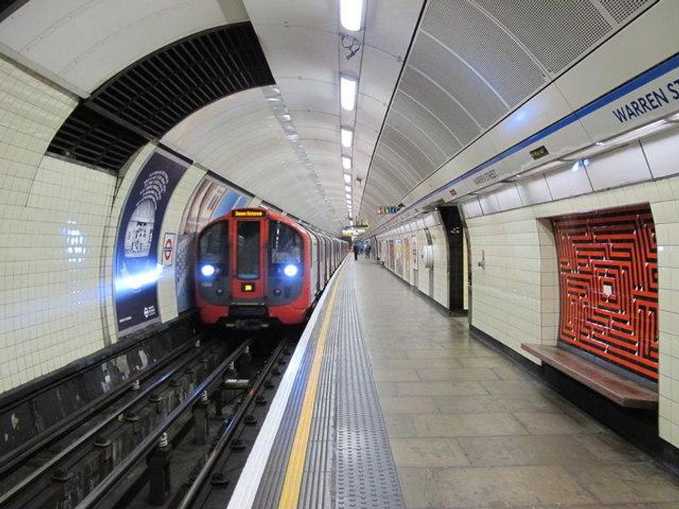
But what we never realised - until the nice people over at Mental Floss pointed it out - is how idiosyncratic the tiling and designs on platforms can be.
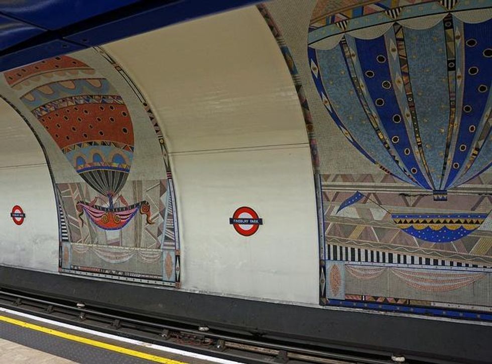
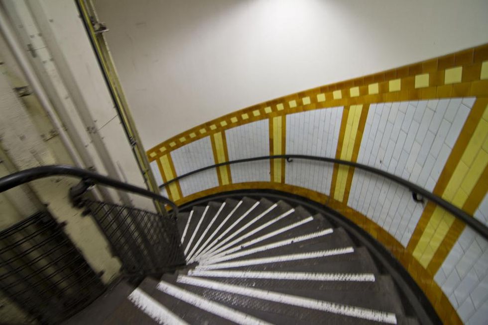
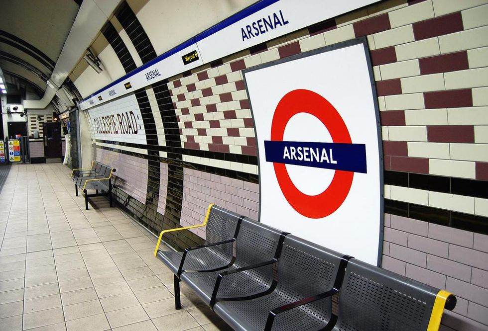
It turns out, though, that there was a practical reason for subtly mixing up the designs and colour schemes at older stations.
When the Tube opened in 1863, it's possible not all of them were that well signed, so distinctive patterns and tiles would help commuters know they were at the right stop. But even more pressingly, it's likely a lot of early Tube riders would have been illiterate, rendering signs useless anyway.
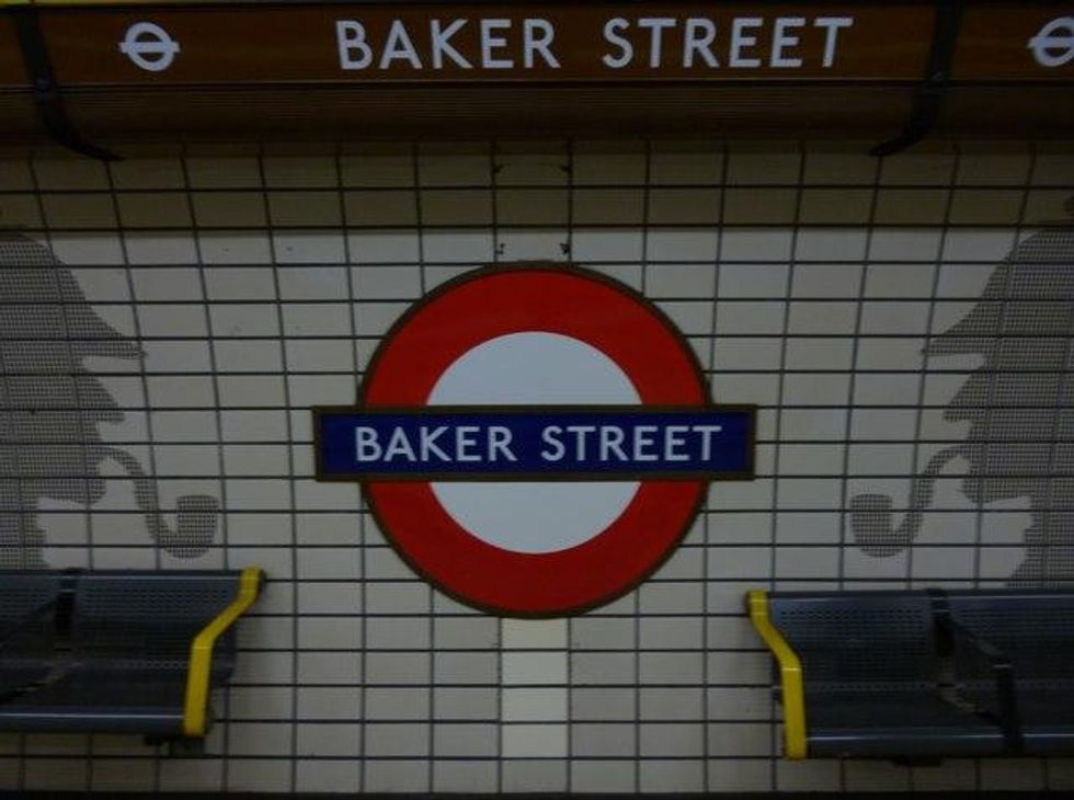
As time went on, a lot of Tube station designers started to have fun with the pictograms. You'd probably realise you'd arrived at King's Cross:
Via Geograph.org.uk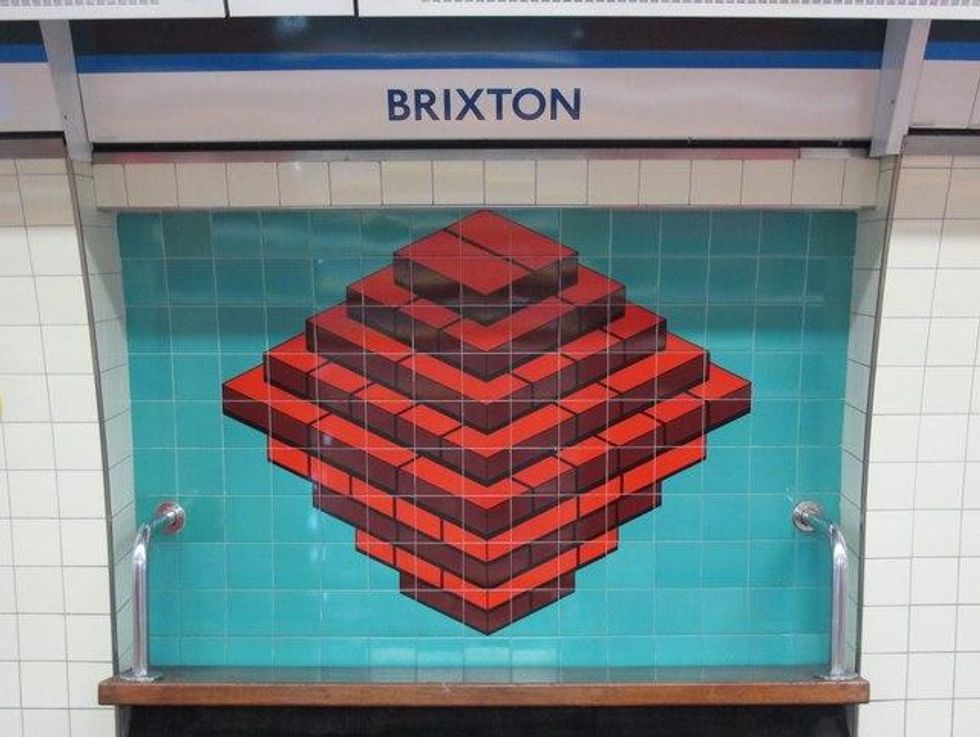
Happy hunting; it should make your ride home a tiny bit more bearable.
H/T Mental Floss
More: Yes, the Tube is hotter than is legally allowed to transport livestock
More: Another glitch in the matrix has been spotted on the Tube