The Conversation (0)
News
Brexit has had quite a fallout. David Cameron resigned, Labour is in chaos, and the pound plummeted.
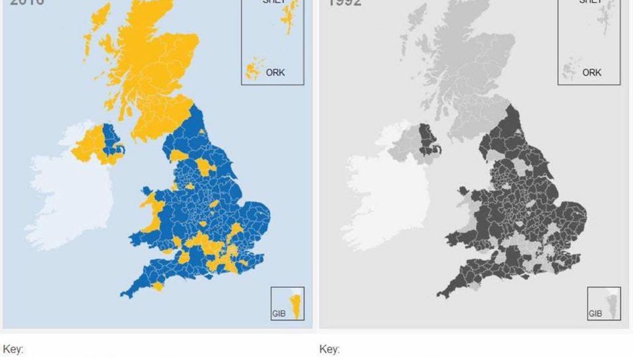
People, searching for answers as to how this happened, have come to a staggering conclusion, thanks to an unverified graphic - mad cow disease.
An image has been repeatedly circulated on Facebook and Twitter comparing the results of the vote with that of areas of outbreaks of bovine spongiform encephalopathy (BSE).
Many believed it:
However, this is not so. As much as many Remainers would like to believe that euroscepticism is engendered from bad beef, it's not the case.
As Snopes has pointed out, thousands of cases of mad cow were being diagnosed across the country every day throughout the country.
The outbreak has no correlation to Leave areas - someone has just changed the referendum results map's colour to monochrome.
Still...
More: 8 of the most misleading promises of the Vote Leave campaign, ranked in order of preposterousness
More: Show these charts to anybody who thinks Brexit was a victory for 'decent, ordinary' people