The Conversation (0)
Viral

Immigration has been a particularly hot topic since the EU referendum campaign.
For this reason, it's often talked about in a negative (and often inaccurate) light. As an antidote to that, this map just shows us the facts, based on statistics from a UN report.
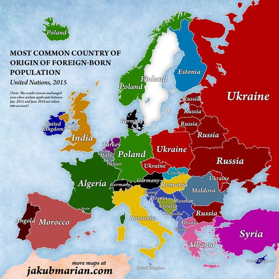
Here’s what immigration looks like in countries across Europe on a map according to the most common countries people emigrate from.
 Picture:
The map shows that the most common country of origin of foreign-born people in the UK is India.
The only place where Brits make up the biggest proportion of immigrants is Ireland.
More: 10 myths about the UK's 'migrant crisis', debunked
More: Three charts that show what European countries really think about immigration