


The Conversation (0)
Louis Dor
Mar 29, 2017
Picture:
Christopher Furlong - WPA Pool/Getty Images
Prime Minister Theresa May has sent the letter that starts the UK's formal exit process from the European Union.
May promised in a speech, back when the letter was sent, that she would protect the rights of EU nationals, seemingly ignoring the irony of mentioning them as an afterthought:
When I sit around the negotiating table in the months ahead, I will represent every person in the whole United Kingdom – young and old, rich and poor, city, town, country and all the villages and hamlets in between.
And yes, those EU nationals who have made this country their home.
It is my fierce determination to get the right deal for every single person in this country.
Immigration was a key issue in the Brexiters campaign - you may remember this poster:
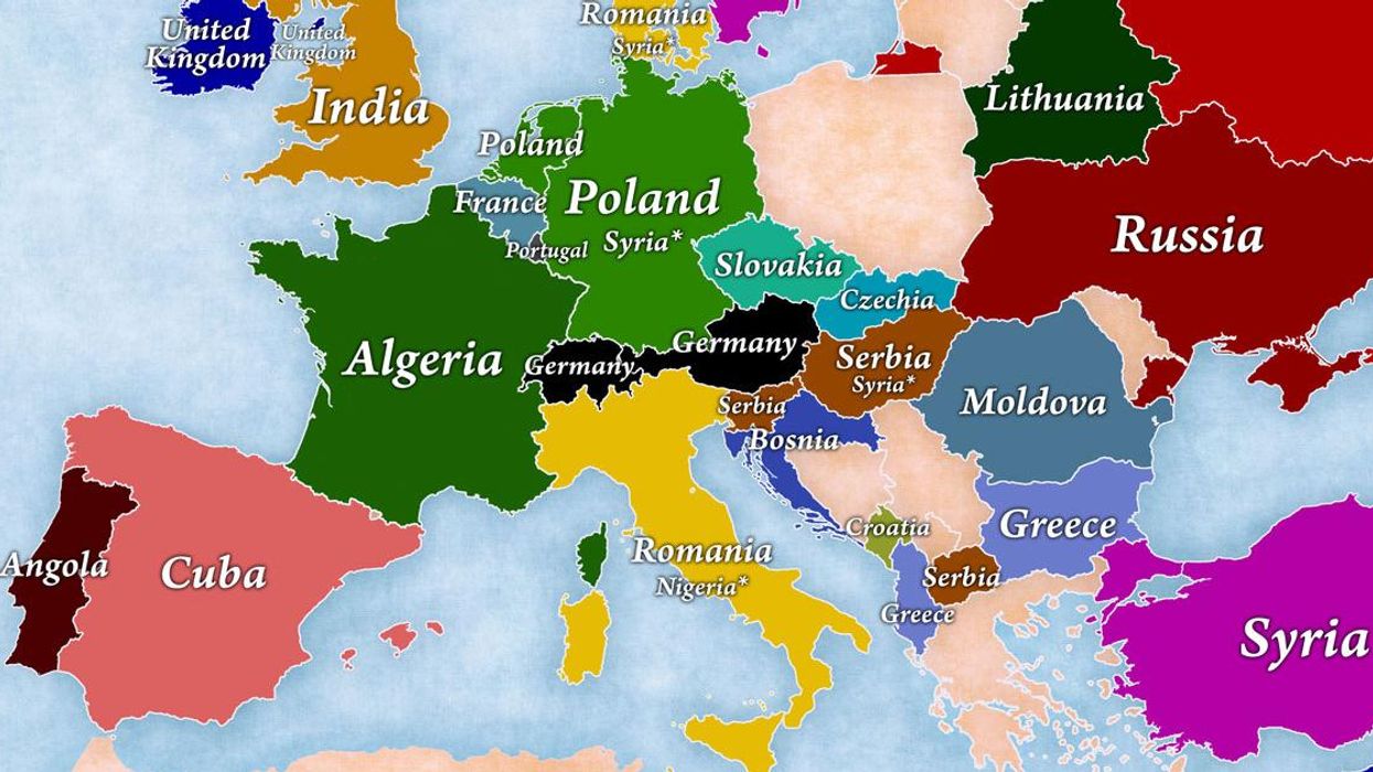
Earlier in the year, Jakub Marian, a Czech linguist, mathematician, and artist, made a series of maps on immigration, using UN data from 2010 to 2015.
They showed, among other things, that the UK's fastest-growing immigrant population was Indian:
That a relatively large number of UK-born people have immigrated to other countries:
And that they are most likely to go to Australia:
That the percentage of foreign-born people in the country, of the population, in the UK is about middling for Europe:
Here's a cool country by country breakdown, that you can really get lost in:
Non-EU migration has historically been far higher than EU migration to the UK.
Regions that voted Leave in the EU referendum were also far more likely to have a lower foreign-born population than regions that voted Remain.
More: 21 maps and charts which will challenge perceptions of Europe