The Conversation (0)
News
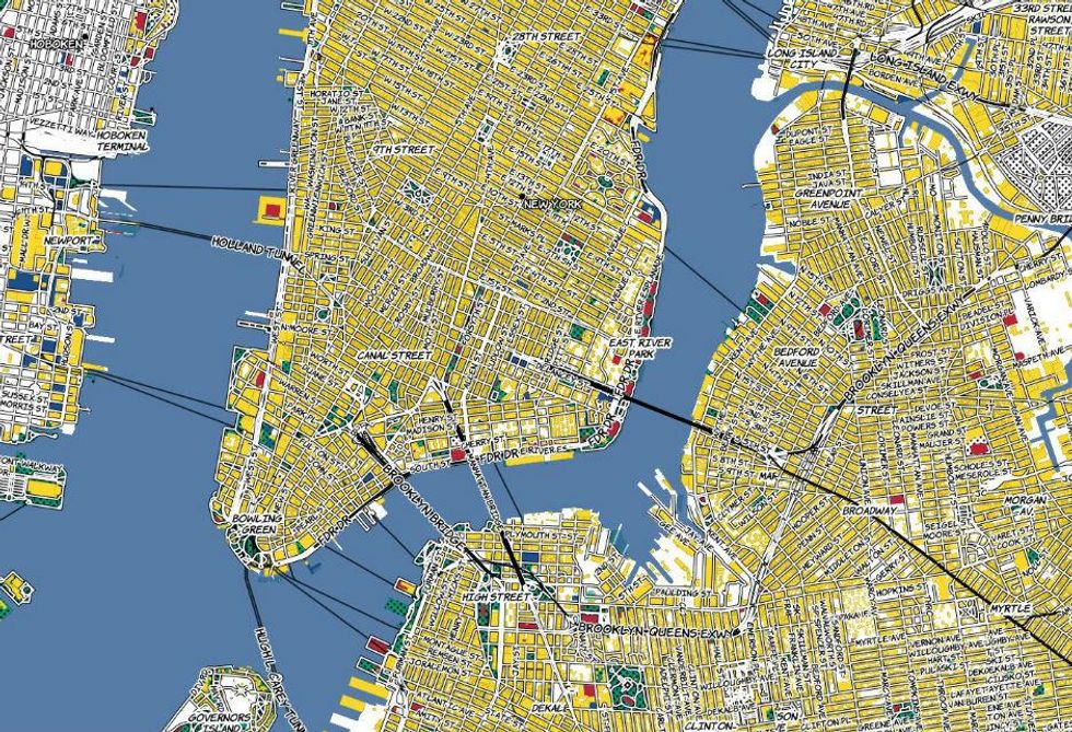
A cartographer has created an incredibly detailed world map taking inspiration from Roy Lichtenstein's iconic pop art.
Katie Kowalsky, from the University of Wisconsin-Madison, has incorporated Lichtenstein colour schemes onto 22 different layers of an interactive map on her website.
Speaking to i100.co.uk via email, Kowalsky said she chose Lichtenstein because his work is so against the styles typically used by cartographers.
I think that of all the artistic styles I could attempt to replicate, pop-art works the best because a lot of the variables cartographers study from academia are about refinement of colour and line-weight and there's a decided rebellion in Lichtenstein's work as far as colour, pattern and even subject matter go...
The 'Lichtenstein' tileset is bright, gaudy, and fun; there's not always a lot of wiggle room for that in cartography.
While Kowalsky says she doesn't plan on selling her work, she will be publishing details on how people can create their own in the near future.
For the time being, all we can do is enjoy the maps through the following screengrabs and via the interactive version on her website.
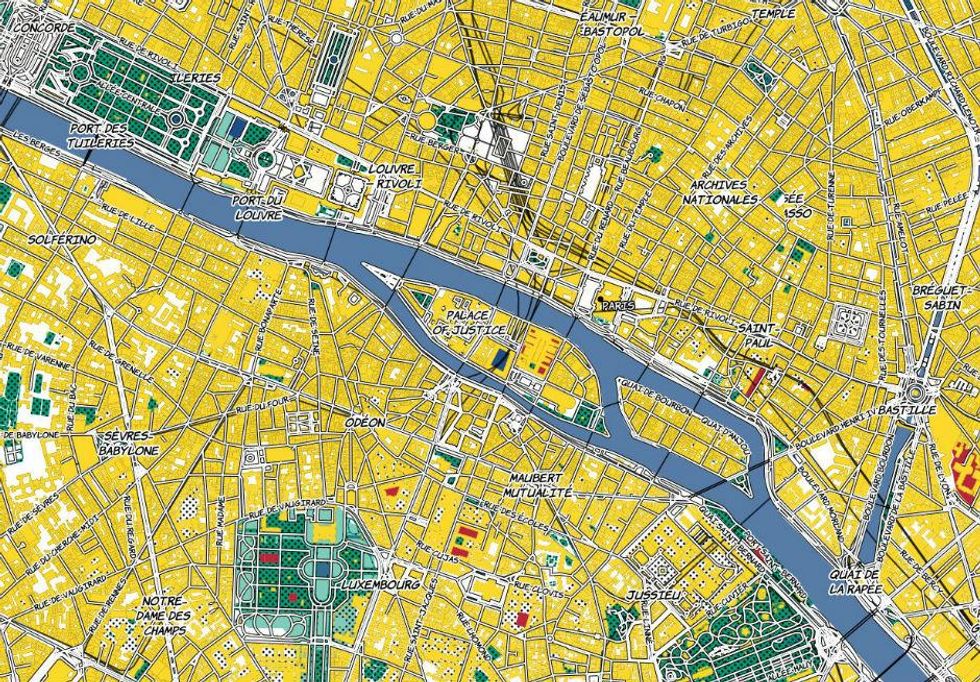
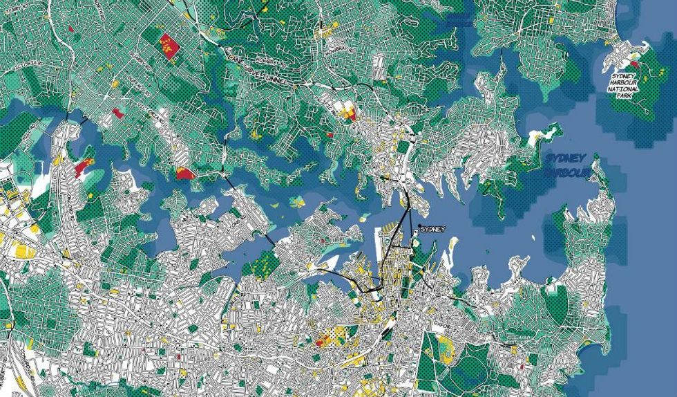
All maps reproduced with kind permission of Katie Kowalsky
More: 12 maps that help show the general election result in a different light
More: Maps of the world's biggest cities according to tourist photos