The Conversation (0)
News
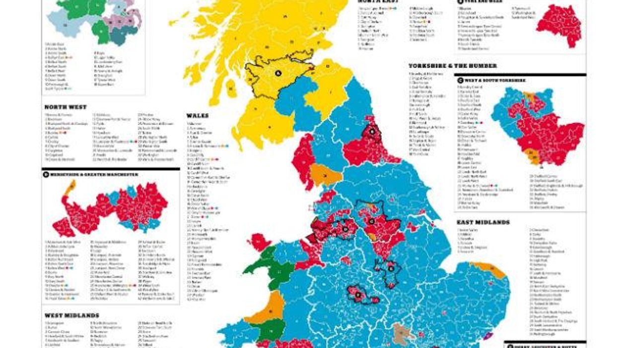
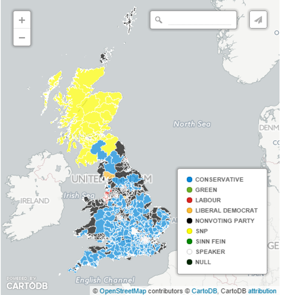
By now we're familiar with the map of Britain's new political make-up, with Scotland a field of SNP yellow and most of England bathed in Tory blue.
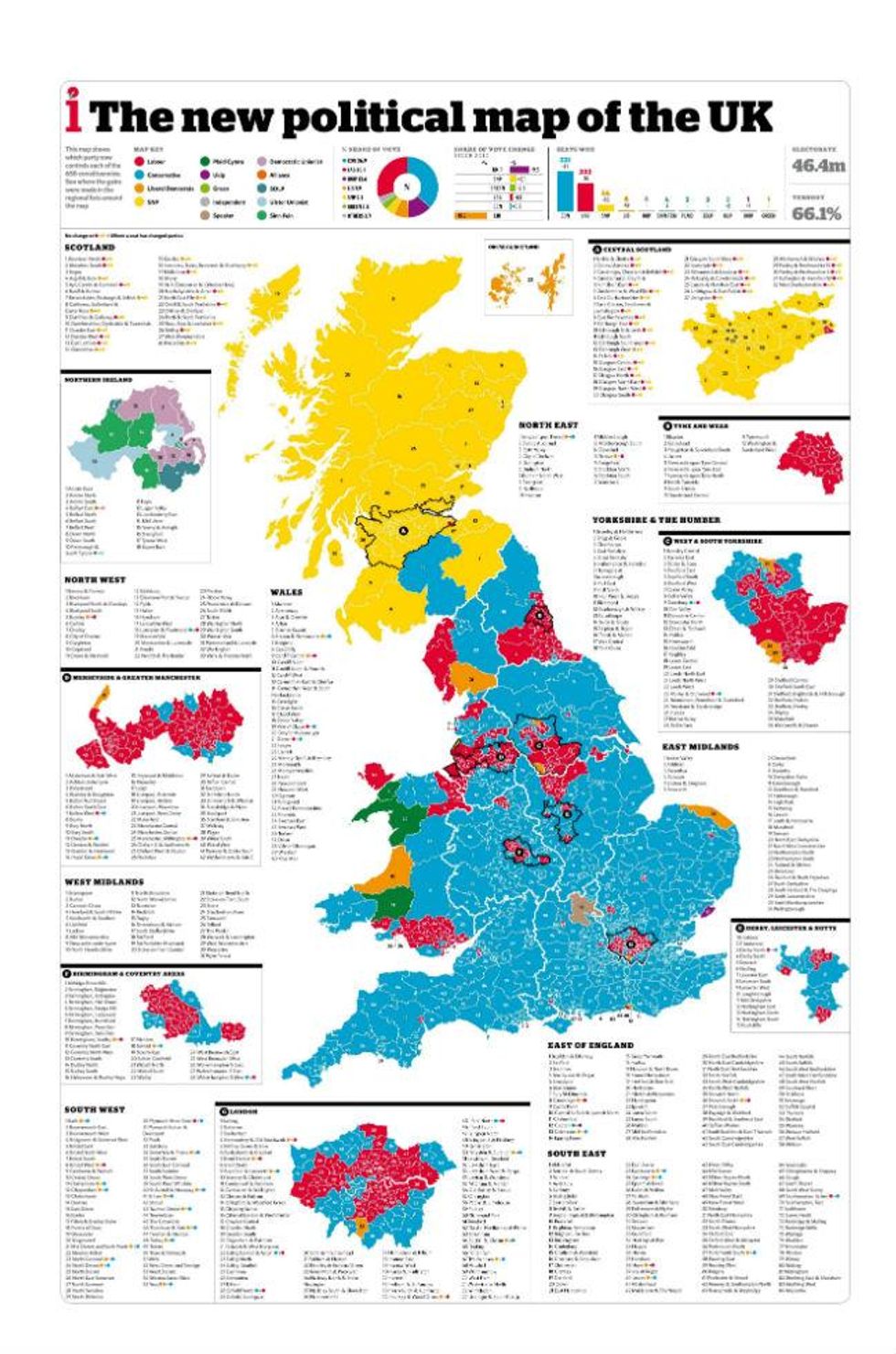
For a version of this map you can zoom into, click here
The changes since the 2010 election are quite dramatic, as this slider shows:
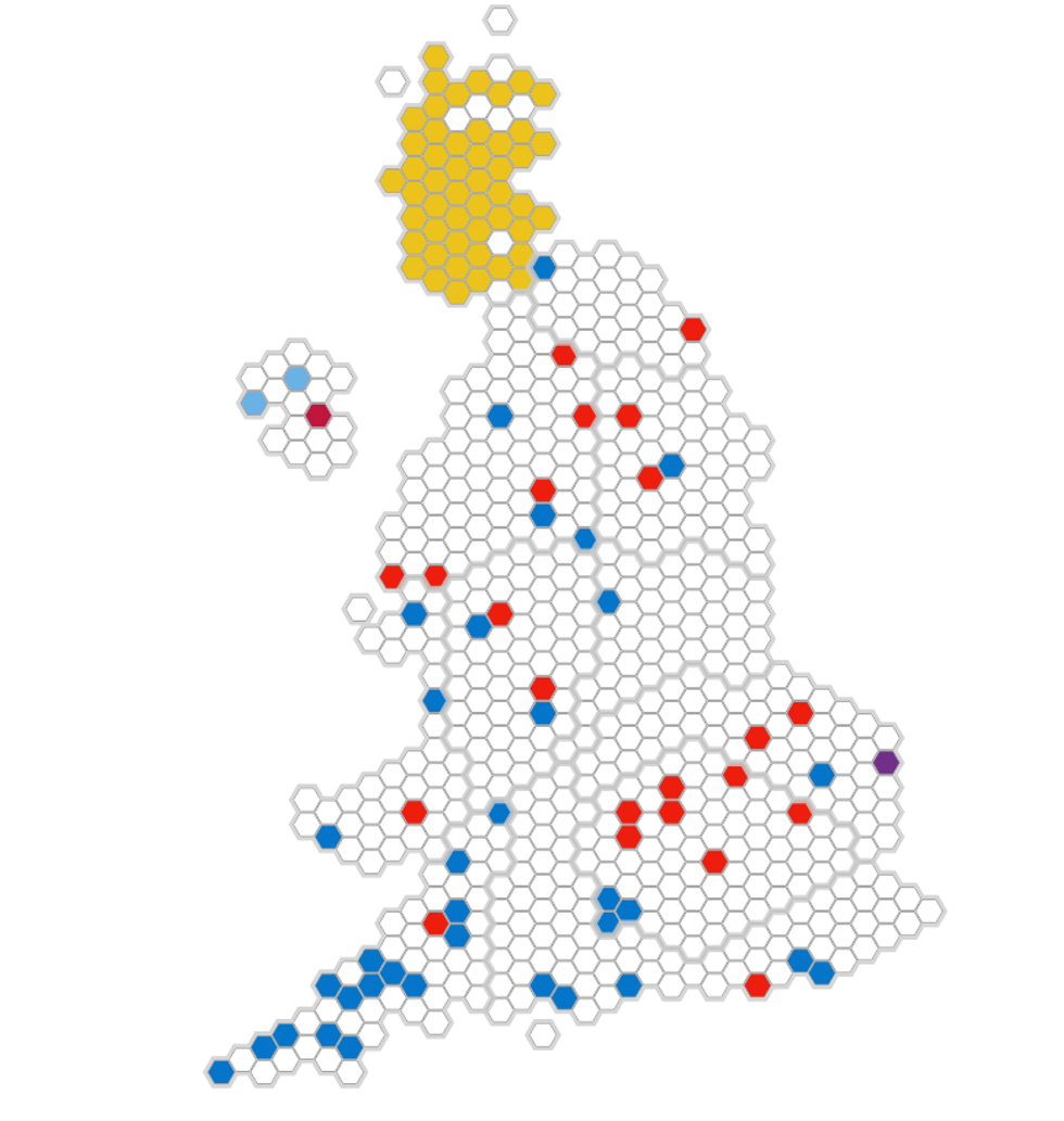
This image was widely shared on Twitter as it became clear Scotland was going yellow and England blue.

London and Brighton look especially lonely.
But if you make each constituency the same size, those blue seats seem to diminish, as The Economist shows:
The UK looks a lot more colourful meanwhile in this map of second place results:
And here's which constituencies have female MPs:
These are all the seats that changed party compared to 2010, from the BBC:
And maybe we should start looking for coal under London?
Lib Dems look away now: This is what the UK looks like if you only include Lib Dem constituencies.
Finally - if all the people who didn't vote this year had united and voted for one 'Apathy Party', it would have had a majority in the Commons:
More: Here's how the election results would look under a proportional voting system
More: [7 laws the Lib Dems stopped the Tories from passing]7