The Conversation (0)
Science & Tech

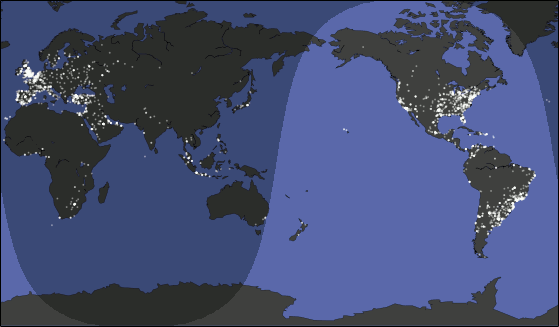
What does a day on Twitter look like? Reddit user Kombutini has made this graphic to show us, with the lights representing tweets put out from 19:40 UTC on February 24th to the same time 24 hours on. He used python to make the visualisation and took the data from Twitter's API.
Only tweets made which have been geo-located are on the map, so mostly ones from mobile devices.
The visualisation is similar to one created by Mapbox's Eric Fischer, who last year mapped every single geotagged tweet sent over the last three and a half years. That's 10 million public tweets a day, or around 120 per second.
It's thought around 500 million tweets are sent a day.
More: This is a map of every tweet sent in the last three years