The Conversation (0)
News
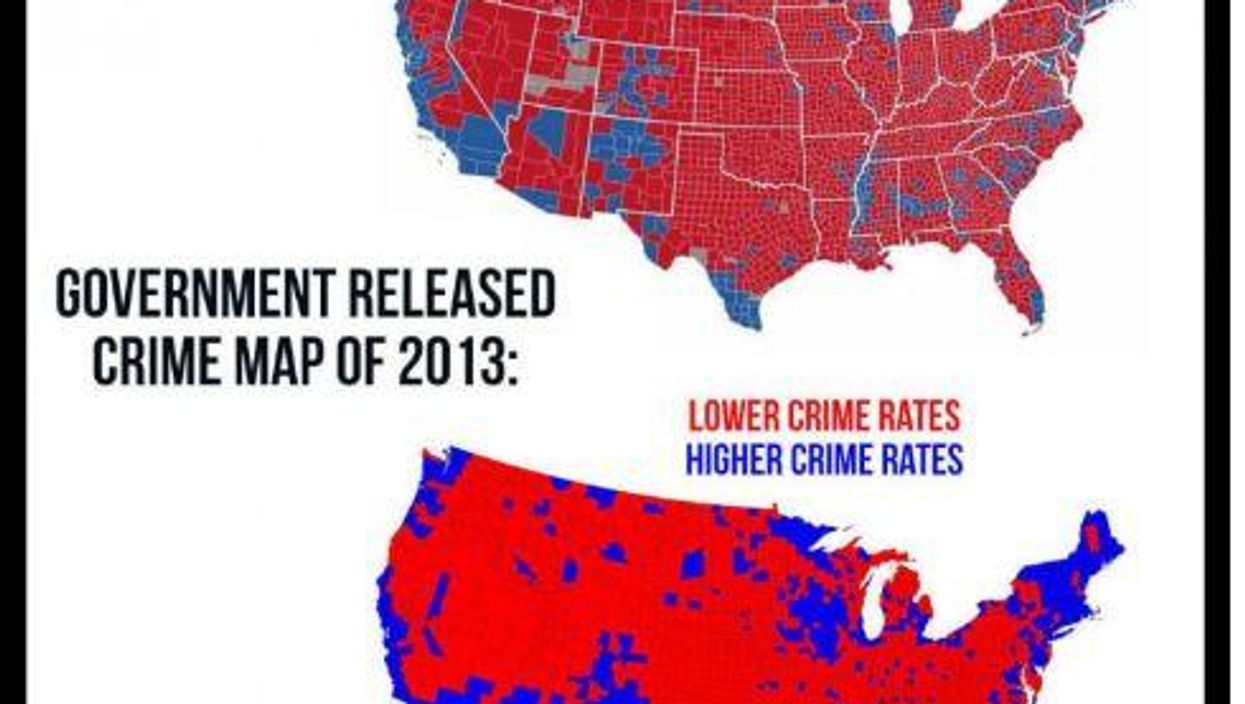
A reader sent us this image after seeing it circulated on Facebook. 'Interesting coincidence,' the reader wrote. 'Is this true?' When we received this email on Nov 15, the image had been shared 16,000 times and 26,000 people had reacted to the post.
Given the intensifying scrutiny of Facebook for failing to filter out fake news, we decided to check whether the 2016 presidential election map, indeed, correlated to the map of 2013 crime rates.
Fake news on social media often takes minimal sleuthing to debunk. That was the case for this image; a quick Google Image search turned up the truth. In fact, our friends at Snopes.com, a website dedicated to debunking online rumors and memes, beat us to the punch and found the comparison was false.
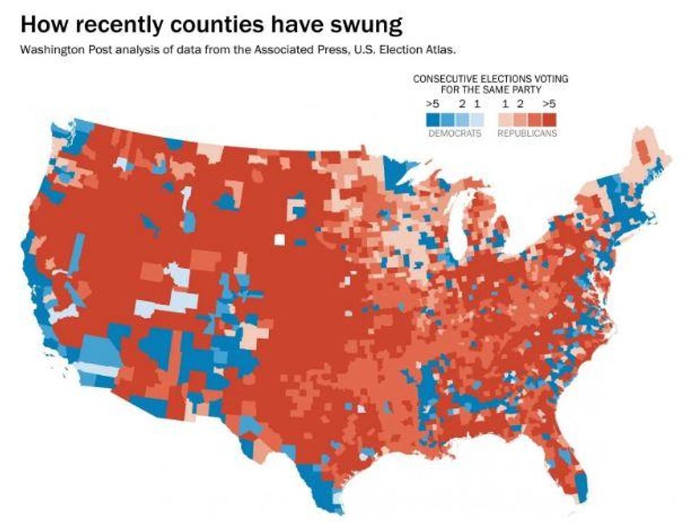
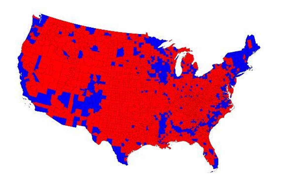
The top map shows the Republican and Democratic majorities by county in the 2016 election, but it looks to be incomplete. You can see a similar map by Philip Bump of The Fix, which is a more detailed version that shows various gradations of red and blue by county:
 Picture:
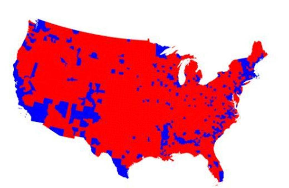
The bottom map in the Facebook image is not of the 2013 crime rate. Instead, it is a map of 2012 election results by county, published by Mark Newman of the University of Michigan’s Department of Physics and Center for the Study of Complex Systems:
 Picture:
Newman has made similar maps for the 2004, 2008, and 2016 elections. Here is Newman’s version of the 2016 election, and his map is a more complete version than the one that is included in the online image that our reader sent:
 Picture:
The fake version of Newman’s 2012 map has been circulating online since as early as Nov 30, 2013, as shown in this blog post that incorrectly says the State Department released the map to 'advise tourists to stay away from any county which voted for Obama (blue) and particularly precincts which voted 80+ per cent for Obama.'
Newman’s maps are quite distinct, which makes it easier to unearth his research as the source of the fake map in the Facebook image. In fact, Newman co-invented the 'diffusion-based method' used to make these maps. He explained the technical details here. Newman told the Washington Post:
You are exactly correct and the map at the bottom is just a map of the 2012 election results, nothing more.
© Washington Post
More: 6 charts about religion that will change the way you view America
More: Charlie Hebdo has responded to Donald Trump's election - and it's pulled no punches