The Conversation (0)
Science & Tech
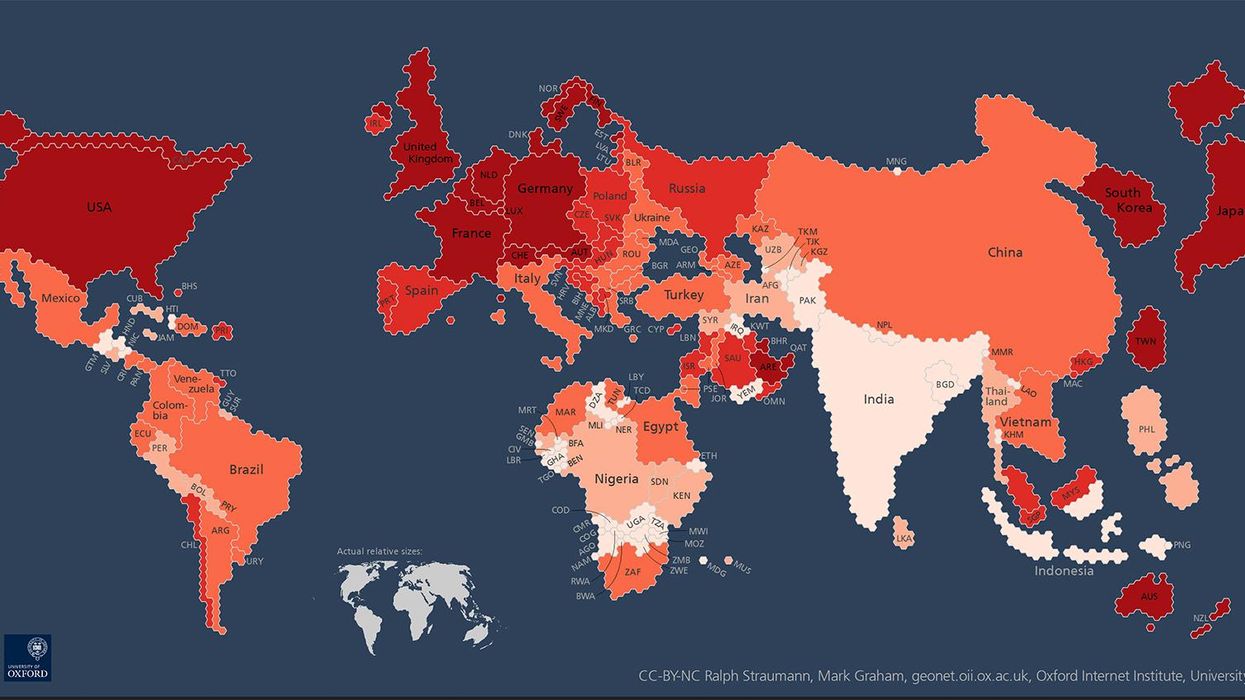
This is a map of the world as you've never seen it before - with countries scaled by internet users.
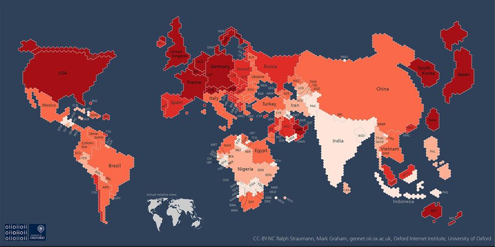
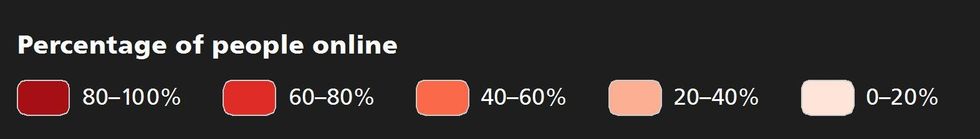
The visualisation, from researchers at Oxford University's Internet Institute, sizes each country according to its absolute number of internet users - while keeping the continents relatively close to their true shapes.
The map was made using World Bank data from 2013 about internet users and population, and shows that all but five of the countries with more than 80 per cent of people online are in Europe, North America or Oceania.
Dr Mark Graham, one of the researchers behind the map, commented: "It is important to realise and remember that despite the massive impacts that the internet has on everyday life for many people, most people on our planet remain entirely disconnected. Even today, only a bit more than a third of humanity has access to the internet."