


The Conversation (0)
Joshua Zitser
Oct 30, 2020
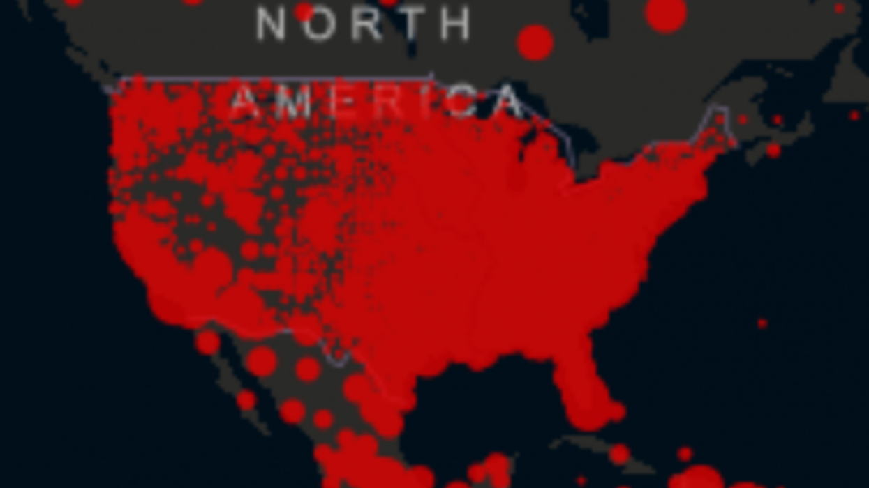
A map has gone viral after revealing the stark difference in the number of covid-19 cases between the US and Canada.
The map, produced by John Hopkins University, shows the distribution of coronavirus infections and deaths across the globe.
Red circles indicate where in the world there are a high number of cases.
The US stands out for being almost entirely red. There have been 9m recorded cases in the US and 230,000 deaths since the start of the outbreak.
Canada, alternatively, has very little red on display; it has had 230,000 cases of covid-19 and 10,000 deaths.
What is most remarkable about the map, science journalist Laurie Garrett points out, is that there is a straight line across the border between the two countries.
In her tweet, she wrote: “There is one place in the world where a map of covid-19 cases and deaths reveals a straight line, with a huge amount of disease on one side, very little on the other.”
In a later tweet, she continued: “Canada's total caseload is about = to our death toll. Is it not long overdue for America to ask, 'What is Canada doing right?'"
Garrett is not the first person to recognise the stark difference between the two countries’ coronavirus response.
In fact, prime minister Justin Trudeau said in July that Canada had handled the virus better than their neighbour.
The US has the highest total of covid-19 cases in the world. It also has the highest number of recorder deaths.
Canada, meanwhile, isn’t even in the top 10 worst affected.