


The Conversation (0)
News
What's the best gift a friend has ever given you?
A long FaceTime chat when you really needed it? A surprise birthday party with all your favourite people? A place to crash when your housemates are being insufferable?
All marks of a great friendship, but one man went even further.
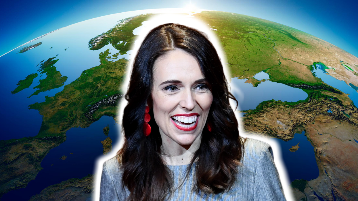
German geographer Simon Kuestenmacher tweeted out the gift he made for his "Kiwi friend": a map of the world which centres New Zealand.
We have yet to hear from the friend, but people on the internet could not get enough.
Many thought centre of the world was the perfect place for New Zealand, a country which has received high praise for its progressive policies which managed to contain Covid-19, and beloved leader Jacinda Ardern.
The issue of Eurocentrism in cartography has long been highlighted by academics.
In 2017, Boston became the first US district to change the maps used in public schools to become more reflective of the true scale of countries, rather than exaggerating the size of developed nations, which is what occurs in maps based on the Mercator Projection – the most commonly used system.
Donald Houston, head of geography at the University of Portsmouth, wrote at the time that "it’s especially problematic given that the first world maps based on the Mercator projection were produced by European colonialists".
As an example, he explained that the Mercator projection depicts Greenland as larger than Africa. But, in reality, Africa is 14 times the size of Greenland. It also presumes that North = up, but Houston explains:
There’s no scientific reason why north is any more up than south. Equally, we could do east-up, west-up or any other compass bearing. Purposefully reversing the typical way world maps are drawn has a similar political effect to using the Peters projection, putting more developing countries in the generally poorer southern hemisphere at the top of the map and so giving them greater significance.
Colin Rose, the assistant superintendent of opportunity and achievement gaps for Boston Public Schools, explained why this matters, telling The Guardian:
When you continue to show images of the places where people’s heritage is rooted that is not accurate, that has an effect on students.
Maybe we can be an example for other school districts. It’s a paradigm shift. It’s important that students trust the material they are given in school but also question it.
Decolonising geography is a big undertaking, but more innovative viral maps don't seem like a bad start.
This article was originally published in August 2020