The Conversation (0)
News
While media headlines are full of the latest superbug or terror threat that's out to get you, the NHS has put together a fascinating tool which helps us understand the real risks out there that pose a threat to our safety.
The interactive Atlas of Risk is designed to help both media professionals and patients understand threats to our health in perspective, and the figures are sobering.
Data from registered deaths in England and the World Health Organisation is used to calculate the biggest dangers - and by far and away the biggest killers are heart and circulatory diseases, which carried off 158,500 people in 2013.
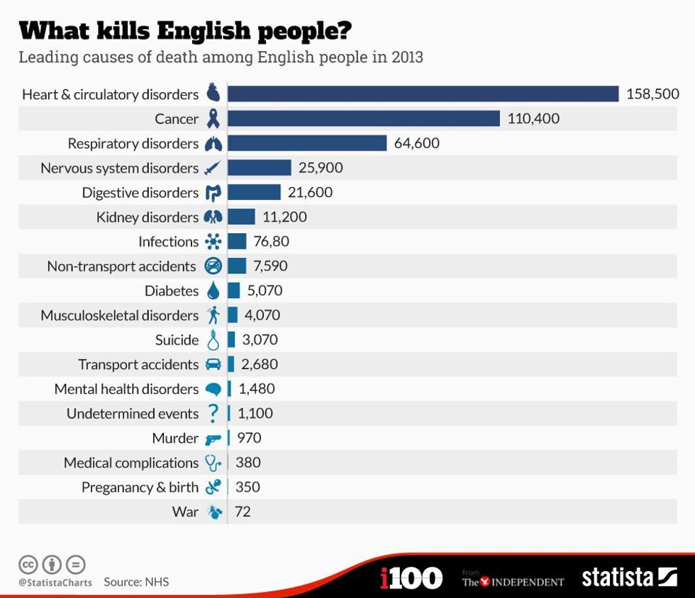
While medical problems were to blame for the vast majority of deaths there were also 970 murders in England in 2013, and more than 3,000 suicides. 350 people died due to complications in pregnancy or birth.
Deaths from terror attacks are statistically so unlikely they don't even factor into this Statista chart.
More: The chart that shows how many hospital beds the UK has, compared to other countries