The Conversation (0)
News
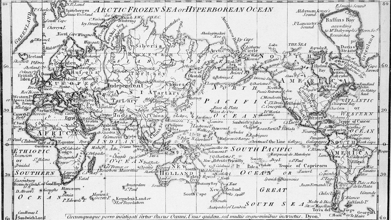
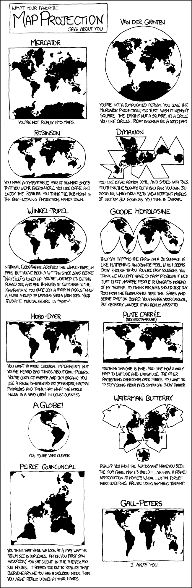
The above map projection is the most popular in the world - the Mercator projection.
Gerardus Mercator made the projection in the 16th century, devised with straight lines of longitude and latitude so that any ship following a constant compass bearing would know where it was going.
It's had its critics ever since.
This is mostly because it made Europe, Russia and the US look much larger than they actually are, while diminishing Africa, Asia, and Southern or Central America.
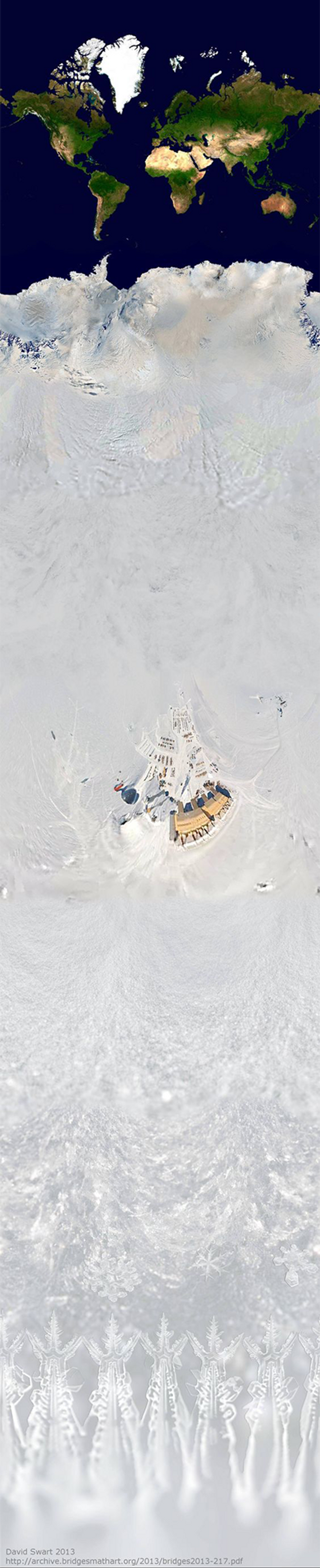
It's also not quite done - if you continue to the South Pole, it looks something like this, as Sébastien Pérez-Duarte and David Swart found in 2013:
Different projections favour different aspects of accuracy - while Mercator is faithful to angles, the Gall-Peters projection favours area.
Metrocosm have explained this brilliantly in an article, and with this fantastic interactive visualisation of the differences between them:
Alternatively, you can always watch one of our favourite West Wing scenes, which does a similar job:
More: The map of the world according to which sport each is country is best at
More: 19 thought-provoking maps that will change how you see the world