The Conversation (0)
News
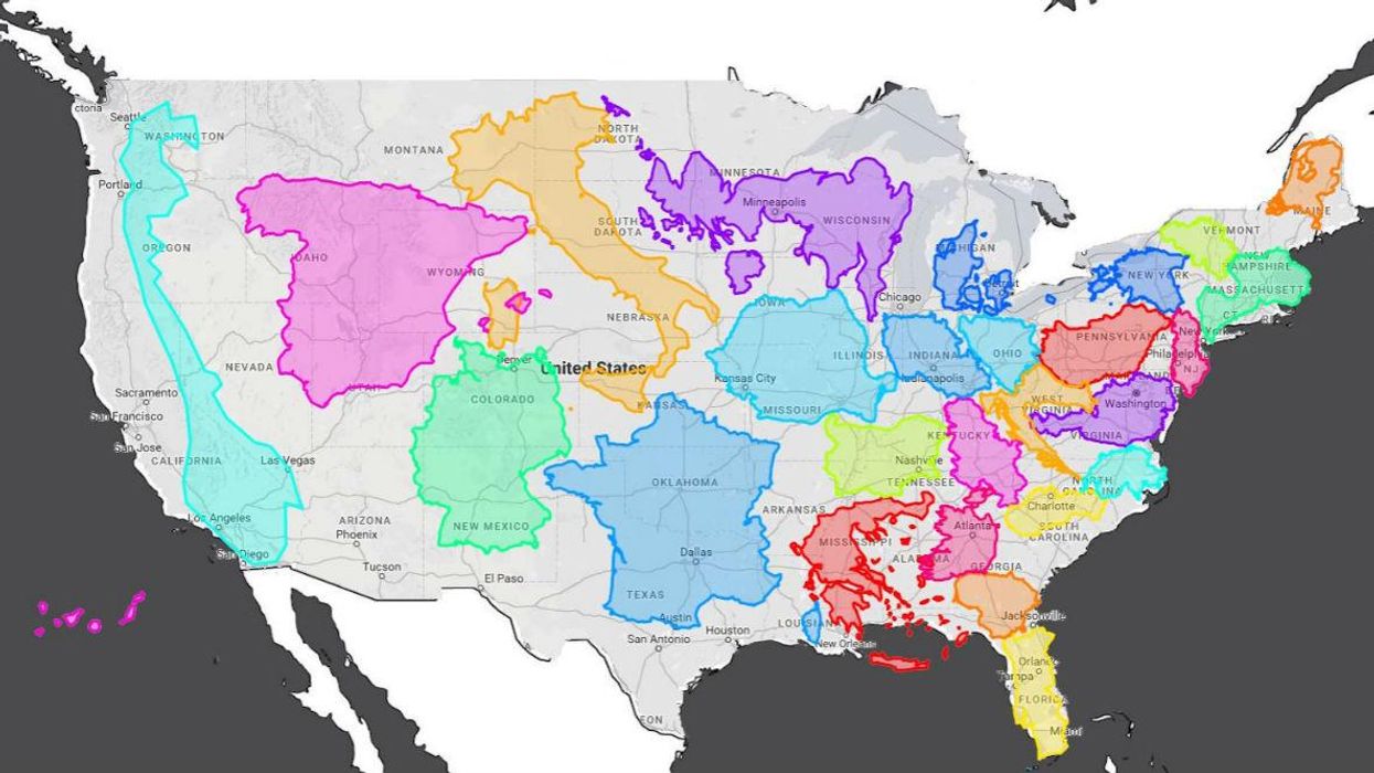
The Mercator projection is the most popular map projection in the world.
And, apparently, it’s also wrong.
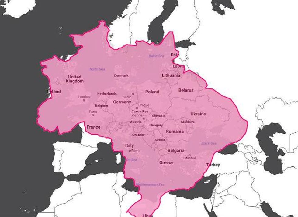
Gerardus Mercator created the projection around 1569, with lines of longitude and latitude, but critics have long since found that the map also made certain areas – namely Europe, Russia and the US - much bigger than they actually are.
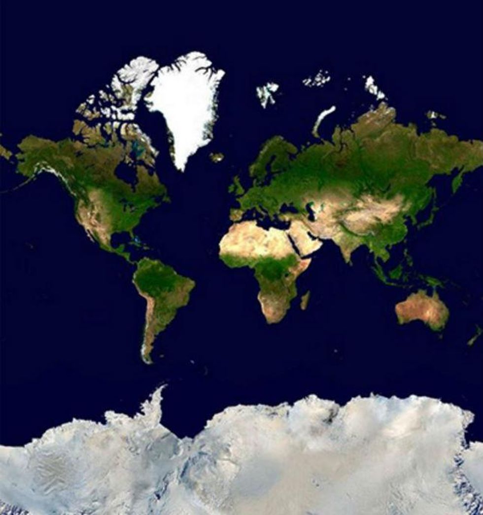
What many people don't know is that it's also inaccurate because the Earth is a 3D globe: attempting to translate that to 2D inevitably causes distortions.
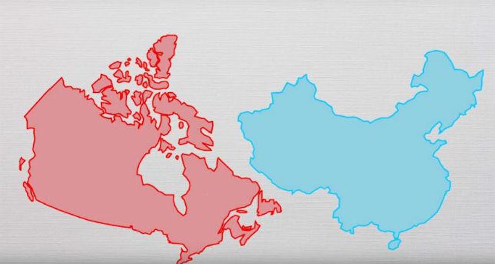
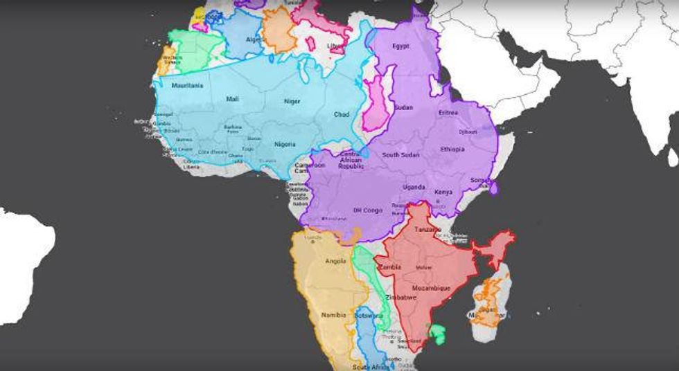
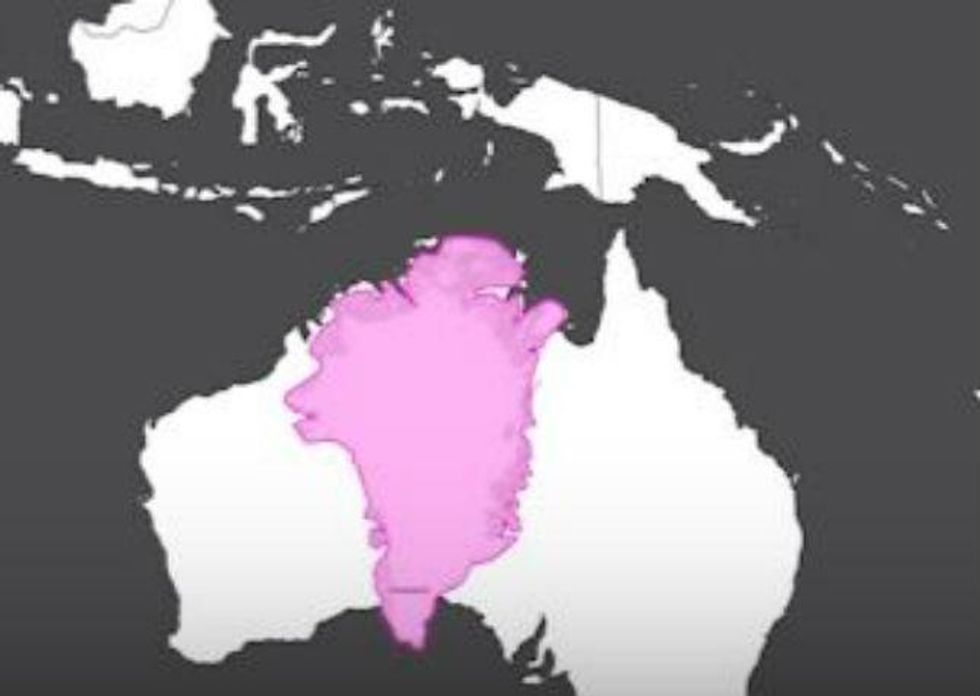
The people over at RealLifeLore used data from The True Size, created by James Talmafe and Damon Maneice to show the real size of countries, and made a video.
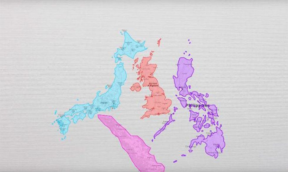
The continent can also fit in China, Eastern Europe, India, Argentina, Scandinavia and the UK with room to spare.
You can watch the entire video, below:
More: Six maps that will make you rethink the world
More: 21 maps and charts which will challenge perceptions of Europe