


The Conversation (0)
News
The dreaded Covid-19 ‘second wave’ is starting to hit some Western countries who are easing out of their lockdown.
Among them are the likes of Germany, the US and the UK.
To deal with any spikes in cases, Germany and the UK have adopted a “local lockdowns” policy, which will see localised areas locked down if cases rise past a certain figure.
In Germany, the trigger for a localised lockdown is over 50 cases per 100,000 people in an area.
The UK hasn’t revealed a specific number that will automatically provoke a local lockdown but Leicester has become the first area in England to be locked down, after experiencing an infection rate of 135 cases per 100,000 people.
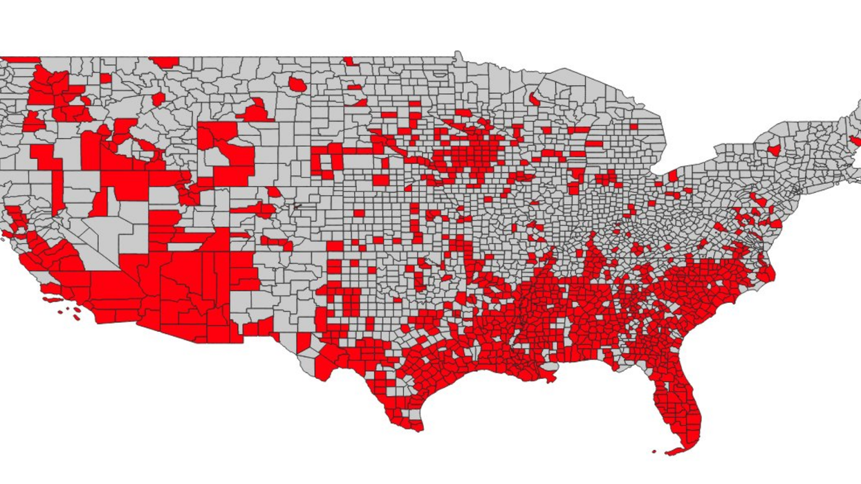
The US is also experiencing apparent second waves all over the country but there is no centralised local lockdown policy in place, despite the nation reporting a new daily record for coronavirus cases on Wednesday, with 52,000 Covid-19 cases diagnosed in people.
But those are a lot of numbers and graphics are far more useful at boiling down this kind of information.
So Twitter user @stejormur made three maps to illustrate what these second waves looked like in the three different countries.
Until I created this map, I hadn't appreciated how bad the situation in the US is. These maps show districts with o… https://t.co/iYycFurOPT— Ste JM 🚊🛰🐦 (@Ste JM 🚊🛰🐦) 1593621210
When laid out in grey and red, it’s a pretty shocking sight.
The maps highlights districts in red that have exceeded Germany’s metric of 50 Covid-19 cases per 100,000 people.
One German district is red, while four UK ones fail the test.
In the US, that number is 1000.
And as Ste points out, half the US population live in the areas currently experiencing second waves of the virus.
He even cross-referenced the maps for population density by plotting them at state level.
@mattgjonas @simoncozens Yeah, some individual counties will be weird where they have very small populations. The p… https://t.co/OlpuAWOBQG— Ste JM 🚊🛰🐦 (@Ste JM 🚊🛰🐦) 1593635496
The reaction to the graphic was swift and horrified.
“Utterly devastating,” said John Hopkins professor Thomas Rid.
Just utterly devastating this comparison. https://t.co/Py5d50aW0W— Thomas Rid (@Thomas Rid) 1593657082
Others expressed their regret at the missed opportunities to act.
On 5 June - I asked if 21 US states should re-impose lockdown .. https://t.co/X7ltrpq74l The graphic below asks th… https://t.co/TgacKwkuNe— Charlie Robertson (@Charlie Robertson) 1593675870
The map also demonstrated how different definitions of “success” at tackling Covid-19 are in different countries.
This also shows to what extent the U.S. has defined down 'success.' Many places in the U.S. started loosening restr… https://t.co/jS29pzJiTm— MiketheMadBiologist (@MiketheMadBiologist) 1593691806
Basically, if you’re coming off well against the UK, with 65,000 deaths, it’s probably not a good thing.
Excellent data-visualization. It shows how bad the situation in the US compared to the Germany & the UK. https://t.co/7IfrHFT0g0— Tahar (@Tahar) 1593667410
Why do we have a feeling these comparisons are only going to get more horrifying with time?