


The Conversation (0)
Science & Tech
Tens of thousands of Syrian refugees are stranded at the Turkish border as Assad regime forces, backed by Russia and Iran, have laid siege to the northern town of Aleppo.
The EU has called on the Turkish government to take in those fleeing war following a November deal which saw the country receive €3bn (£2.3bn) in funding specifically to host refugees.
However, Turkey's deputy minister for EU affairs told the Independent on Sunday that the country was providing "every kind" of humanitarian aid and said it would be better to settle them on the Syrian side of the border.
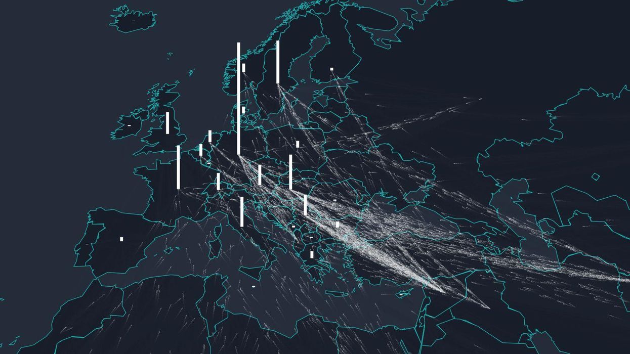
The scale of the refugee crisis can, at times, be difficult to fathom - with Turkey alone taking in more than 2.5m people - but the below visualisation by the Finnish site Lucify takes data from the UN's refugee Agency, the UNHCR.
While routes and travel times aren't accurate, the map does show accurate migration patterns for refugees between 2012 and 2015.
Each moving point on the map represents 25 people. If you are viewing on a mobile device, each point represents 50 people (for performance reasons). You can hover over each country to produce nation specific views, if you wish.
If for some reason, you are unable to see the visualisation on our site, you can see it on Lucify here.
More: How European countries feel about the refugee crisis, in one word
More: The Hungarian journalist who kicked a refugee is planning to sue him and Facebook