


The Conversation (0)
Viral
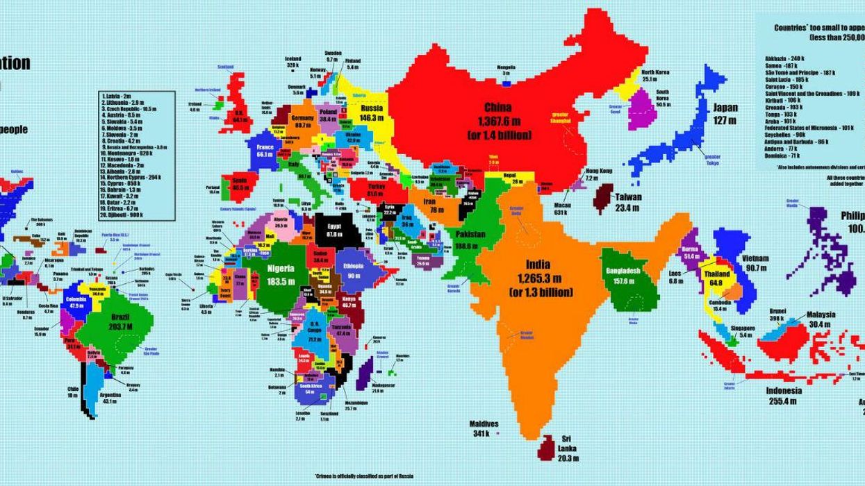
This map depicts the countries of the world in terms of the size of their populations, with each square representing 500,000 people.
Asia dominates the map with population-heavy countries like India and China, while Russia and Canada, the world's two largest countries in terms of area, are completely dwarfed.
In an email exchange, TeaDranks - a self-confessed map lover - told i100.co.uk that far from using some complicated cartography software he actually created the map using Microsoft Paint.
The main problem was getting India and China to fit properly. For the bigger countries like China, Indonesia, Japan etc. I got an outline of the country and gradually filled it into until all the squares were used up.
The other problem was getting Africa to all fit together because of how disproportional it is. Desert countries like Libya and Niger are very sparse and Nigeria is super populated. Europe, North America and South America were fairly easy though.
He explains that he was initially inspired by a similar map that he stumbled upon on the internet and has taken at least three goes to perfect it.
As for the future, TeaDranks plans to make some other maps in the same style, "probably some of religious populations".
You can see a hi-res version of this map here.
More: This map of the United Kingdom is extremely rude
More: 19 maps from which we'll let you draw your own conclusions