The Conversation (0)
x
Jessica Brown
Sep 29, 2017
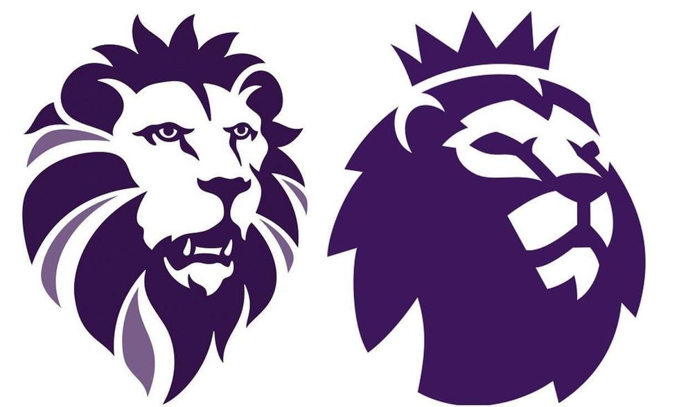
Ukip today unveiled the design for its new logo, and it's not gone down brilliantly.
The purple and yellow pound is gone and it's been replaced by a lion that looks remarkably like the logo for the Premier League.
NEW: UKIP unveils the two options for its new logo. The lion got a big cheer. The pound sign is gone but the yellow… https://t.co/913q7PzfHQ— Dan Bloom (@Dan Bloom) 1506678661
Seriously, look how similar it looks.
As is tradition, Ukip have been the centre of ridicule for a good hour or so on Twitter.
It's been rather amusing
I knew UKIP's new logo was familiar. https://t.co/Los5kNMbVJ— Adam Bienkov (@Adam Bienkov) 1506684676
Fixed it. @flashboy https://t.co/UugFVVA5VE— John Bull (@John Bull) 1506686029
As you can see, a bit of a theme quickly emerged.
https://t.co/pLGm4PtKXh— Adam Bienkov (@Adam Bienkov) 1506689972
I made the Ukip logo more anime https://t.co/nCwCwlzr14— Left Inside (@Left Inside) 1506682637
https://t.co/WbcgKIqIxQ— Chris Applegate (@Chris Applegate) 1506685821
@JamesHMcLaren @danbloom1 https://t.co/Pj2kztRhVX— G (@G) 1506684807
Fixed it. https://t.co/0ijvVaWXQT— David Quantick (@David Quantick) 1506687981
@jimwaterson https://t.co/v5JtVudxF7— fat lad 🌈 NHS (@fat lad 🌈 NHS) 1506685248
@jimwaterson https://t.co/GmUfoNuPmT— Spigon (@Spigon) 1506690542
And some people had some helpful suggestions of an alternative:
@danbloom1 I think this would be a more appropriate logo #UKIP #BBCQT https://t.co/mBZ4MfbJKs— Crate Digger (@Crate Digger) 1506682827
Keep reading...Show less