So, we only went and bloody did it. We voted Leave in the referendum on the EU.
Journalists, commentators, politicians and pollsters around the country are, like you, still trying to get their head around what the hell has actually happened.
We thought we'd try to make it a little easier.
Here's a breakdown using maps and charts, because people love maps and charts.
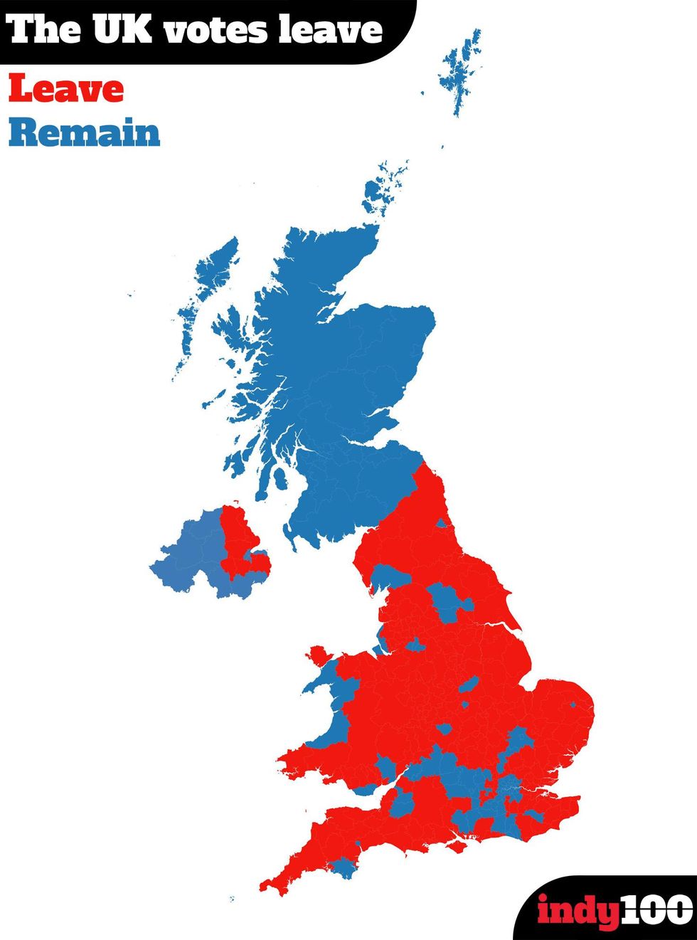
1. Basically when we say the UK voted Leave, we mean England and Wales (broadly speaking)

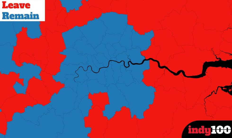
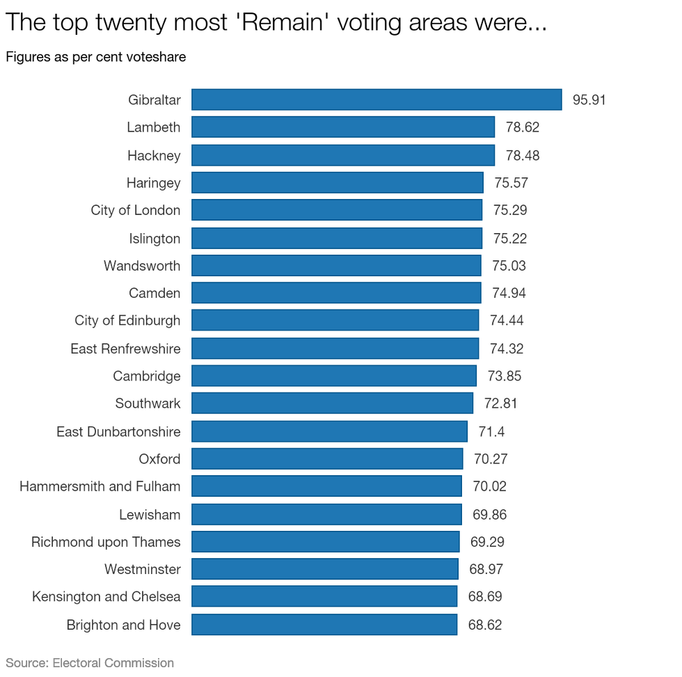
2. London was also pretty uniformly Remain (among a handful of other English and Welsh cities and towns)

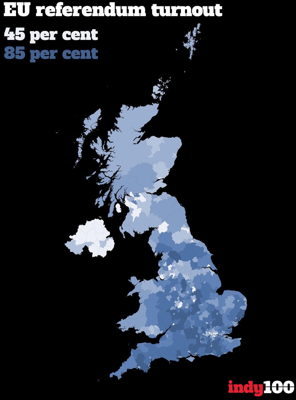
3. Turnout was pretty high, averaging 72.2 per cent across the country
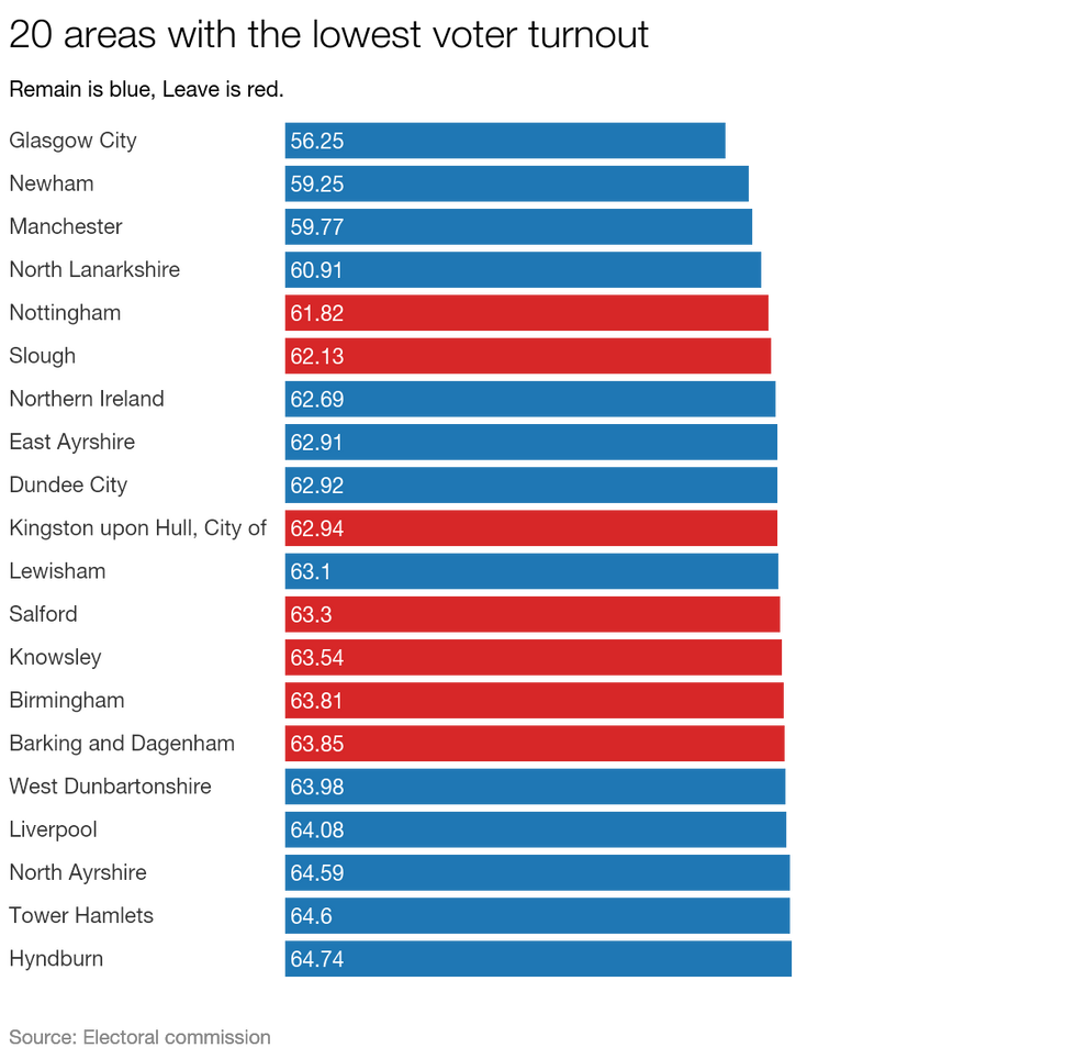
4. Although these places could've cared a little more, tbh

5. While these places are probably pretty unhappy right about now

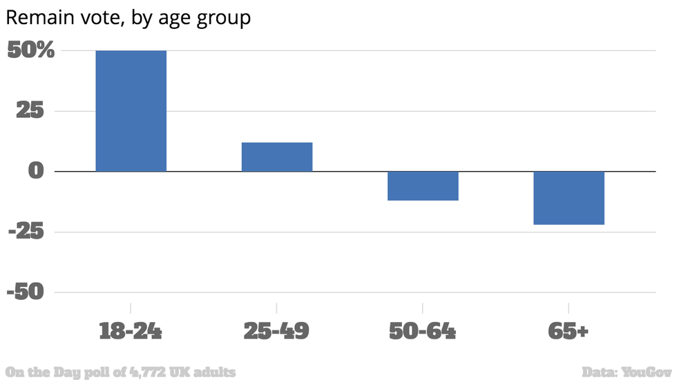
6. The remain vote was strongest with the youngest

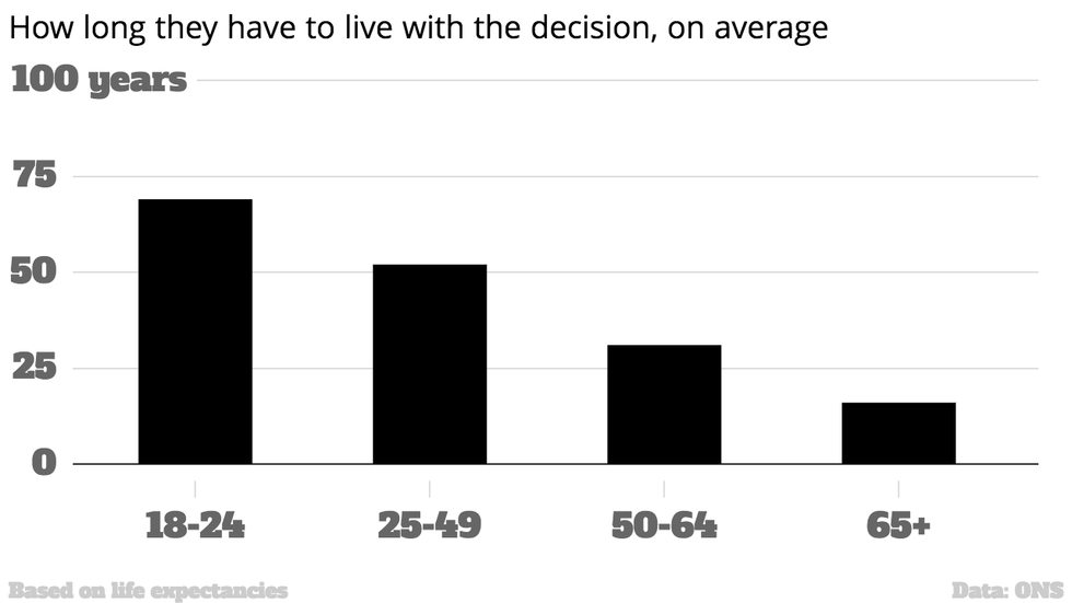
7. Who will have to live with the decision for the longest time
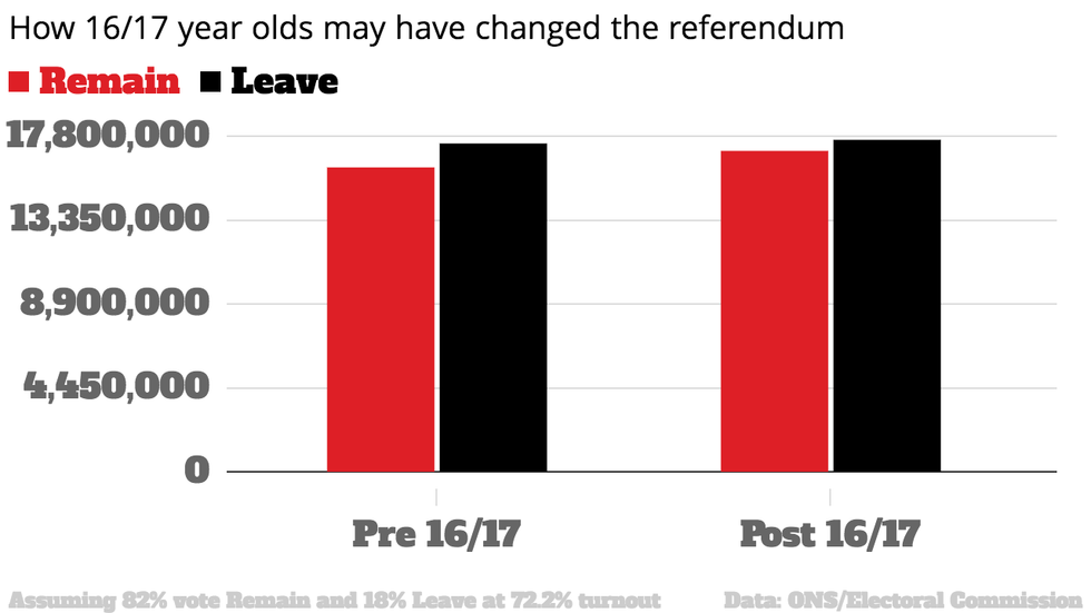
8. But, as much as we'd like to believe it, 16-17 year olds probably wouldn't have swung it for Remain.
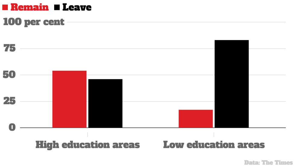
9. In addition, it's simplistic to say this vote was the old against the young - education played a part as the Times pointed out
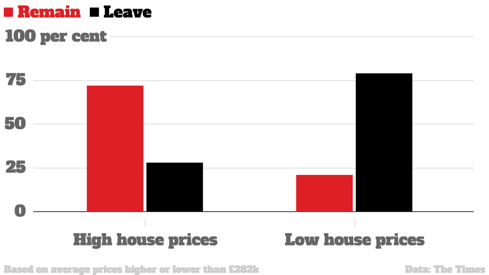
10. As did areas with lower house prices
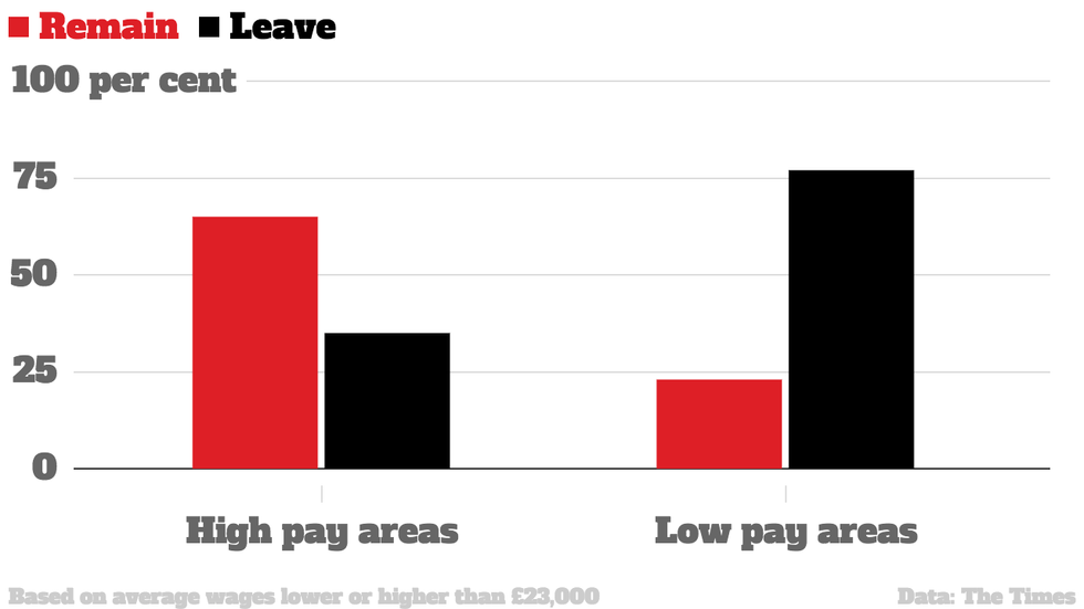
11. And lower pay
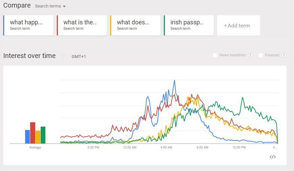
(Alongside other very worrying queries like "what is the EU?")

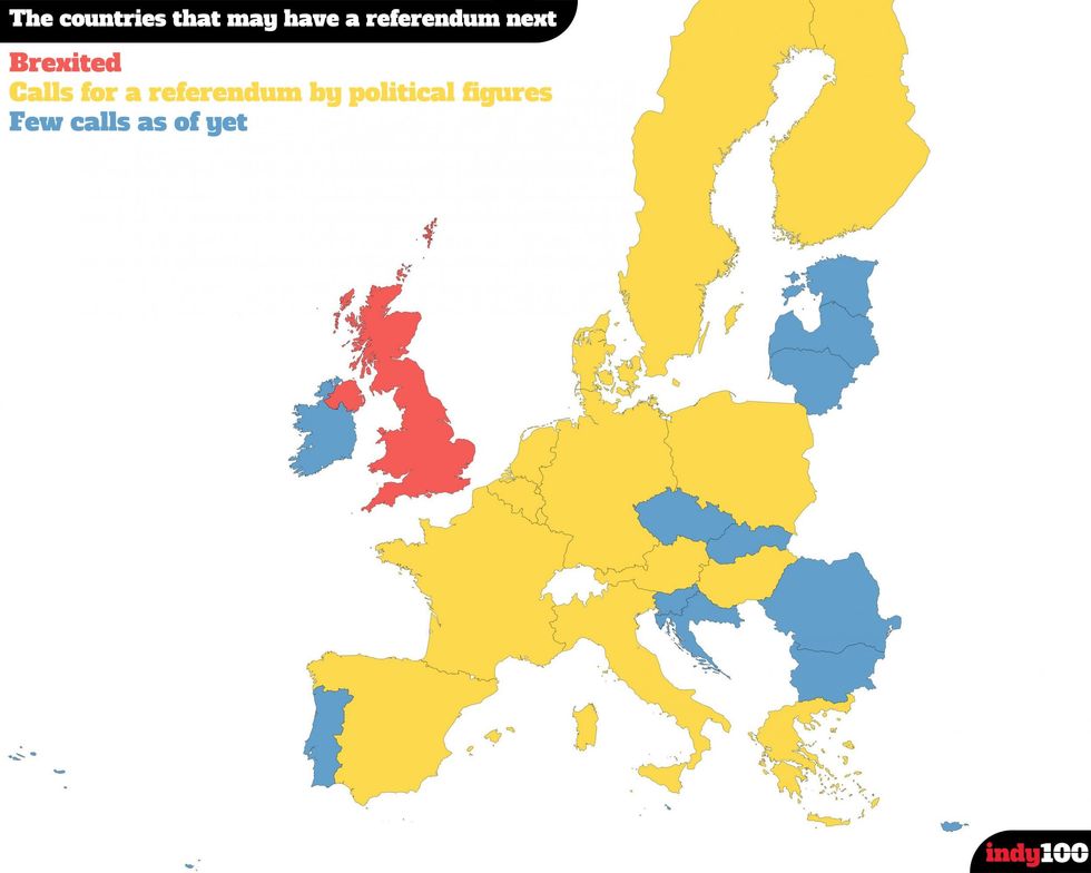
13. And now we should probably get a new UK map, as we're not really very 'U' anymore
14. Meanwhile other politicians are acting up around Europe, calling for other country-starting-letter-prefix-exits.

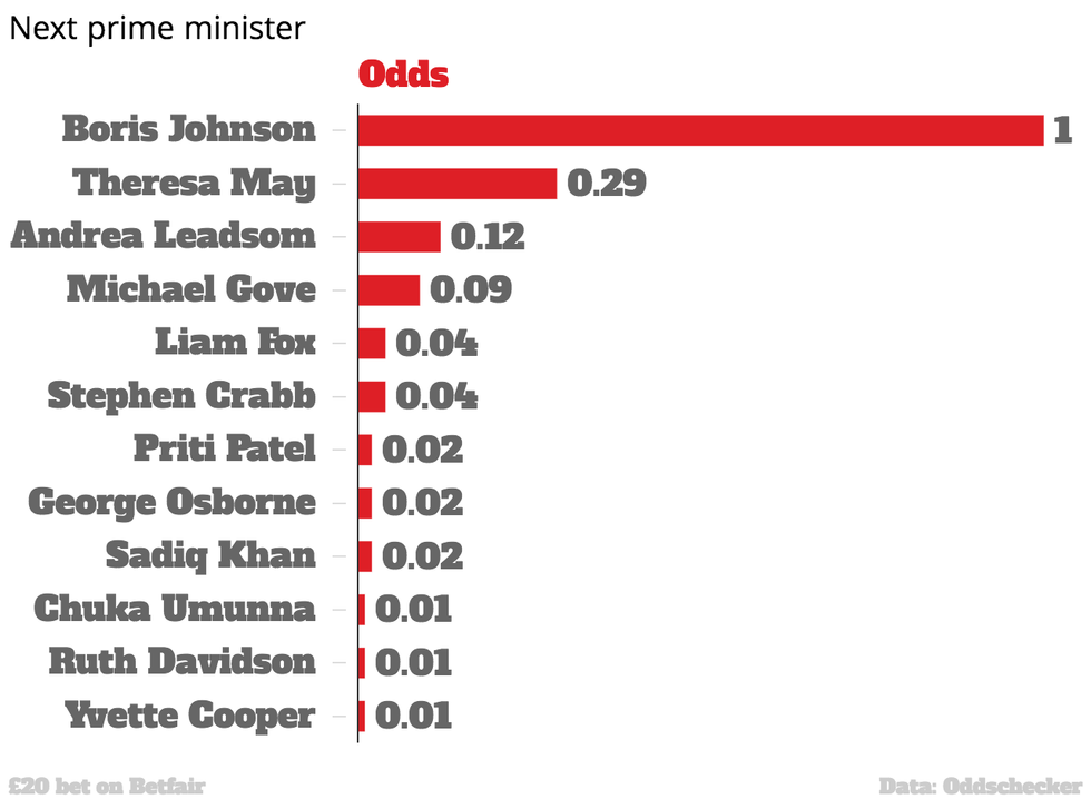
15. Oh, and now Boris is now odds on to be prime minister


More: How old people have screwed over the younger generation - in three charts
More: The Mail has explained what Brexit means and its readers seem shocked