The Conversation (0)
Coruscant Consulting
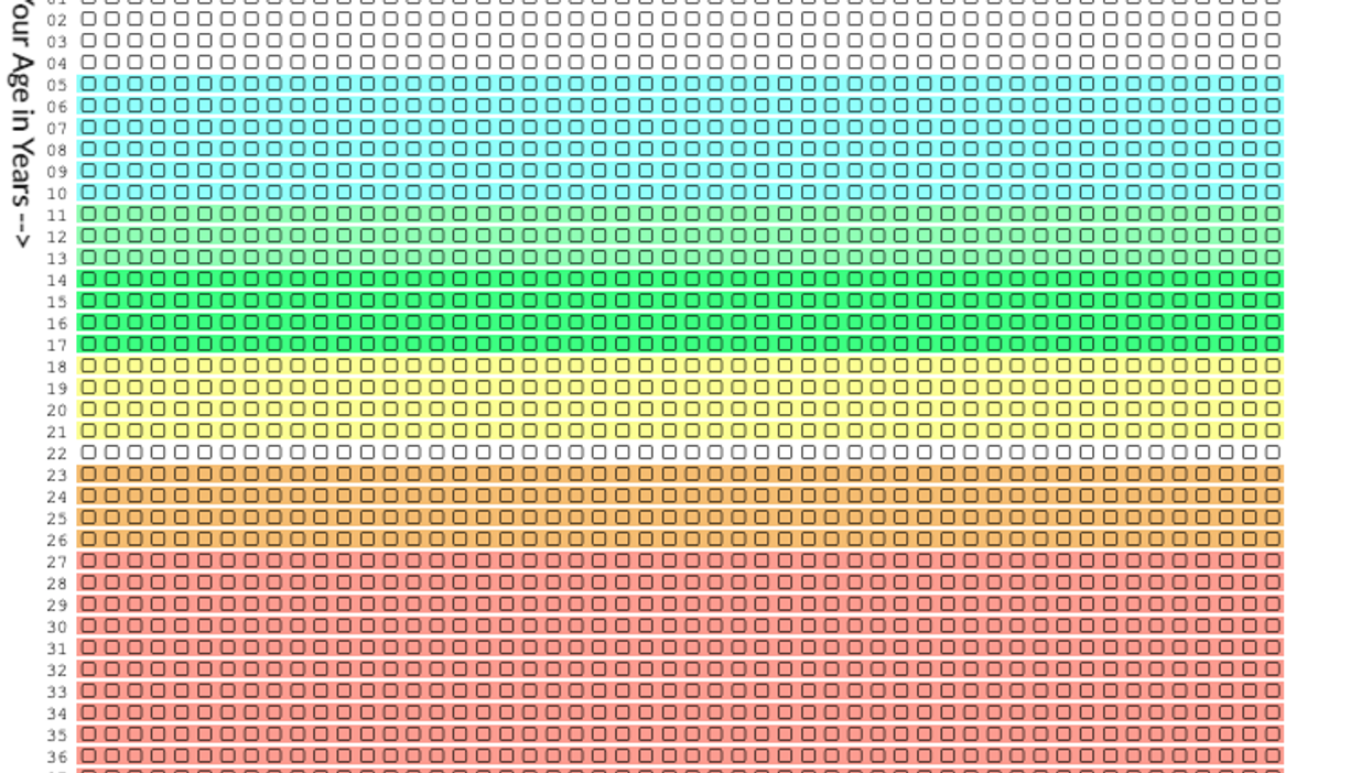
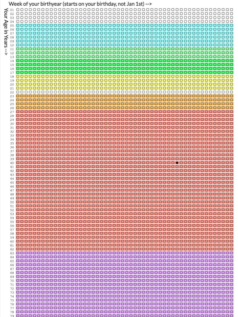
An interactive infographic that shows in detail how much of your likely lifespan has already been used up has internet users freaking out.
The infographic posted in the thread r/InternetIsBeautiful by u/Zestyclose-Rope-733 is from the technology software search web system Coruscant Consulting Ltd and was created by Sverrir Sigmundarson.
Sigmundarson, an independent software consultant who is based in Strasbourg, France, used the detailed infographic to show people’s lives “in weeks.”
“Sometimes life seems really short, and other times it seems impossibly long. But this chart helps to emphasize that it’s most certainly finite. Those are your weeks, and they’re all you’ve got,” the web system reads.
“Each row of weeks makes up one year. That’s how many weeks it takes to turn a newborn into a 90-year-old. Here they are—fully countable—staring you in the face,” it continues.
To see how this works, you add the month, day, and year you were born, your gender and country of birth ( which has a drop-down option); the age you were when you went to elementary school ( in blue); middle school (light green); high school (bright green); and higher education ( broken up into yellow for college and orange for university).
You also add the age that you started working and how long you have been working for( which is noted as “career” and is in red), which will then give you a retirement age (in purple).
The site also shows famous people’s life spans, such as Leonardo Da Vinci, Albert Einstein, and William Shakespeare.
Afterwards, you see your generated life expectancy.
 A screenshot of the amazing infographicCoruscant Consulting
Naturally, people were taken aback by the details, coming to grips with how they’ve “lived their lives.”
“The worst part is I haven’t done anything but work for the last two years since my social skills died. So I’ve been wasting weeks staring at my phone/tv when I could have been stepping out and enjoying life a bit,” someone wrote.
“Well, this has made me realise my own mortality,” another person said.
“I’m a bit over halfway through my assigned weeks from this chart. I’m feeling a bit unsettled, “ said someone else.
One person, rather perceptively, added: “As a species, we have probably evolved a degree of psychological ability to be somewhat in denial about our mortality and then a chart comes along like this with its unsettling geometric simplicity and triggers an existential crisis. I think I speak for everyone when I say f*** this chart.”
Check out the infographic for yourself - if you dare - by clicking here.
Top 100