The Conversation (0)
News
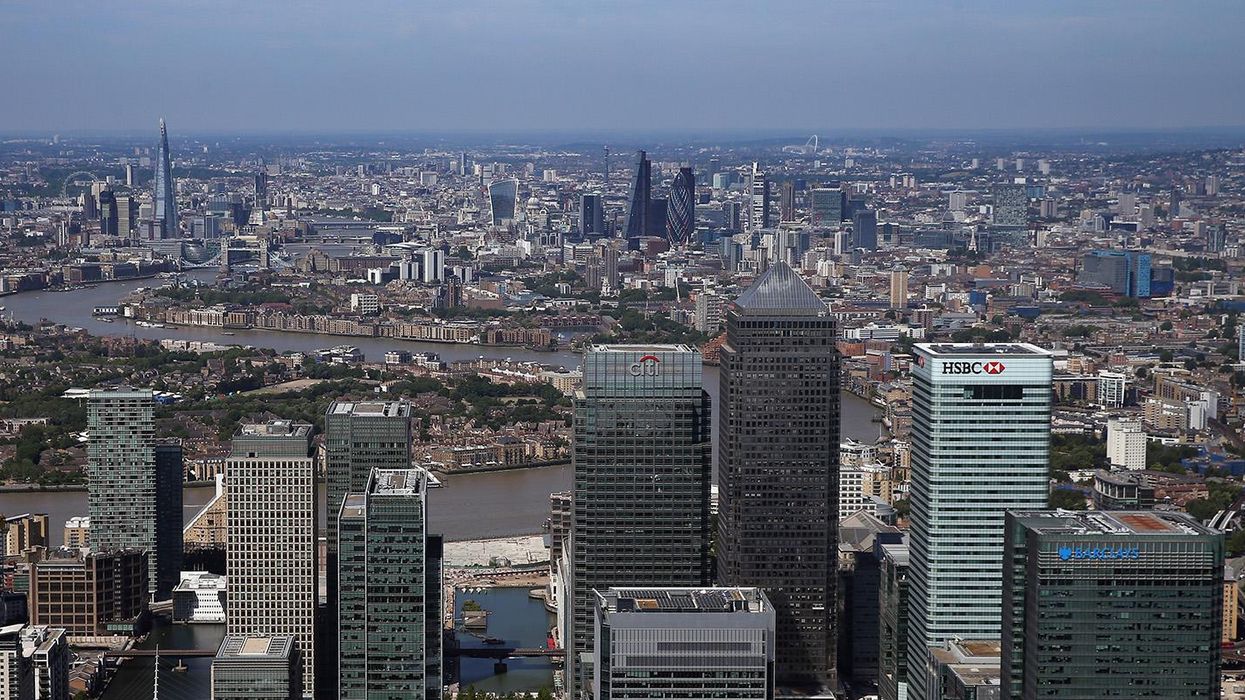
On Thursday, Londoners go to the polls to elect a mayor from a field of candidates who have touted the city's credentials to compete on a global platform and grow.
So how does London compare to the world's biggest cities and does it have room to expand in population?
Analysis by the London School of Economics' LSE Cities centre has produced some handy visualisations evaluating London's demographics as part of their Urban Age research.
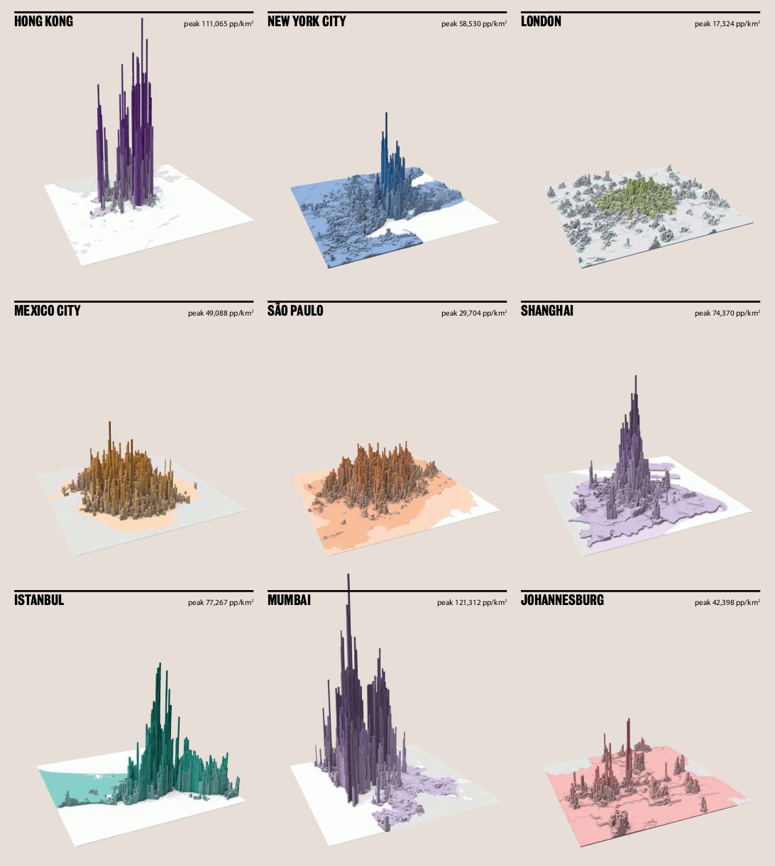
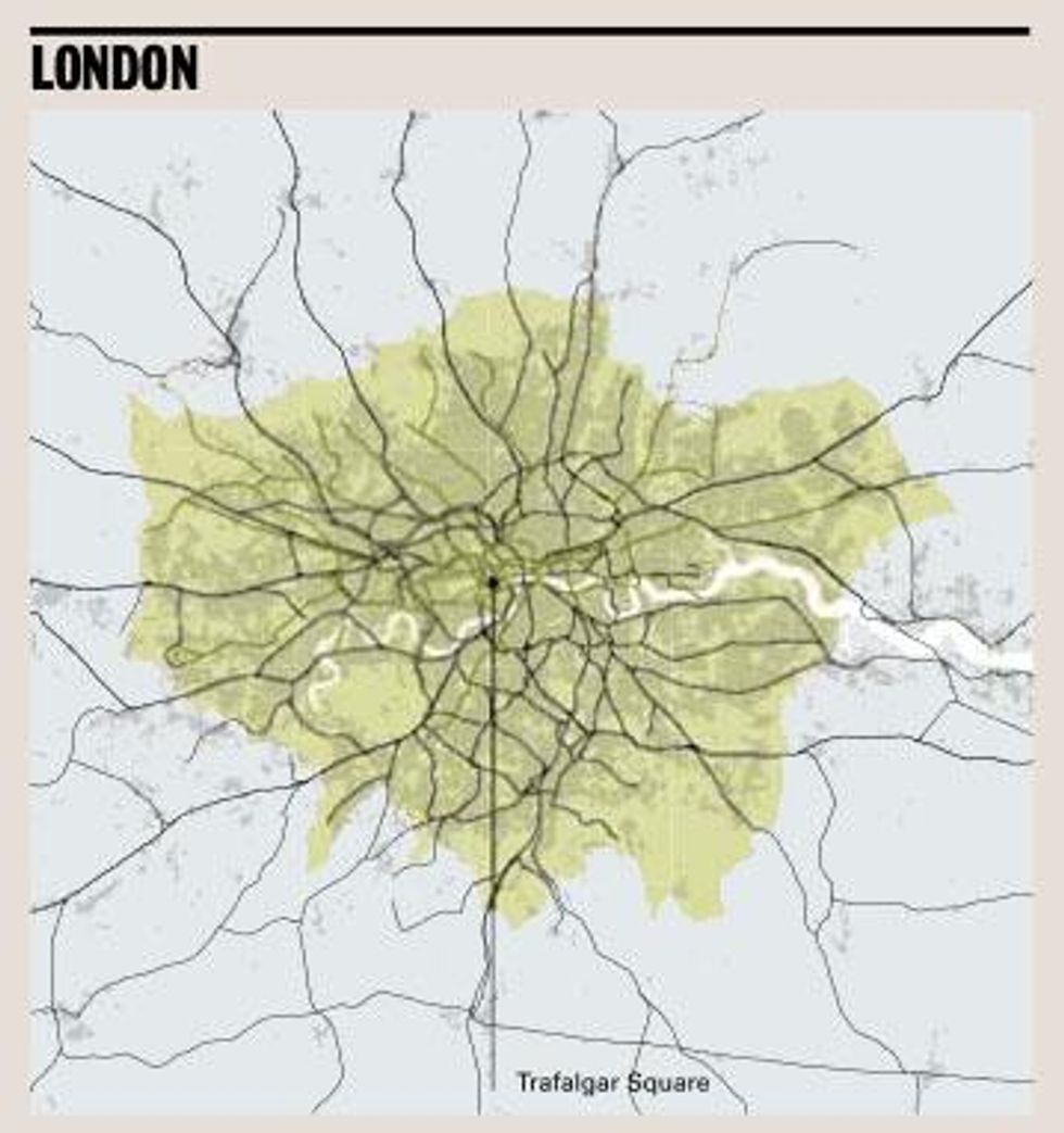
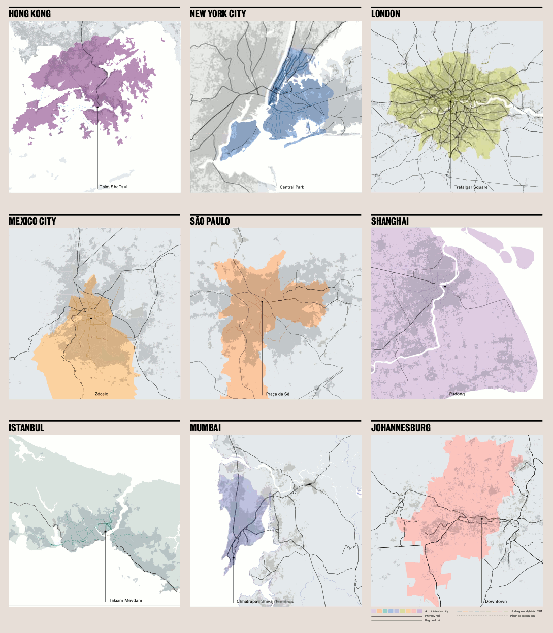
The population density, compared to other cities is actually pretty low, running at 17,324 people at its peak square kilometre...
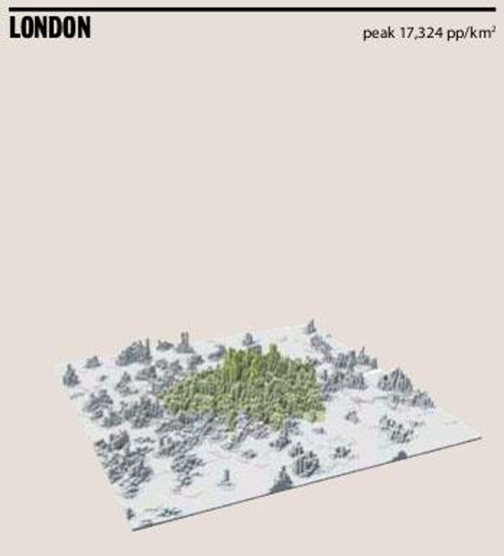
...compared to 121,312 in Mumbai - that's six times as many people in the densest kilometre.
But what the graphic shows is that the population of London is relatively spread out, rather than densely packed housing in the centre of the city - like Manhattan for example.
Apparently we're ok with a brief commute.
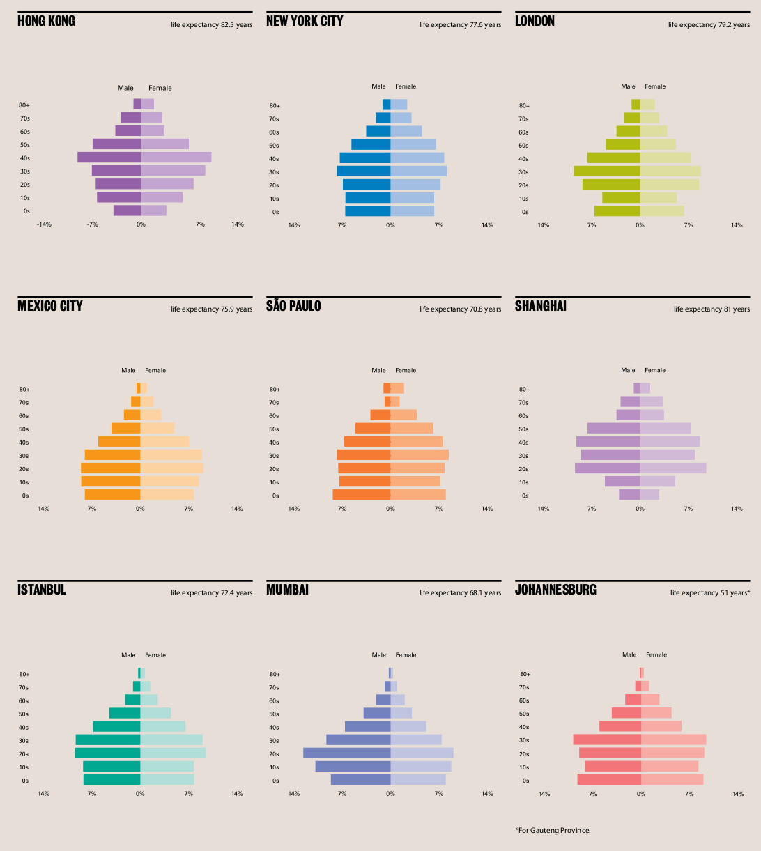
The age spread of London shows that, like New York, the country's largest city is younger than its rural areas.
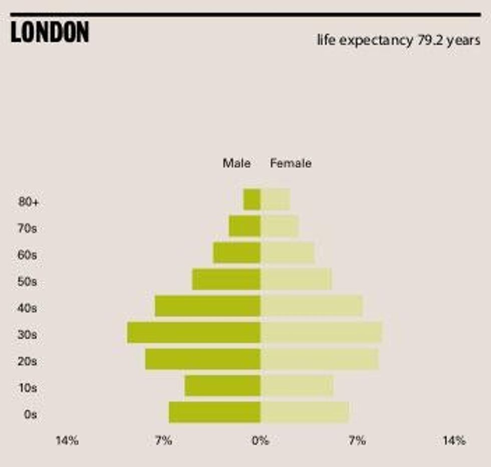
However, compared to cities like Mumbai and Mexico City, London has a more middle-aged spread.
London's spread population is mirrored by its transport system, which is old and extensive, compared to other large cities.
Because of this London has high levels of accessibility, enabling people to live further out and accommodate a growing city population.
London's network extends 402 kilometres, compared to Hong Kong's 250, or Mexico City's 177.
London also uses this network about as much as the average global city, with public transport accounting for 40 per cent of all trips.
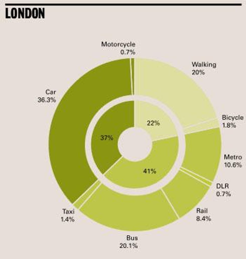
In New York this figure stands at 60 per cent and in Hong Kong this stands at 50 per cent, however, these cities are at the upper end.
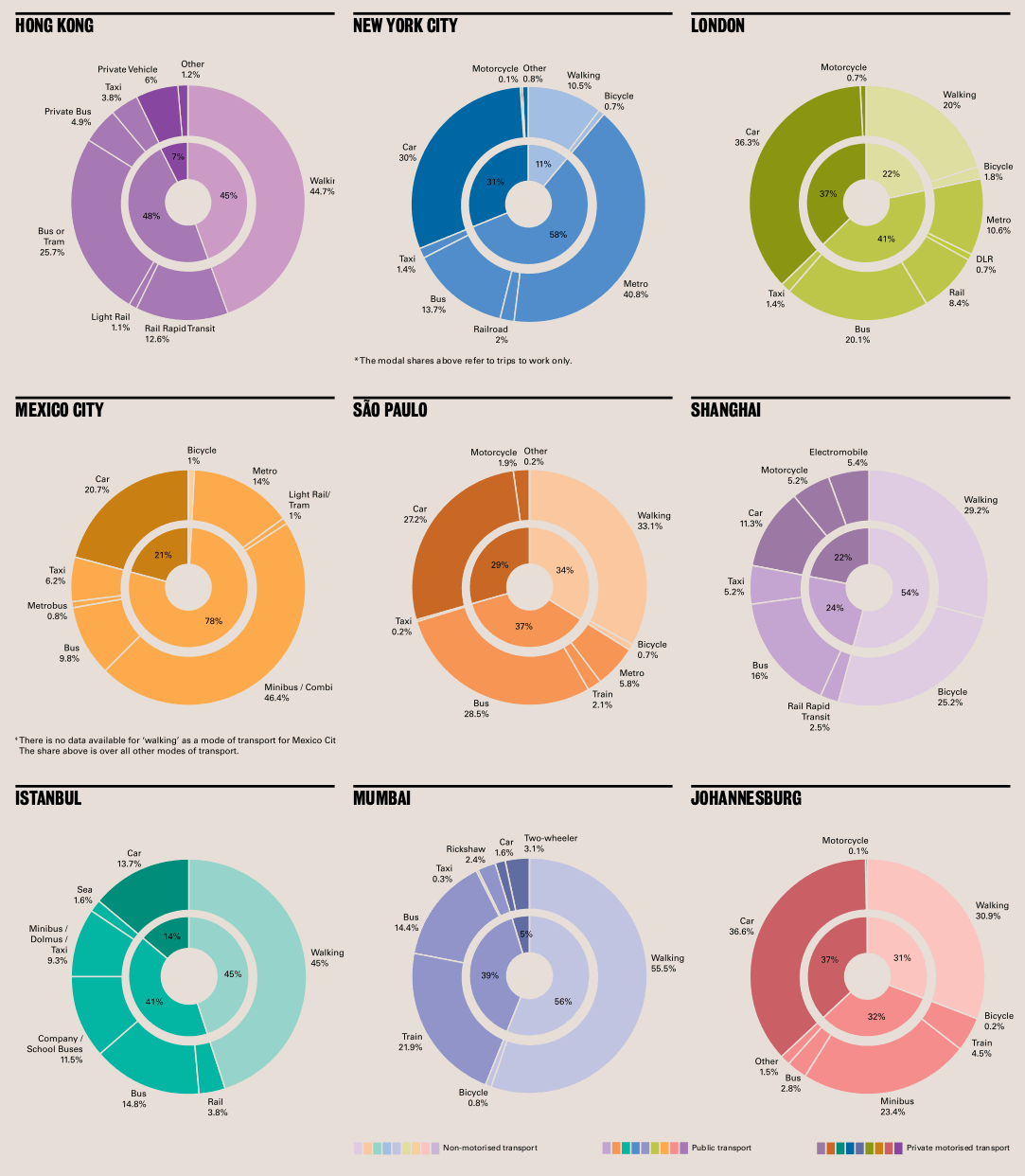
In Istanbul meanwhile, 45 per cent of trips are made on foot, compared to our 20 per cent, and in Mumbai this figure stands at 55.5 per cent.
However, we do still use a lot of cars - presumably due to our largely low-rise residential, spread out city (compared to the likes of New York and Hong Kong).
More: 21 maps and charts which will challenge perceptions of Europe