


The Conversation (0)
News
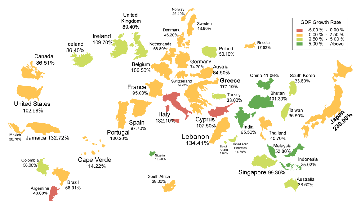
As Vox explains, "unless you are dead inside, you love government debt visualisations", and this one which maps the national debt of countries around the world is splendid.
The map, from cost information website HowMuch.net, scales each country based on the size of its debt compared to GDP (hello, Japan!) and then colours them based on their growth rate.
According to the IMF, which HowMuch cites, there is no "unsafe" debt threshold which countries should stay below, however, some studies have shown that a debt-to-GDP ratio of somewhere above 96 per cent can be damaging for growth.