


The Conversation (0)
Indy100 Staff
Jan 11, 2017
Which countries have the most women and the most men?
We've answered this question before using UN Population Division data, however a new visualisation has been made popular in a subreddit.
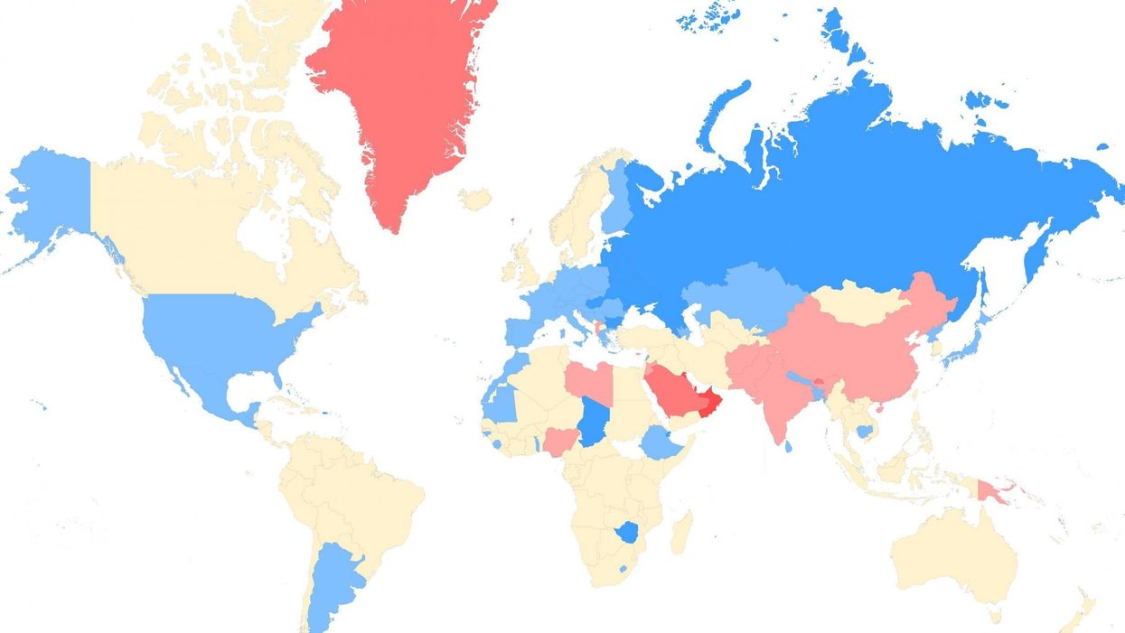
The data, from the CIA World Factbook, comes in the form of a ratio for male to female.
Blue is predominately female, red is predominately male, yellow is about the same.
View the interactive map, below:
People commented about focal points on the map, such as Russia's ongoing shortage of men as a result of the Second World War losses and a high mortality rate, Mongolia sitting in between the country and China, which has an excess of men due to the one child policy.
People also commented on how policies about a child's gender has influenced figures.
Redditaccountplease wrote:
India has improved vastly since it became policy that doctors cannot disclose the sex of a fetus (now they just do it in a more subtle way).
Practices of aborting female fetuses, female infanticide, and wife-burning have lessened, and hopefully continue to do so.