The Conversation (0)
News
Logo design is difficult.
When coming up with a new creation you have to simultaneously vye for recognition among a sea of other logos, and somehow convey an entire company's ethos into one easy to read symbol.
In the past, indy100 has identified the hidden meanings and design quirks of these 30 logos.
Here's a few more which we think merit your attention.
No Kid Hungry is a charity based in the United States, which aims to end food poverty among children.
According to their website, 1 in 6 children in America do not have enough food to eat.
13 million live in households that lack the means to get nutritional food on a regular basis.
The charity provide cooking lessons, organises breakfast clubs in schools, and activities during summer centred on meals and fitness.
Their clever logo is an apple, bitten on either side, which also resembles two children standing face to face.
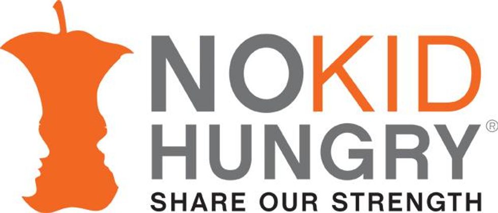 Picture: No Kid Hungry
Bear Handed is a hair salon which, like most, also sells it own brand of hair care products.
It describes itself as a 'Western hair studio', and is located in Phomnh Penh, Cambodia.
The logo is combines both a bear and the shape of fingers and a palm.
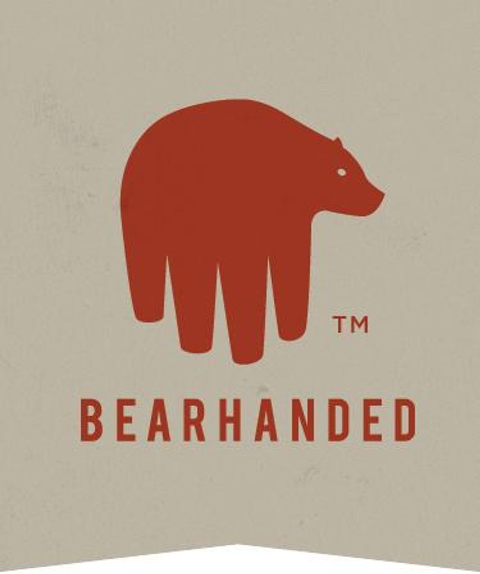 Picture: Bearhanded
Similar to the No Kids Hungry logo, this one for the Pittsburgh Zoo & PPG Aquarium uses an optical illusion.
The outline of a huge tree, also doubles as a gorilla and what appears to be a lion facing one another.
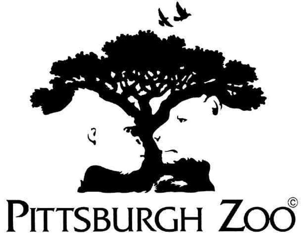 Picture: Pittsburgh Zoo
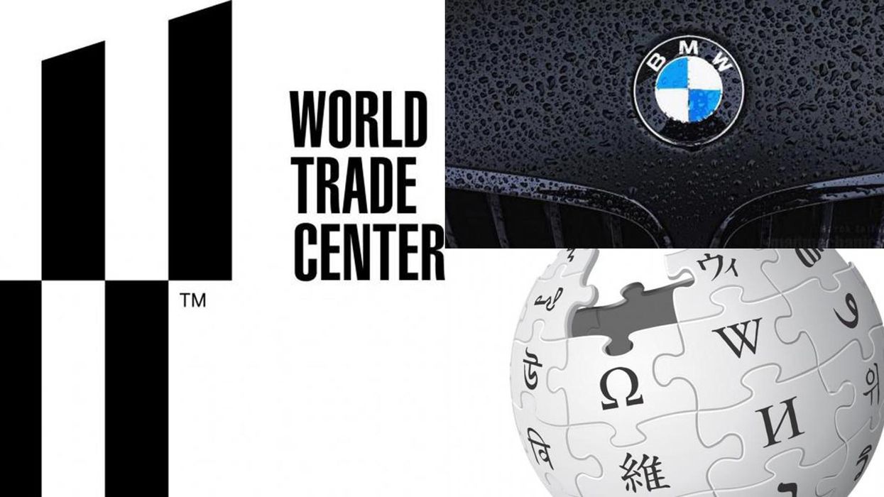
This logo is for the structures that replaced the two World Trade Center towers (The Twin Towers) which were infamously destroyed on 11 September 2011.
As well as housing a reflecting pool and memorial to the 2,753 persons who died at the towers because of the attack, the site is also now home to several new buildings.
The logo designed for the new World Trade Center buildings contains various symbols.
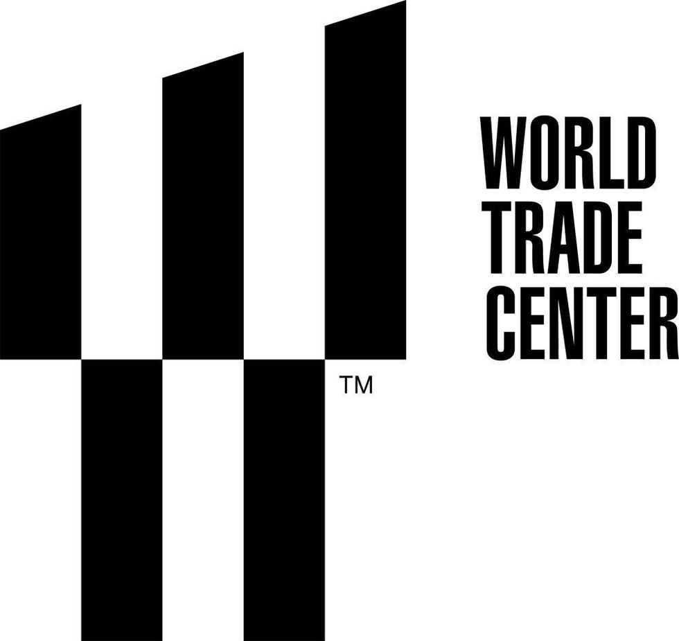 Picture: World Trace Center
The logo by Landor is made to be read in a number of different ways.
Firstly, each of the five bars represents one of the buildings that make up the new World Trade Center.
The lower bars represent the reflecting pools.
And also it's a large 'W'.
Design blog Under Consideration explains the other features of the logo.
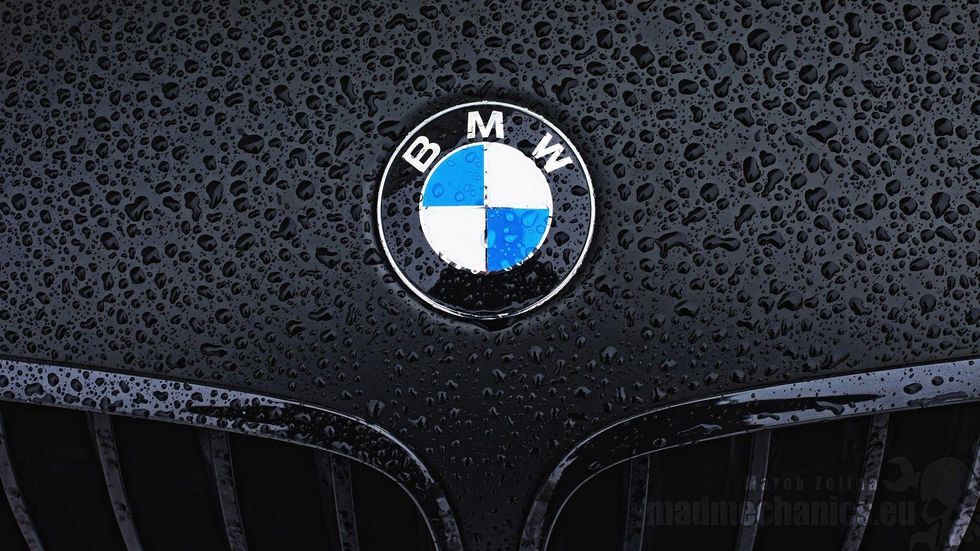 Picture: BMW
The car company has a background in aviation when in 1916 the Rapp-Motorernwerke company (a motorcycle engine maker) took over a smaller company Gustav Flugsmaschinefabrik which made small aircrafts. Some argue that this history is reflected in the logo today. The white and blue of the logo represent a propeller and blue sky at an angle, rather than a check pattern.
This theory has been discounted by the New York Times who say the blue and white represent the colours of the Free State of Bavaria. When the trademark logo was registered in 1929 it was illegal to show a state's colours in a logo, and therefore the colours were switched, and the aviation connection was added at this point.
 Picture: Mcdonalds
M is just an M and was designed to be an M, but according to the BBC, design consultant Louis Cheskin warned McDonald's not to change its logo when it considered it in the 1960s. Cheskin allegedly cautioned them against the change because he believed that, subliminally, customers saw the golden arches as a pair of nurturing breasts. Whether or not we do, the McDonald's people believed Cheskin and left the M intact.
 Picture: Game Cube
The dead space created by the letter G makes a C.
 Picture: Paramount Pictures
The original 24 stars that surround the image of a mountain, represented the 24 film stars were officially attached to the studio when the logo was designed in 1917.
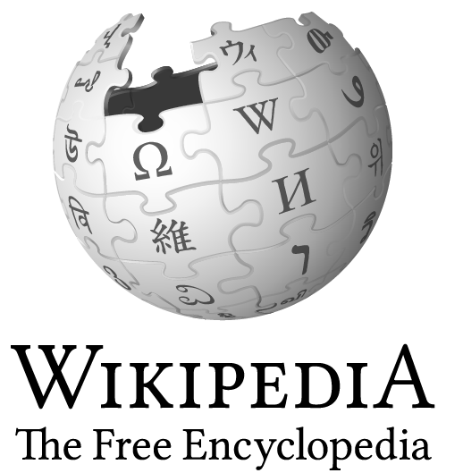 Picture: Wikipedia
No it's not the death star under construction. According to Wikipedia itself, the incomplete nature of the logo represents the unfinished nature of the project. In addition to articles it also refers to the languages yet to be rendered, as the existing 'glyphs' on the jig saw pieces are the first letter of 'Wikipedia' in the languages Wikipedia in which articles are already available.
HT The Wacky