The Conversation (0)
News
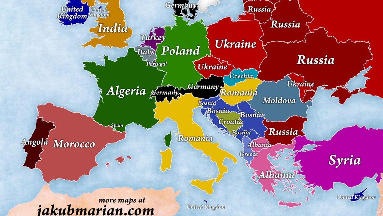
What is the most common country of origin for immigrants to the UK?
India, according to the United Nations.
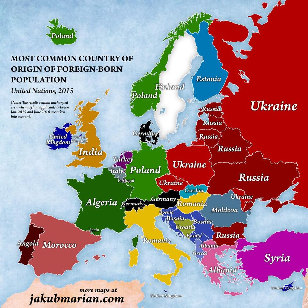
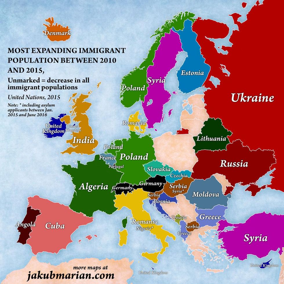
A series of maps, made by Jakub Marian, a Czech linguist, mathematician, and artist, has used data from the United Nations Population Division, as well as a 2015 UN study to give a brief rundown.
The maps also taken into account Eurostat data on asylum applicants between January 2015 and June 2016, in an attempt to update the figures for the migration crisis.
Still, India prevails as the UK's greatest source of immigration, while for the Republic of Ireland the UK takes the top spot.
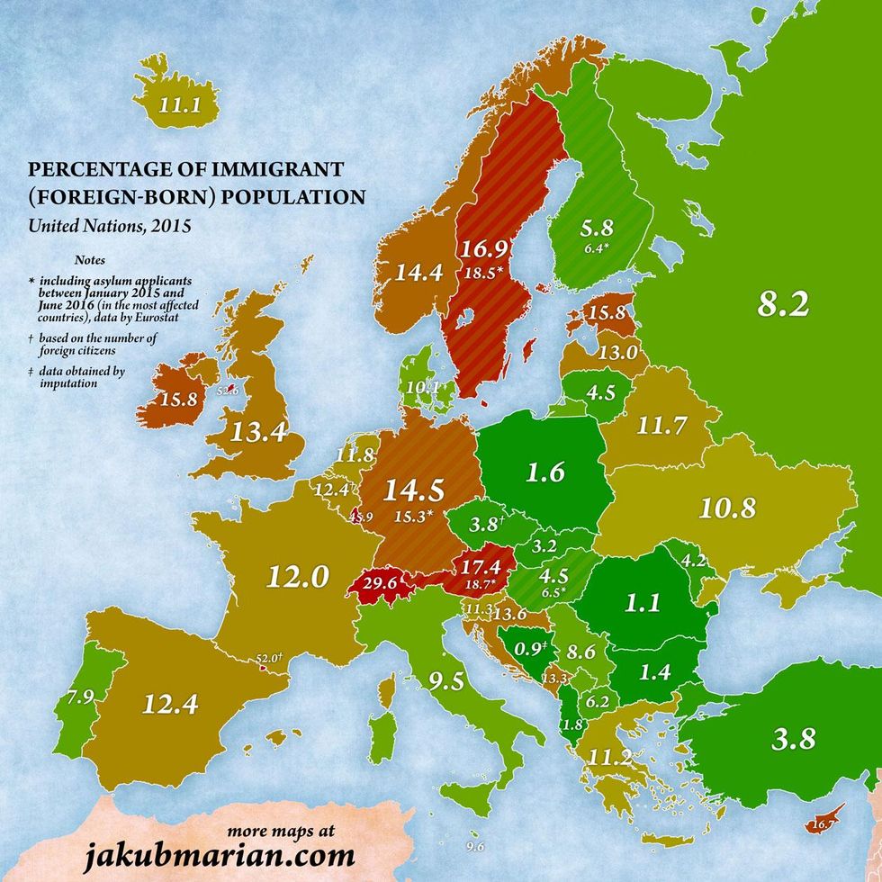
In terms of the foreign-born population as a percentage of the total population, the UK ranks fairly highly, but trails countries like Norway, Sweden, Germany, Switzerland and Austria.
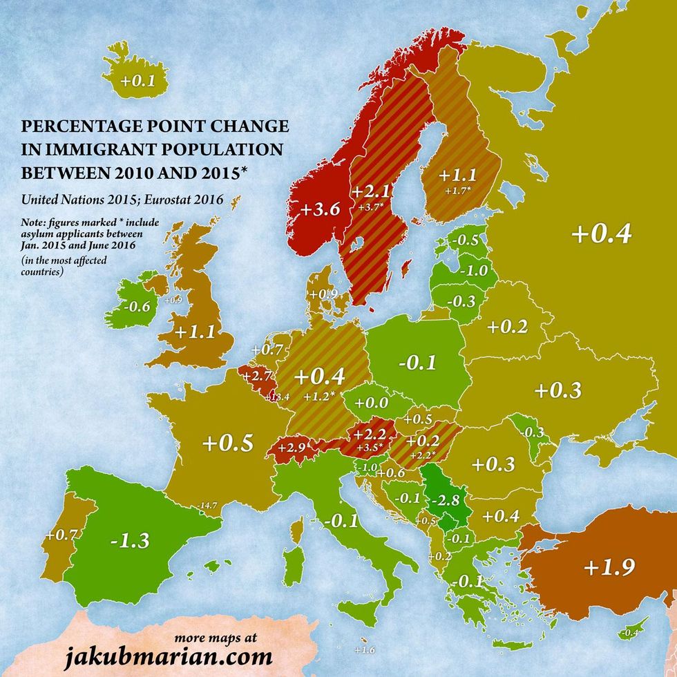
However, our immigrant population is rising faster than most European countries.
And which country is growing most quickly as a source of our immigration? India again.
Meanwhile, Poland, Serbia, Germany and Romania account for many countries across the continent, while people from the UK are the fastest-growing immigrant population in the Republic of Ireland.
If you voted for Brexit for immigration reasons, it seems you may have been slightly misled.
Note: Kosovo is grouped together with Serbia in the UN report and was similarly done so in these maps for these purposes.
More: Updated: A map of all the countries Boris Johnson has offended
More: This map shows the most common surnames in Europe
More: The European map according to the most vegetarian-friendly countries