The Conversation (0)
News
David Cameron is set to give a speech on Tuesday where he will urge business leaders to give their staff a pay rise.
He will tell employers at the British Chambers of Commerce annual conference that they should pass on the benefits of economic success and "the strongest growth for seven years".
The prime minister is expected to say: "Economic success can't just be shown in the GDP figures or on the balance sheets of British businesses but in people's pay packets and bank accounts and lifestyles."
Cameron is correct, Britain does needs a pay rise. A study from the Office for National Statistics (ONS) last year found that the drop in real-term wages since 2010 was the longest in half a century.
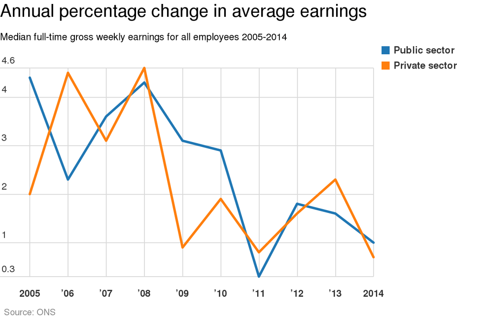
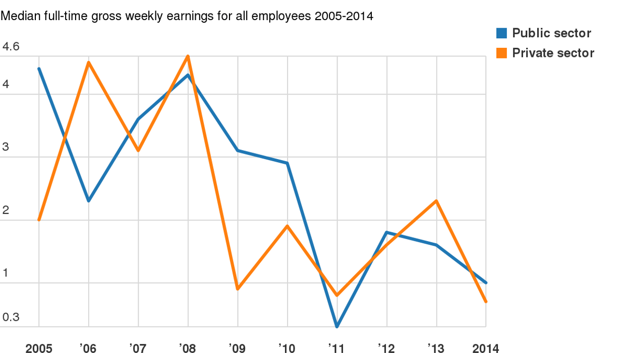
The chart above is taken from the ONS's December 2014 annual survey of hours and earnings, and looks at the annual percentage change in median earnings for all employees in the public and private sector over the last decade.
The same survey shows the value of average gross annual earnings of full-time employees in the public sector has decreased by 8.4 per cent and 8.3 per cent in the private sector, according to an analysis by the TUC.
The government extended their one per cent pay rise limit for public sector workers until 2015 in the March 2013 Budget, and pay restraint in the public sector looks set to continue. In his December 2014 Autumn Statement chancellor George Osborne said the measures had delivered £12bn in savings, adding: "We expect to deliver commensurate savings in the next Parliament until we have dealt with the deficit."