The Conversation (0)
Picture:
Datawrapper
Income inequality is a growing political concern, especially in the UK if the sustained popularity of Jeremy Corbyn is anything to go by.
The Labour leader's slogan "For the Many, not the Few" encapsulates a growing concern around the world between the pay of average workers and company chiefs.
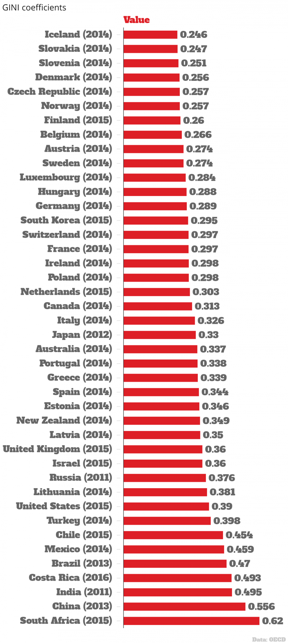
A recent post in a popular data subreddit looked at GINI co-efficients, an economic formula for gauging the income difference between the top and bottom earners in a country.
On the scale, 0 is for perfect equality and 1 represents complete inequality.
The data appears to be taken from the World Bank and Wikipedia, over a range of years.
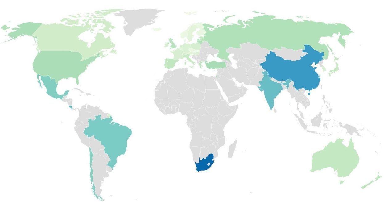
The following data, pictured in the map at the top of the page, is from the OECD, is of the same index for the latest annual data available for countries between 2012 and 2016.
HT OECD
More: Inequality is the biggest challenge facing the world, say experts
Top 100