The Conversation (0)
Viral

Channel 4 has announced a re-branding. Gone are the nine blocks that made up its traditional logo of 33 years and introduced are new abstract “idents” which will be used on programming instead.
The Independent's media correspondent Adam Sherwin described it as "either a bold reinvention of a middle-aged brand, or a marketing brainstorm too far", with viewers left with mixed feelings over the re-design.
Looking back over the years, many brands have tried their hand at a logo change or similar re-design. Some have gone better than others... Here are 10 of the worst:
Picture: Coca Cola, via Wikimedia
Back in 1985, the Coca-Cola company announced a brand new, sweeter formula for its classic drink which it called "New Coke". The move did not go well.
Despite the soft drink having lost market share to rival cola maker Pepsi, consumers in the US quickly voiced their disapproval for the re-branding. The company reportedly received over 400,000 calls and letters from angry fans, Fidel Castro labelled the move a "sign of American capitalist decadence" and it was called "one of the worst marketing blunders in history" by Time magazine. One woman in Georgia state even attacked a Coke delivery man in the street.
Coca-Cola abandoned the rebranding after just a few months, reverting to the old recipe and the old taste. Sales subsequently shot up. Maybe it was a success after all...
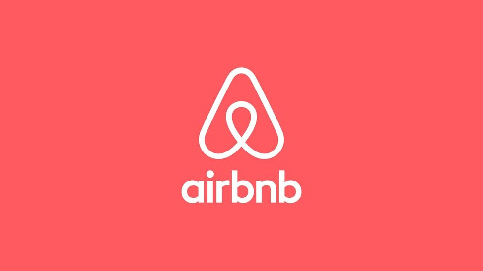
The holiday rental website, which has made millions from investors in Silicon Valley, underwent a rebrand in 2014. Many said its new logo looked like a penis, others said it looked like a vagina. Nevertheless Airbnb stuck to its guns, explaining that the logo "an expression of what it truly means to belong anywhere". Right.
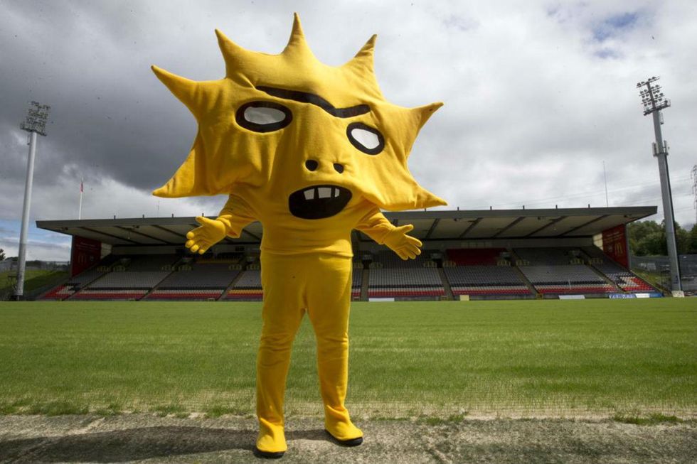
Kingsley: the most terrifying football mascot of all time for the Scottish Premiership club, introduced to coincide with its two-year sponsorship deal with US-based investment advisory firm Kingsford Capital Management.
Mike Wege, chief growth and marketing officer at Hershey's chocolatiers, said the new logo was an "expression of our progression to a modern, innovative company". Many online pointed out that the little block of chocolate looks an awful lot like a poop emoji...
It was supposed to look like a smile, but unfortunately for a sugary drink company that spent a reported $1m on its new logo, many people pointed out that it looked like an overweight man whose belly is protruding from his clothes...
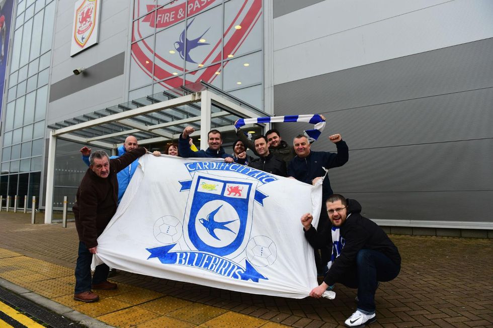
Cardiff City have been known as the Bluebirds since their inception in 1908 - owing to their blue kit - except for a period between 2012 and 2014 when the club's owner Vincent Tan changed the club's colours to red and its crest to a Welsh dragon.
The club's supporters, football fans being the tribal beings that they are, did not exactly react very well to the re-branding, with many refusing to wear the new shirt and instead wearing the club's blue away kit to matches. The club changed the home kit back to blue in January 2014.
According to Business Insider, the Sci Fi channel's president David Howe said of the new logo: "[T]he thing that we got back from our 18-to-34 techno-savvy crowd, which is quite a lot of our audience, is actually this is how you’d text it... It made us feel much cooler, much more cutting-edge, much more hip."
What he failed to point out is that not only is "Syfy" a slang term for syphilis, but it's supposed to be short for science fiction - which it now clearly isn't.
The BBC called Royal Mail's attempted re-branding in 2002, when it was part-privatised, "A duffer. A complete waste of money".
After a design process of two years, a company as British as cups of tea and long queues, gave itself a naff Latin-sounding name and was met with widespread disgust. It reverted to the Royal Mail after 15 months.
The clothing brand ditched its traditional logo in 2010 for one that, according to one critic, looked like it had been "designed for $20 by someone on a freelancing website with no design expertise at all".
After facing a consumer backlash online, the company changed its mind after just a few days and reverted to the old one, with its North America president Marka Hansen admitting that "we did not go about this the right way".
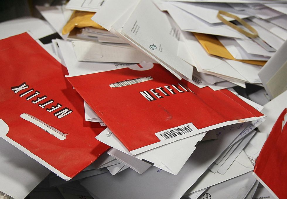
Before becoming the market leader in streaming, Netflix briefly changed the name of its DVD rental service to Qwikster, in what Mashable described as "the worst product launch since New Coke".
As Mashable's Chris Taylor added: "'Qwik' suggests a discount supermarket or photocopy shop, while the generic '-ster' ending was all the rage for startups... in 2000."
The re-branding forced existing customers - who could previously have streamed online or hired DVDs to their heart's content - to set up two separate accounts. Understandably, the reaction was furious and the company backtracked after a month.