Viral
Evan Bartlett
Jun 01, 2015
From the golden arches of McDonald's to the swoosh of Nike, a memorable logo is an all-important part of a business's brand identity.
Sadly, not all companies quite get it right, and some - as shown by this thread on Quora - get it spectacularly wrong.
Here are 10 of the worst logos ever created:
1. Office of Government Commerce
Despite a reported outlay of £14,000 in design fees, this branch of the Treasury had to scrap its logo after someone pointed out what it looked like when rotated 90 degrees...
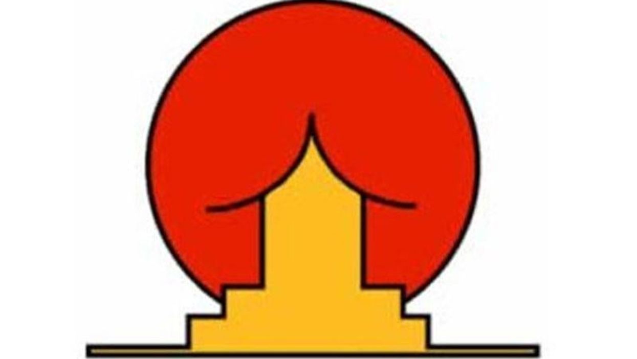
2. The Institute of Oriental Studies, University of Santa Catarina
"Hey, it's supposed to be a pagoda in front of the rising sun," we hear the designers say.
3. Arlington Paediatric Clinic
Probably not the most popular paediatric clinic in town.
4. Catholic Church’s Archdiocesan Youth Commission
This was reportedly the logo of the youth commission back in 1973.
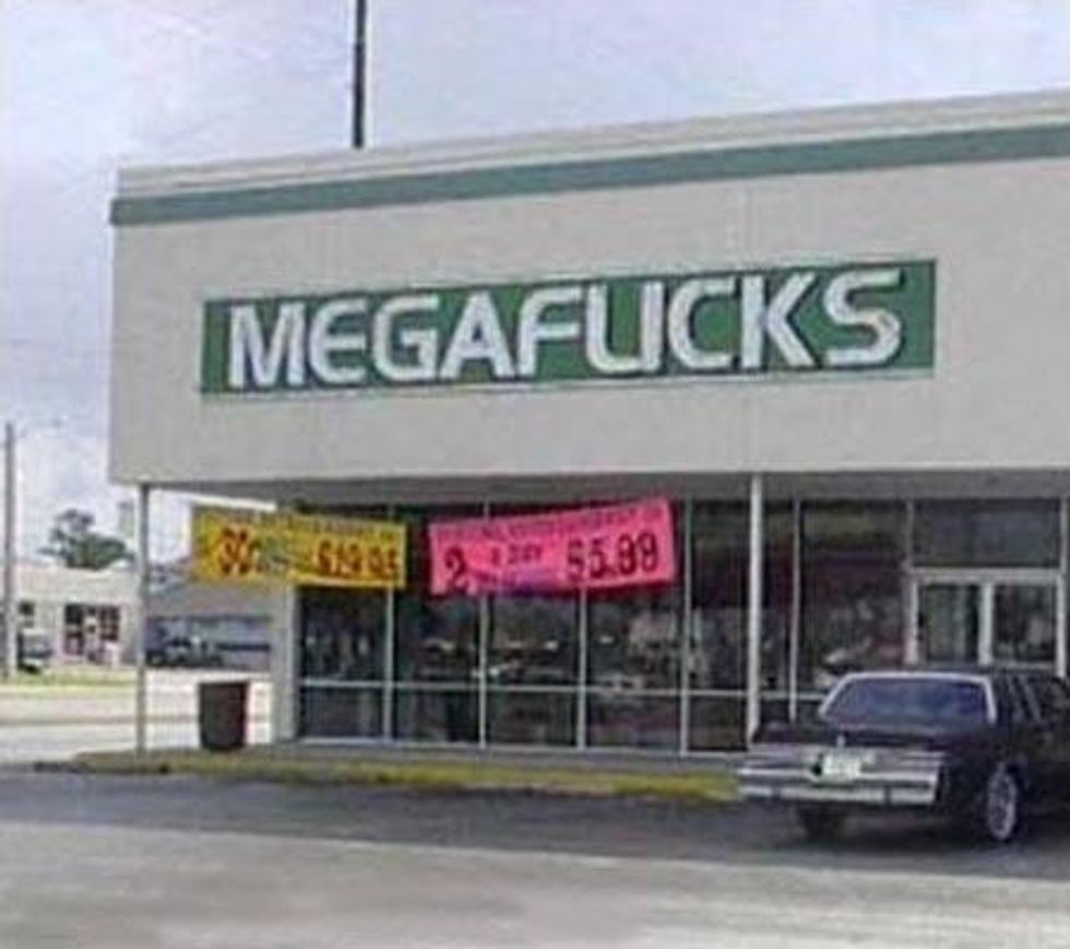
5. Megaflicks
The video store that wishes it used a different font.
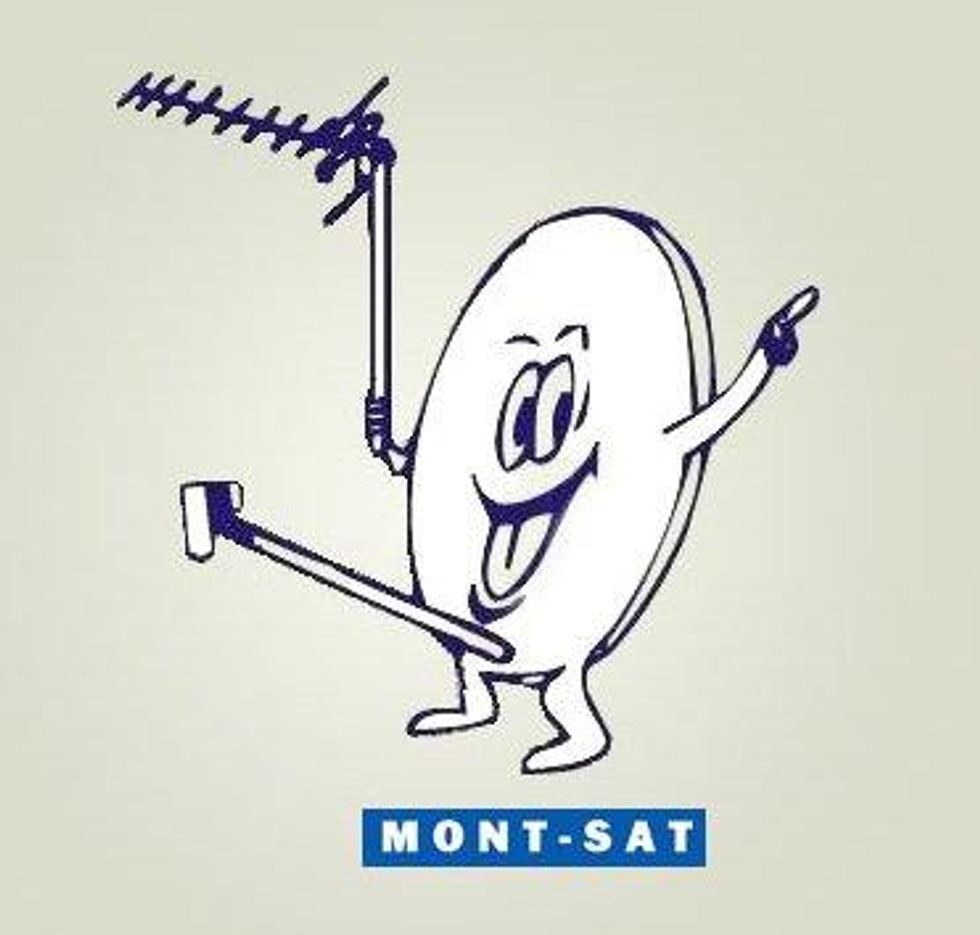
6. Mont-sat
This Polish satellite looks particularly pleased with himself.
7. Junior Jazz Dance Classes
This one might take a while to get. As one commenter notes on Quora: "Focus on the negative space."
8. State of Vermont pure maple syrup
The kind of syrup no one wants on their pancakes.
9. 2012 London Olympics
As well as being likened to Lisa Simpson doing something rude, some commenters said the London 2012 Olympics logo looked like a broken swastika. Iran even threatened to boycott the games because they thought it spelled out the word 'Zion'. The worst part: they spent £400,000 on the design.
10. S--t Yourself
Although not a logo per se, an honourable mention must go to this unfortunate magazine spread.
Did we miss any out? Let us know in the comments...
Top 100
The Conversation (0)
