The Conversation (0)
News
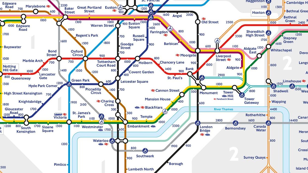
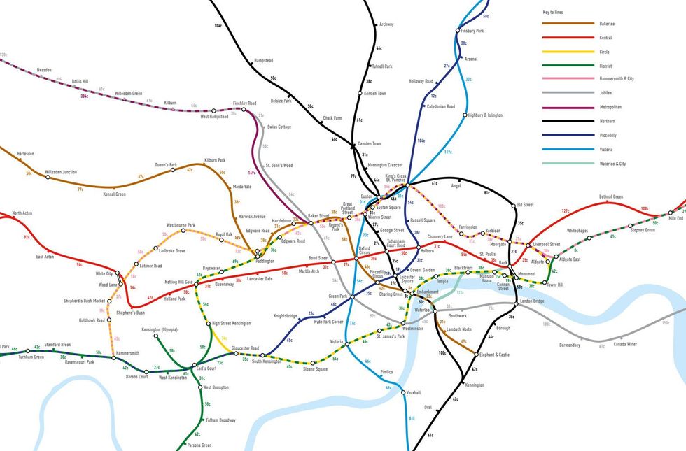
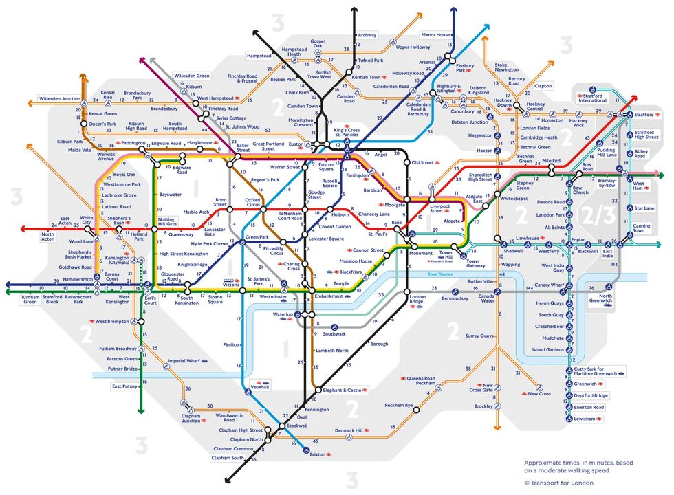
Transport for London (TfL) have unveiled a Tube map with official distances in steps between stations.
TfL said the map was released in order to encourage Londoners to take part in daily exercise and get fit.
What we're all more likely to do with this announcement is sit on our phones scrolling through other Tube maps which have gone some distance to explain parts of London.
So read our collection of them over the years, and then maybe walk to work to make up for it.
Mayor of London Sadiq Khan said of the newest map from TfL:
We need to make it easier and more enjoyable to walk around London. We all hop on the Tube to take short journeys around central London, whether for work or when we’re out in the evening.
The new steps map will encourage more of us to walk these short journeys instead – it’s good for our health and it will help support London’s small businesses. We’ve made clear our commitment to tackle air pollution and get more walking and cycling in London.

Complete simplicity.
It probably won't help you with your route much, though.
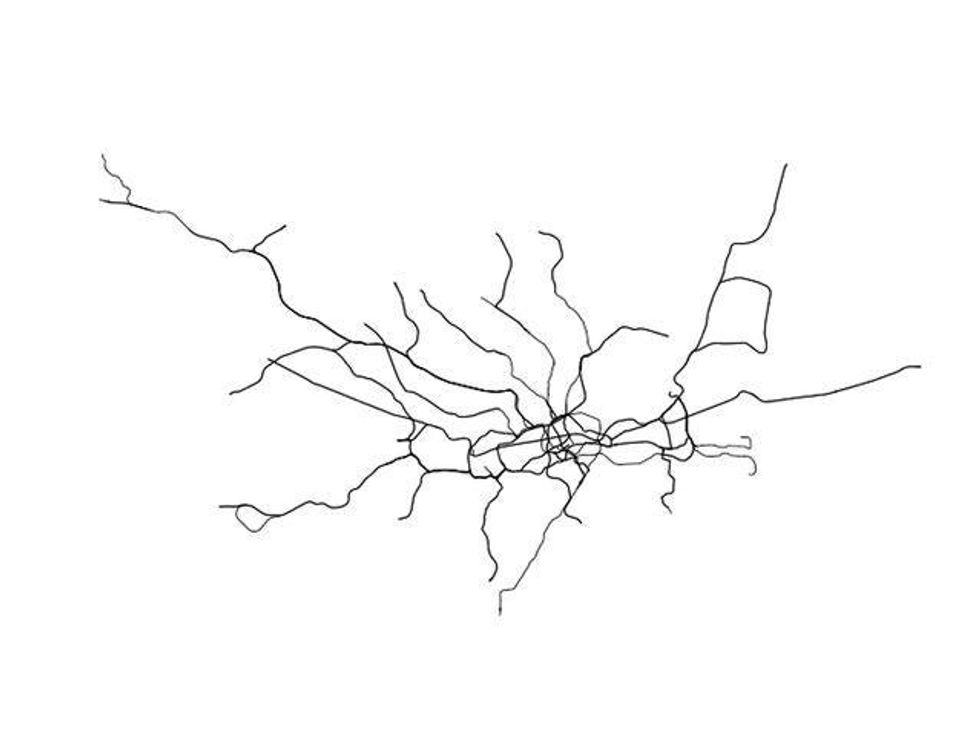
They were designed by artist and urban planner Neil Freeman, and you can browse them in our quiz about which map belongs to which city.
No prizes for guessing that this one measures how many calories you'll burn walking between stations.
It also shows the relative distance between stops.
The visual representation, created by Will Gallia, shows 562,145 people moving around the Tube network's 11 lines.
It's based on a sample of Oyster card data during a week in 2009 - each dot on the map represents one journey.
Honestly, don't look at it, don't think about it too much.
This one may be even worse.
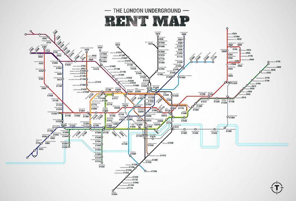
The map, taken from average local property prices listed on Zoopla in February, shows the extortionate prices of central London property.
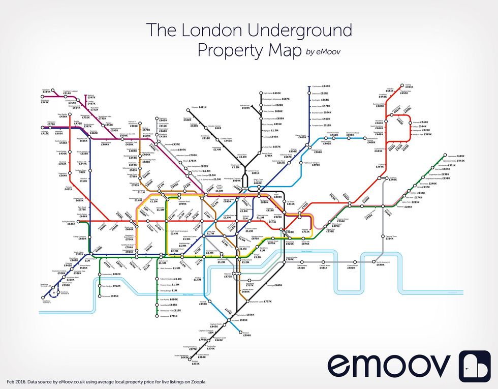
It was discovered that Zone 2 is 37 per cent cheaper than Zone 1 on average.
The most affordable stops in Zone 2 are some of those that used to be classed as Zone 3. Prospective buyers pay an average of £313,000 in West Ham, £324,000 in Canning Town and £340,000 in Stratford.
Another release by TfL to encourage people to get people off the seats and on their feet, this map shows the distance in metres as opposed to steps.
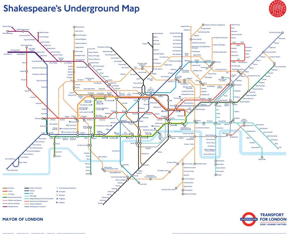
To celebrate the 400th anniversary of William Shakespeare's death.
The lines are no longer 'Bakerloo', 'Victoria', or 'Northern', but instead take categories for characters and titles, such as 'Heroines', 'Lovers', 'Fathers and Kings' and 'Modern Adaptations'.
More from the Independent: TfL releases ‘walk the Tube’ map showing number of steps between London stations