The Conversation (0)
News
A new study claims that the majority of food in the UK is imported, and shows just how interconnected the global food system really is.
The collaborative research from the Royal Society found:
The UK is currently importing over 50% of its food and feed, whereas 70% and 64% of the associated cropland and greenhouse gas impacts, respectively, are located abroad.
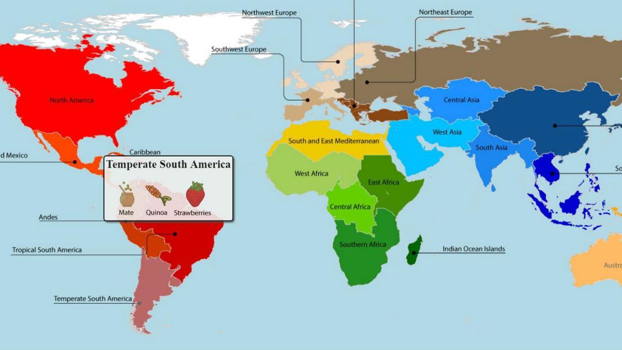
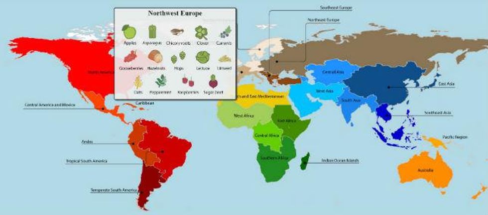
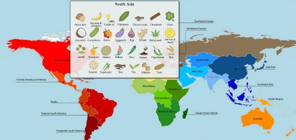
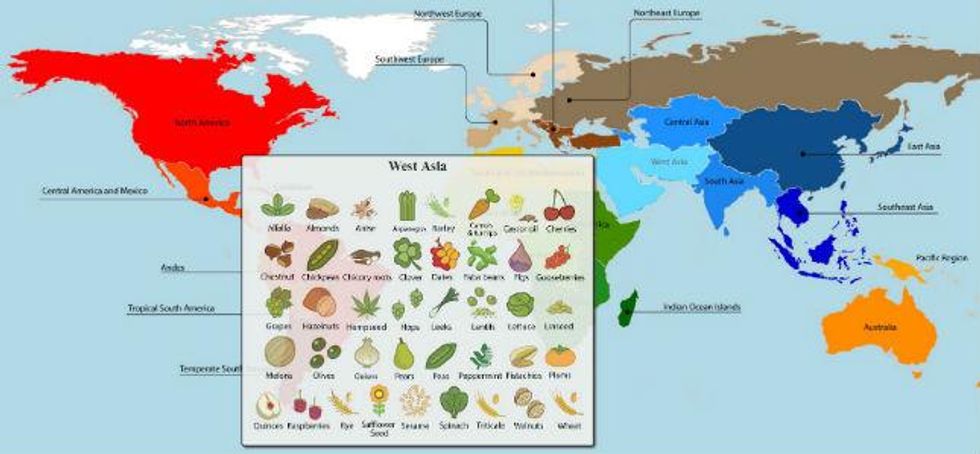
An interactive map, created by Colin K Khoury and researchers at the International Center for Tropical Agriculture (Ciat), showcases where different foods come from, and where they are the most prevalent, or as it is referred to in the study, their "primary region of diversity."
They also made cool interactive diet and production infographics:
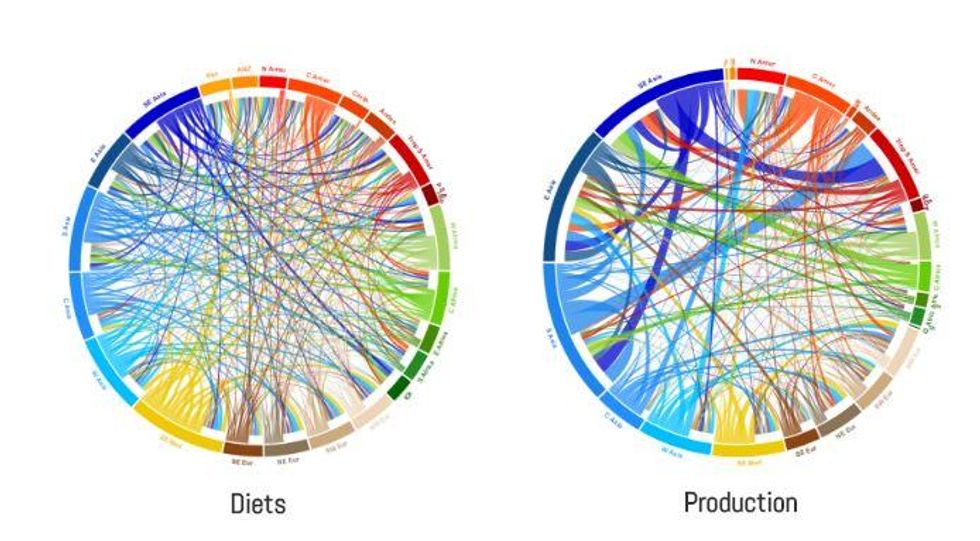
Each region has a colour representing its own 'native' crops and those colours are connected to other regions due to the importance of those crops in the diets/agricultural production in other regions.
So while, as the World Economic Forum points out, Brits have been enjoying strawberries for Wimbledon for 150 years, the fruit actually originates from Asia.
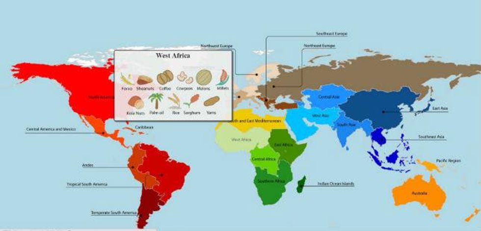
According to data taken from the Global Hunger Index 2015, some of the hungriest people live Asia and West Africa, despite much of the world's imported foods coming from these regions.
The entire body of research, as well as the interactive map, and infographics which show diet and production flows, can be accessed here.
More: World Hunger Day: A map of the hungriest countries in the world