


The Conversation (0)
Indy100 Staff
Aug 08, 2019
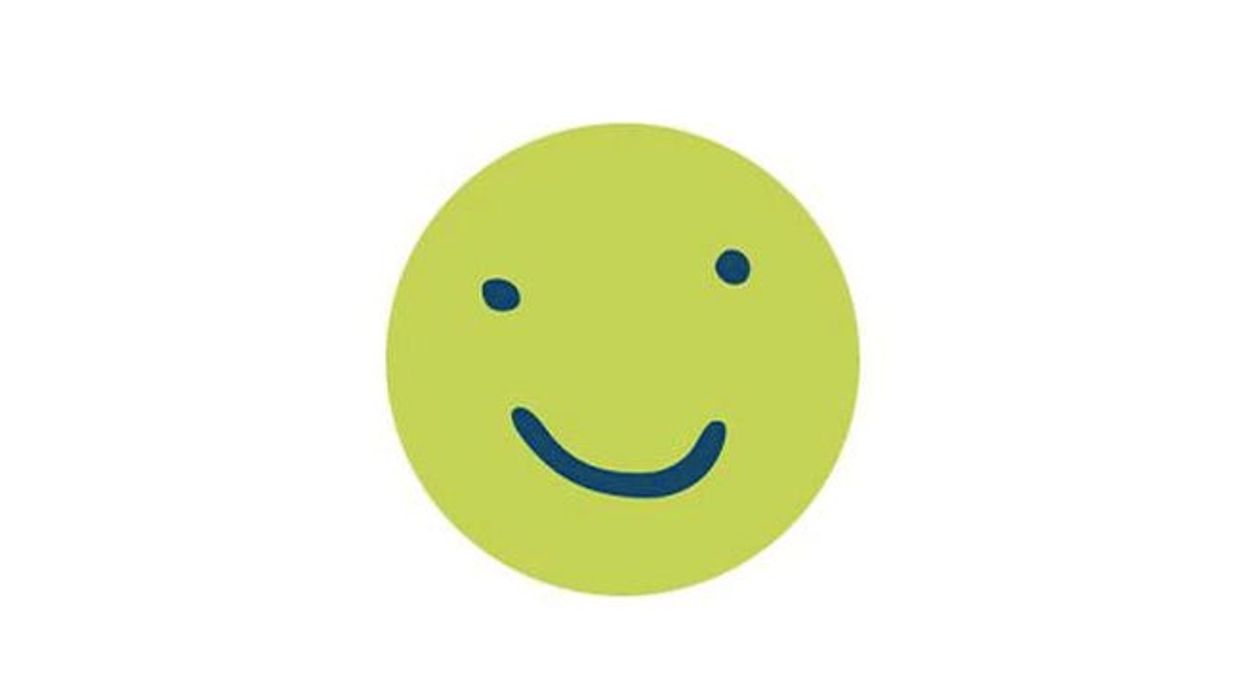
Picture:
Porirua City Council
You know what they say, money can’t buy taste.
But then, they also say you get what you pay for – and this New Zealand council that paid over $98,000 for a total rebrand did not get almost 100k’s worth of design on their new logo.
We don’t want to be mean, but the logo itself looks like it was made on MS paint in before we figured out how to actually use MS paint. The mayor insists that it came in “cheap” at just under $1000 as part of a larger rebrand with the full cos spread across different aspects, but the jury is out on whether or not it’s worth that.
The full breakdown is as follows:
- Strategy and brand development, and brand guidelines – $30,000
- Design of collateral, print and electronic templates, animation stationery, advertising, banners, certificates, rates latter and assessments – $28,775
- Brand architecture – $8,850
- Photo library based on the new brand “look and feel” – $24,991
- Update to brand guidelines – $5,260.
- Becoming a meme for bad logos? Priceless.
The taxpayers’ union gave the logo an absolutely scathing beating, describing the face as “limp and childlike”. The design was said to intend to connect with the “youthful” population, so naturally, many questioned why they even need to do that at all.
Heartbreakingly, the mayor has rushed in to defend the little mascot, saying: “People say, 'What is this smiley face about?' I said it's actually about our people,” he went on: “I'm feeling sorry for him right now. He's getting a bit of a beat up.”
He added that if you come to Porirua you’ll get a smile, too, which sounds slightly creepy considering the smile in question.