The Conversation (0)
News

Despite the permeation of nationalistic, right-wing sentiment in Europe, the victory over Austria's far-right candidate in its presidential elections this weekend show there is hope yet.
However, the results were worryingly close.
The following Statista graph, based on the exit polls as of 1000 GMT on Monday, shows just how close the race got:
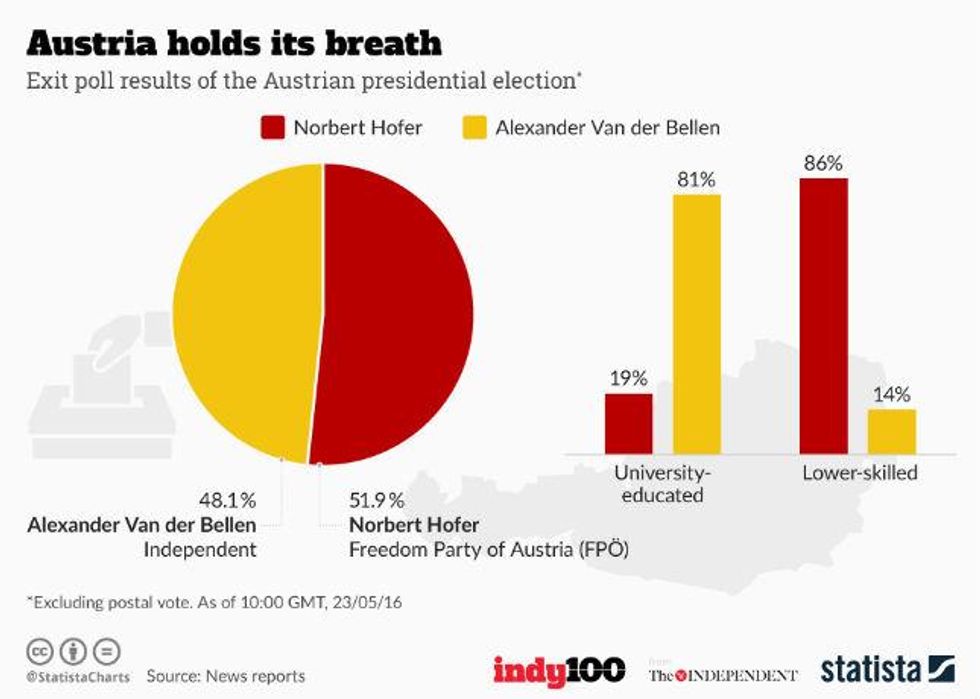
Alexander Van der Bellen, a former Green party member, ran as an independent candidate and won by a minute margin – some 30,000 votes out of the 4.6 million ballots cast– against rival and leader of the far-right wing Freedom Party, Norbert Hofer.
Since the exit polls came out, the final result figures have changed slightly, but what remains the same is Van der Bellen's knife-edge victory:


Hofer stirred up controversy when he was reported to have worn a blue cornflower, which is an old Nazi symbol.
While the EU may have dodged a bullet, the fact that the results were so close indicates a definite political shift to the right, which analysts say is due to a backlash over immigration fears.
More: 21 maps and charts which will challenge perceptions of Europe
More: This interactive map traces how fences have gone up across Europe during the refugee crisis