


The Conversation (0)
Evan Bartlett (@ev_bartlett
Mar 19, 2015
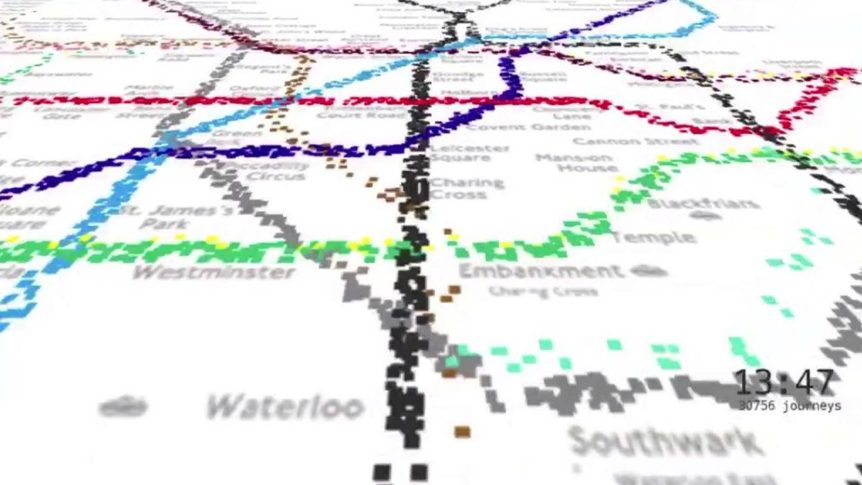
A computer programmer has created a beautiful visual representation of a day in the life of the London Underground.
This visualisation shows 562,145 people moving around the Tube network's 11 lines based on a sample of Oyster card data during a week in 2009 - each dot on the map represents one journey.
Will Gallia, a 26-year-old from Haggerston who took three years to create the video, told the Evening Standard that he was surprised its appeal went beyond computer programmers and graphic designers.
It’s weird that it resonates with people. Even the simplicity of the dots thing – people like the idea they’re represented by a small point.
- Will Gallia
You can read more about the project on Will's website.
More: Meanwhile, a rave on a Tube carriage